Marketing Dashboard Example
https://www.geckoboard.com/dashboard-examples/marketing/
What is a CMO dashboard?
Chief Marketing Officers (CMOs) use CMO dashboards to maintain a high level overview of their company’s marketing spending and performance. These will often include long term measures of brand health, as well as key metrics that indicate the success of current marketing initiatives.
- CMO dashboard

This CMO dashboard focuses on three areas. In the first column, the CMO is tracking some important brand health metrics, including the volume of monthly searches for their brand name, the number of mentions of their brand on social media, and their current Net Promoter Score. This gives the CMO an indication of both brand awareness and sentiment, both of which are leading indicators of future commercial success.
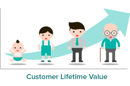
In the central section, the CMO dashboard is tracking metrics related to customers. This includes the average Customer Lifetime Value (LTV) and Customer Acquisition Cost (CAC). Many CMOs and Marketing Directors use the LTV:CAC ratio to measure the financial sustainability of their current marketing investment. The principle being that the cost of acquiring a customer should be repaid several times over during the customer lifetime.
Finally, this dashboard is also reporting on the overall advertising spend this quarter. This dashboard is designed to give a high level overview, whereas the individual performance of these campaigns is likely to be measured by other dashboards used by Marketing Managers, such as a digital marketing dashboard.
-
- Focus area
Overall marketing performance, marketing spend
-
- Who looks at it?
CMO, Marketing Director, CEO
-
- How often?
Several times a month
What is a digital marketing dashboard?
Although digital marketing is well known for providing advertisers with a huge volume of reporting data, it can often be difficult to determine (and easily access) the metrics that are most important to you. A digital marketing dashboard provides a single view of the KPIs Digital Marketing Managers need to see, in order to understand their digital marketing campaigns, and take action to optimize performance.
Digital marketing campaign dashboard
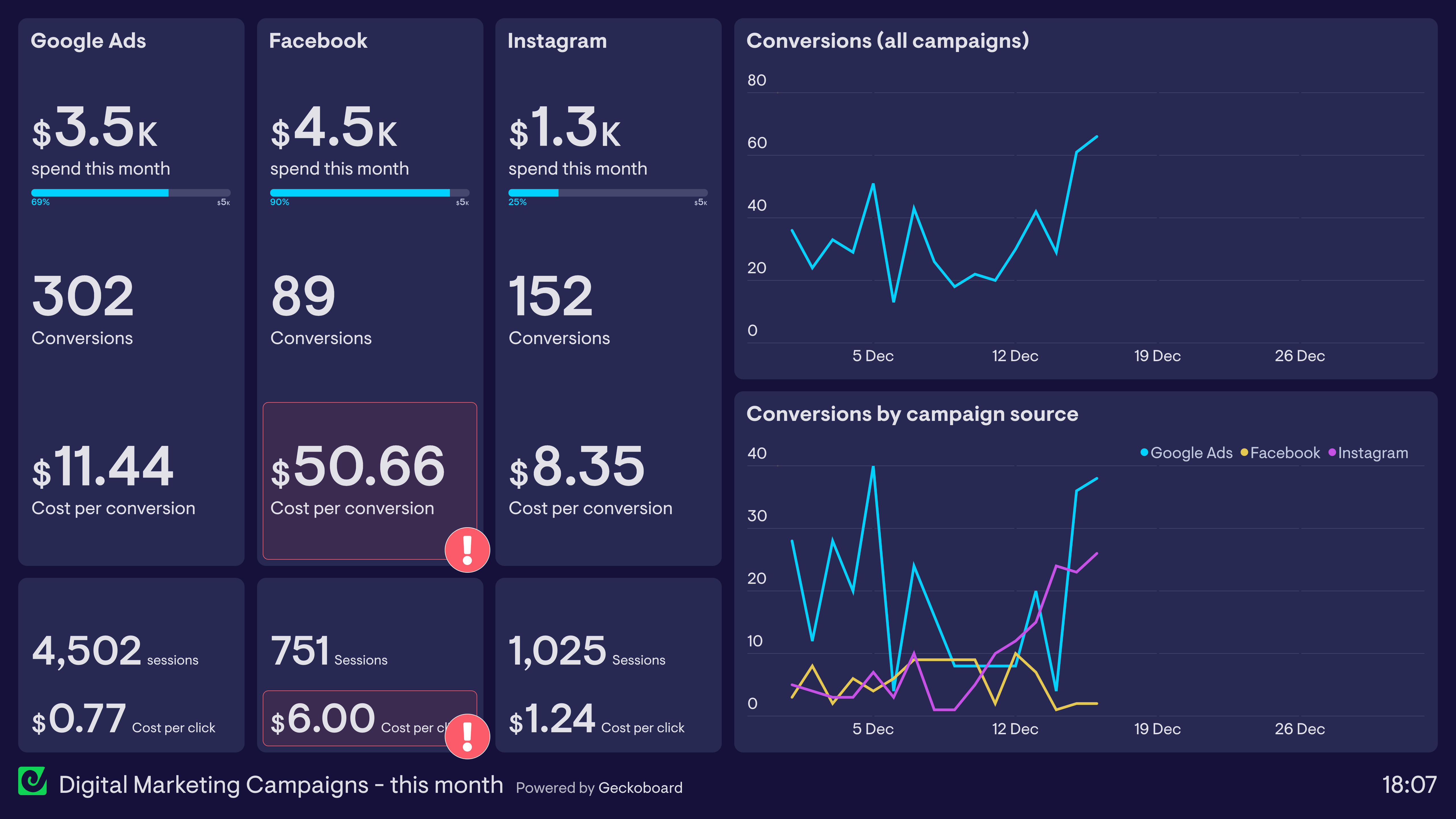
In this dashboard example, the Marketing Manager is tracking the effectiveness of campaigns she is running across Google Ads, Facebook and Instagram. The dashboard tracks budget utilization as well as overall website conversions, including Cost per Conversion. Using this dashboard, she can easily see that Facebook Ads have been underperforming, at over $50 per conversion. She is also able to track other metrics higher up the funnel, such as Cost per Click, to help determine exactly where in the user journey she can be more effective.
Focus area
Cross-channel campaigns, marketing effectiveness
Who looks at it?
Marketing Manager, Digital Manager
How often?
Every day
What is a web analytics dashboard?
Webmasters and digital marketers use web analytics dashboards to visualize the performance and health of their website. Although many free tools, such as Google Analytics, give website owners access to a vast array of information, it’s not always easy to present the most important information in an easy-to-digest format. This is where custom KPI dashboards can be most effective.
Examples of web analytics dashboards
Website KPI dashboard
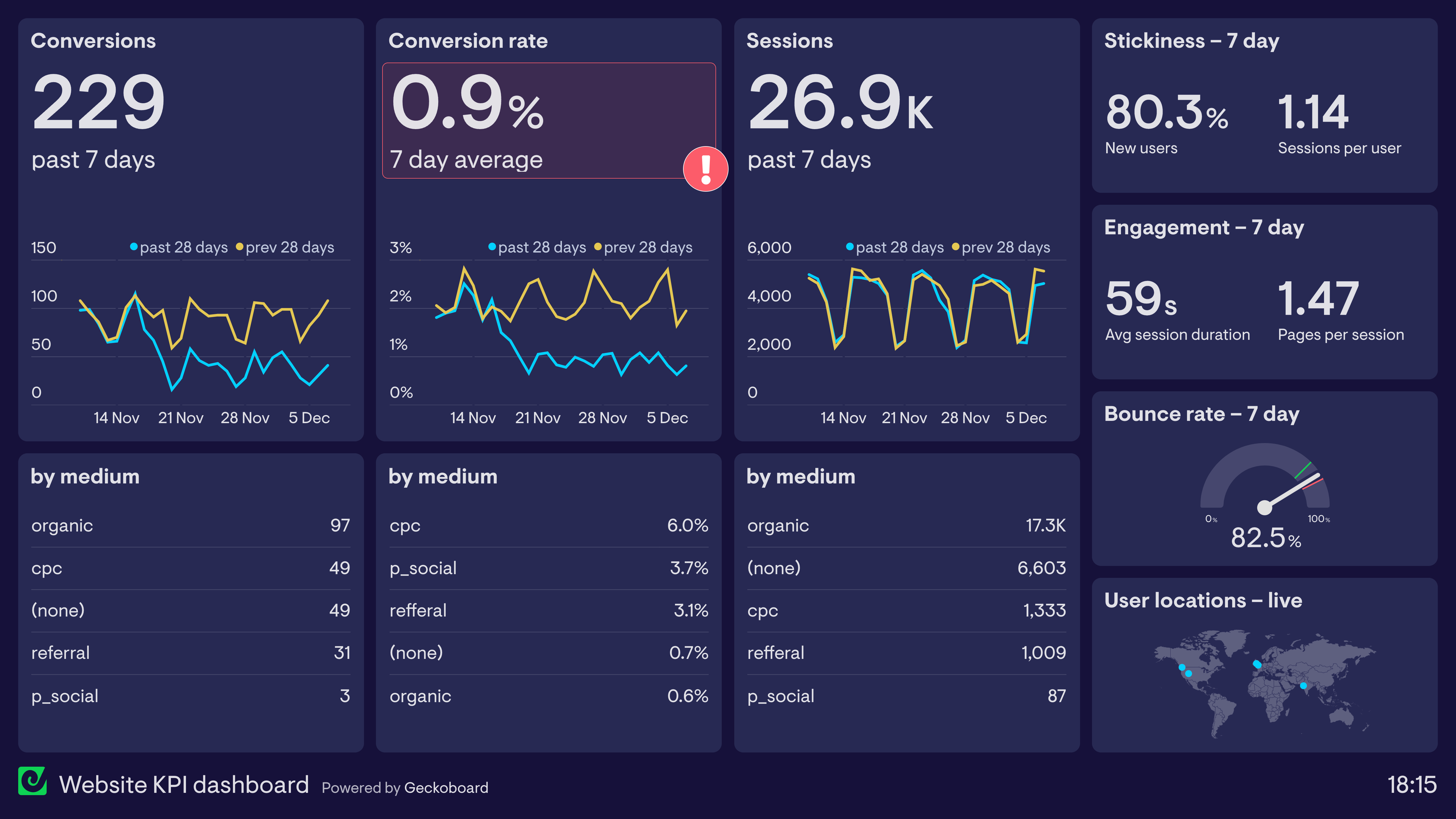
This dashboard is designed to visualize how effectively a website is converting traffic. A ‘goal completion’ occurs when a user submits a lead generation form, which is then processed by one of the Sales Managers.
In this example, the Marketing Manager can quickly and easily see that conversions have dropped significantly in the past month. This is despite the number of website sessions remaining constant. It’s possible that something on the website is preventing the users from converting, such as a slow loading landing page, or a broken form.
This dashboard is also tracking engagement metrics, such as bounce rate and session duration, in order to show how effective the site is at maintaining users’ interest and attention.
Focus area
Conversion rates, website engagement
Who looks at it?
Webmaster, Marketing Manager
How often?
Every day
What is an ecommerce dashboard?
Successful ecommerce businesses need to optimize every stage of the customer journey, from first touch to purchase. Ecommerce dashboards aggregate the most important performance metrics, so online sellers can track their progress and quickly respond to any changes.
Examples of ecommerce dashboards
Ecommerce KPI dashboard

This dashboard takes many of its metrics directly from Shopify, which the store owner uses as their primary ecommerce platform. Not only is it important for the seller to track total revenue and orders, but also health metrics such as Average Order Value, and Profit Margin.
This seller has also included a Profit & Loss statement, detailing various business costs incurred last month. These metrics are not tracked in Shopify. But by using a data dashboard, they can display these important metrics alongside the Shopify data, even though they come from different sources.
Focus area
Revenue, orders, business health
Who looks at it?
Owner, CEO, Marketing Director
How often?
Every day
Shopify and Facebook Ads dashboard
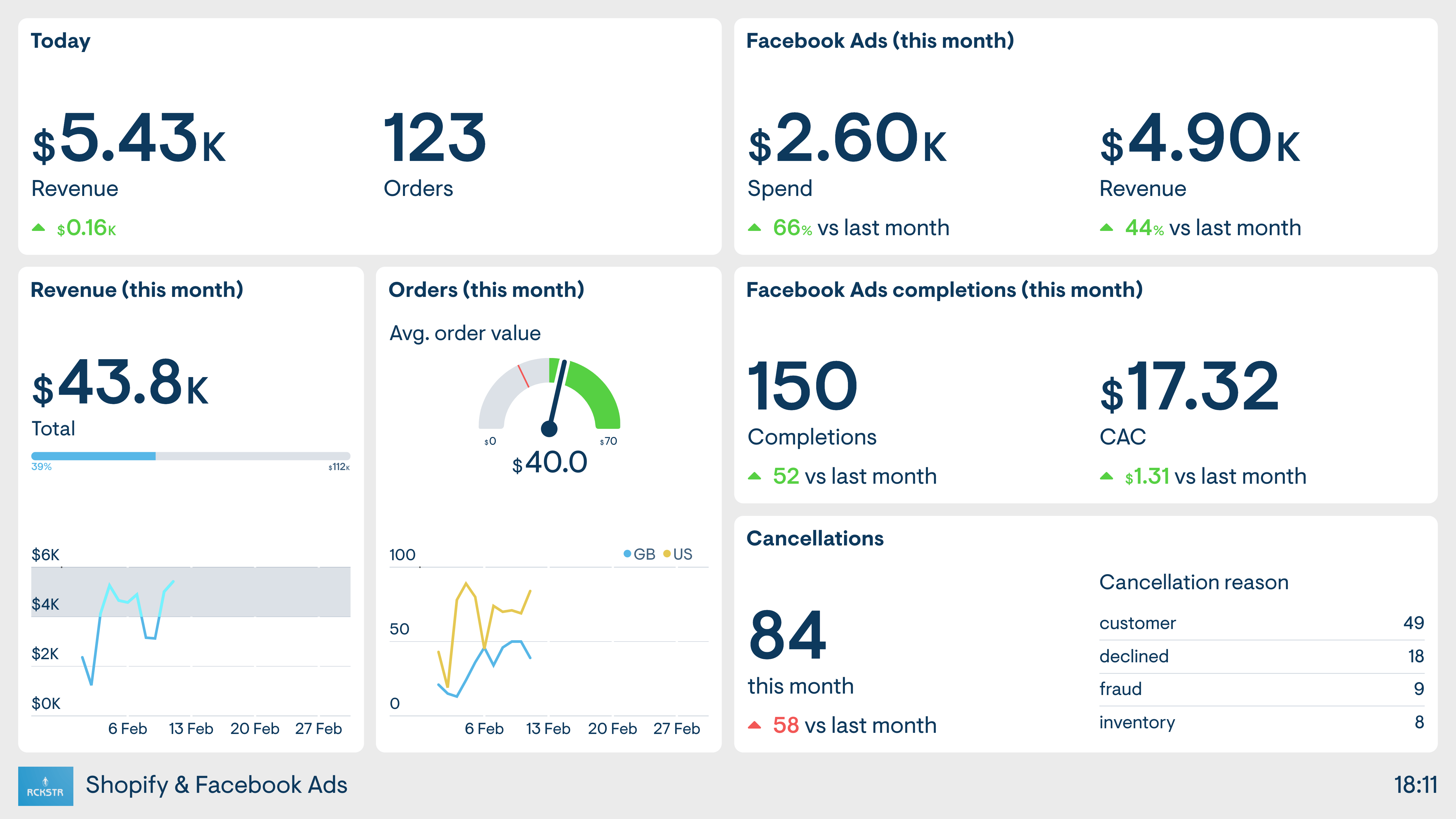
This seller’s ecommerce business has a strong focus on Facebook Ads, as the driver of new sales. This dashboard takes data from both the online store (Shopify) as well as Facebook, so the seller has a clear view of the performance of both platforms.
Focus areas
Ad performance, revenue
Who looks at it?
Owner, Social Media Manager, Marketing Director
How often?
Every day
What is a social media monitoring dashboard?
Social media monitoring dashboards visualize important performance metrics for a brand’s marketing efforts on social media. This includes followership, organic performance, the performance of paid advertising, and the visibility of their brand through 3rd party content and discussions (otherwise known as social listening).
Examples of social media monitoring dashboards
Social media overview

This dashboard shows how a KPI dashboard can bring together and display performance data from multiple social media channels. Not only is it tracking the number of followers the company has on each platform, but also how its advertising campaigns have performed over the last seven days.
Furthermore, in the line chart, we can see the effects of their social media marketing, which is visualizing data from Google Analytics that shows traffic acquired from the different social media platforms this month.
Focus area
Followers, traffic from social
Who looks at it?
Social Media Manager, Marketing Manager, Marketing Director
How often?
Several times a week
Twitter dashboard

This dashboard focuses on the company’s Twitter performance. We can see the number of website sessions and conversions generated by Twitter traffic. We can also see the number of people following both the company Twitter account, and the CEO’s Twitter account, including some recent mentions.
Focus areas
Conversions from Twitter, recent Twitter activity
Who looks at it?
Social Media Manager, Marketing Manager
How often?
Several times a day
Instagram dashboard

This dashboard focuses on Instagram performance. Like the Twitter dashboard, it displays metrics such as followers and website traffic, in addition to metrics tracking the performance of the most recent post.
Instagram is a popular platform for influencer marketing. Here we can see that the Marketing Manager who uses the dashboard is also tracking the success of various influencer campaigns, in the form of revenue generated from promo codes. Promo codes are a popular way to provide influencers with an exclusive ‘incentive’ for their followers, but also have the dual purpose of being able to track the ROI for each individual influencer campaign.
Focus areas
Instagram performance, influencer campaigns
Who looks at it?
Social Media Manager, Marketing Manager
How often?
Every day
LinkedIn dashboard

This dashboard focuses on LinkedIn marketing, a popular social media platform for B2B marketers. As we have seen, it’s important to not only track your brand’s performance on the platform itself, in the form of organic content and paid advertising, but also the effect that activity generates further down the funnel. Ultimately, this dashboard makes it clear that signups are the North Star metric, indicated by the KPI’s placement in the top left hand corner.
Focus areas
LinkedIn advertising, organic performance
Who looks at it?
Marketing Manager, Social Media Manager, Sales Director
How often?
Several times a week
What is a Google Ads campaign dashboard?
Google Ads provides detailed metrics on the performance of ad campaigns for paid search, display and video. However, it is not always easy to visualize this data in a way that it is easy to digest – especially for team members and managers who don’t regularly use the platform. This problem can be solved by the use of KPI dashboards, which visualize only the most important metrics in a format that is easy to understand.
Google Ads this month

This dashboard shows the performance of Google Ads over the past month. The dashboard makes it easy to see how the budget is being utilized, and how the campaign is performing overall in terms of clicks and conversions.
The line charts in the middle split the campaign by ad group. Here we can see that the ad group targeting branded search terms has been performing consistently, but there has been significant improvement in the ad group targeting generic keywords used by small businesses.
Focus area
Campaign performance, conversions
Who looks at it?
Digital Marketing Manager, Marketing Director
How often?
Several times a week
What is an email newsletter dashboard?
Email marketers use newsletter dashboards to track the performance of their email marketing efforts. These dashboards track the performance of individual email campaigns alongside more holistic metrics such as mailing list growth.
Email marketing dashboard
![]()
This dashboard is tracking several key metrics related to the brand’s regular newsletter. In the top left hand corner, they are tracking the number of conversions generated from newsletter sends. In the bar chart, we can see the individual performance of email campaigns in the form of Open Rate, Click Through Rate and Email Bounce Rate. Along the bottom of the dashboard, we can track how many new subscribers the newsletter has attracted this month. This includes a helpful visualization of the maximum number of subscribers allowed under their marketing platform’s current plan (5,000). Finally, we can see the number of days until the next scheduled newsletter send. This is helpful when communicating and coordinating with stakeholders across the business.
See also: 9 best email marketing metrics to track
Focus area
Mailing list growth, email campaign performance
Who looks at it?
Marketing Manager, Marketing Director
How often?
Several times a month
What is an SEO dashboard?
Search Engine Optimization (SEO) is a highly technical process, which involves working with many data points. An SEO dashboard aims to distill and visualize the most important metrics so marketers can track performance over time and / or monitor vital SEO health metrics.
Example of an SEO dashboard
SEO audit dashboard

This dashboard is used in conjunction with a regular SEO audit run via SEMrush. It reports on important monitoring metrics created by SEMrush such as site errors, warnings and the website score. It also shows the biggest keyword rankings changes over the past month. Geckoboard doesn’t have a native integration with SEMrush, but it’s easy to pull SEMrush data onto your dashboard using Supermetrics’ addon for Google Sheets.
The dashboard also visualizes an important SEO metric from Google Analytics – page load time. Page load time can have a drastic effect on a website’s ranking. Here we see that the average load time for the homepage has recently spiked. This would require further investigation.
Focus area
SEO errors, load time
Who looks at it?
SEO Manager, Webmaster, Marketing Director
How often?
At least once a week
SEO KPI dashboard

SEO can be painstaking work, where the impact is often only seen after several months of regular optimization. This is why it’s especially important for marketers who are working on SEO to visualize their performance data in a way that makes sense to them and their team.
This dashboard is tracking website traffic generated from organic search. We can see which landing pages acquired the most traffic and how these sessions are contributing to overall business success. This Marketing Manager has also decided to track the performance of new content produced this year. Here we see a regular occurrence with SEO work, it’s taken several months for new content to rank, but once it has, it has seen radical growth – we sometimes call this the “hockey stick” effect.
Focus areas
Organic traffic, new content
Who looks at it?
Marketing Director, Marketing Manager
How often?
Several times a month
What is a lead generation dashboard?
A lead generation dashboard visualizes the performance of lead generation tactics used by marketing teams. In particular, it allows marketing teams to understand the effectiveness of different aspects of their demand generation funnel, and if any areas require further or urgent attention.
Lead capture – 7 day performance

This dashboard provides a snapshot of the company’s lead generation performance over the past seven days. We can see how many leads have been generated each day.
Furthermore, the dashboard sets parameters for when different aspects of the funnel are performing above or below a set threshold. We can see, for example, the landing page is converting leads at a rate above the 5% goal. However, we can also see that the welcome email has dropped below the 95% target for successful deliveries. This might require further attention.
Focus area
New leads, funnel optimization
Who looks at it?
Sales Director, CEO, Marketing Director
How often?
Several times a week
What is an A/B test dashboard?
Many digital marketers use a Test & Learn approach to optimize user experience and overall marketing effectiveness. This often takes the form of A/B tests where samples of users are given different content, in order to see which iteration is more effective. An A/B test dashboard visualizes and compares the performance of each iteration, allowing marketing teams to be aware of how the experiment is progressing in real time.
A/B test dashboard
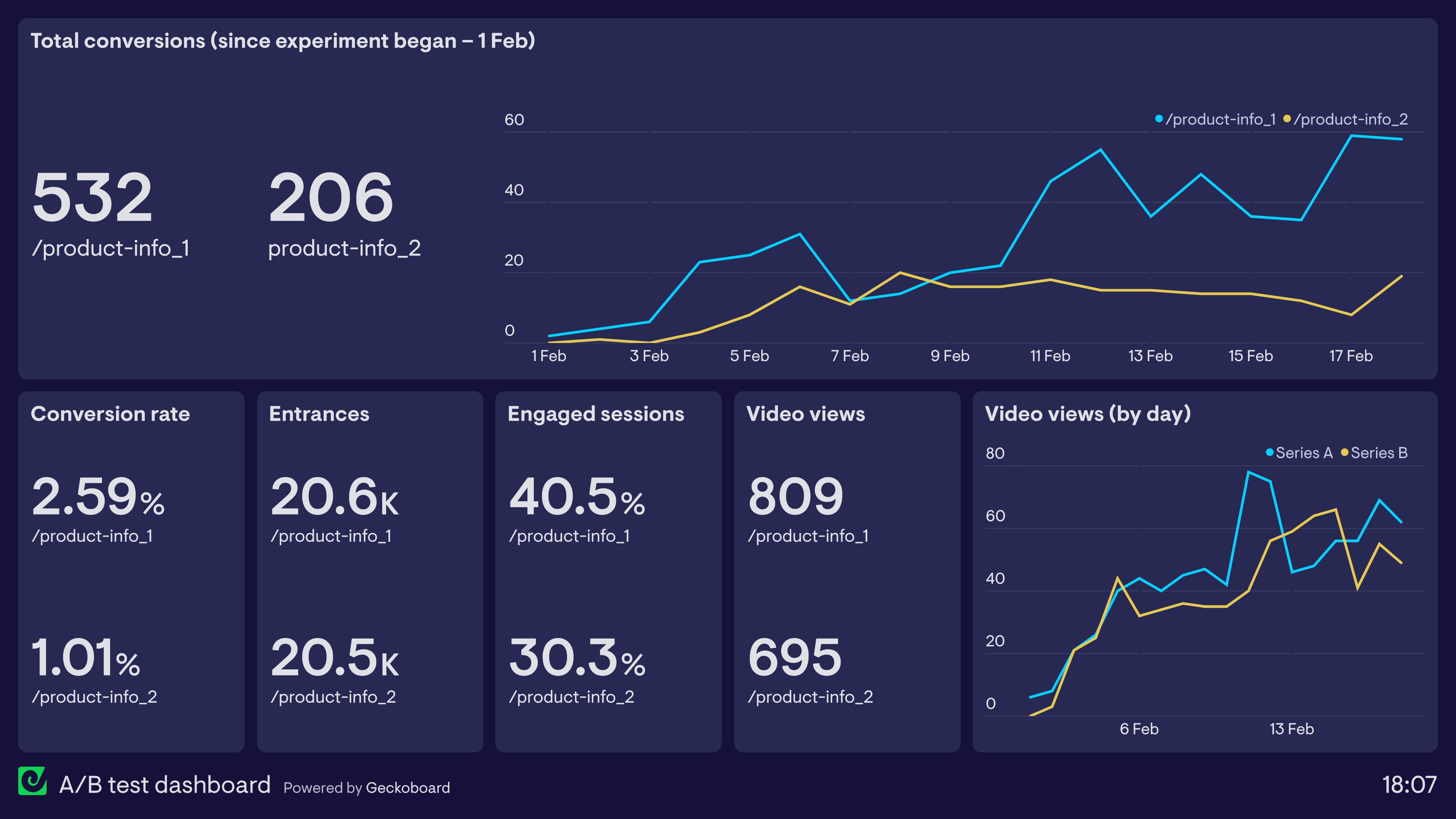
This dashboard shows the performance of two different product information pages, in order to understand which is more effective. The experiment has been set up in Google Optimize and the data is pulled directly from Google Analytics. We can clearly see that the first version has performed better in terms of both conversions and engagement.
Focus area
UX testing
Who looks at it?
UX Designer, Digital Marketing Manager
How often?
Several times a month