Activation Rate
What is activation rate?
Activation rate measures the percentage of people who successfully complete a certain milestone in your onboarding process. The milestone can be any event that increases the odds that the user will come back and continue using the product.
Typically, the event milestone is something that occurs in the onboarding process, or early on in a user’s experience with the application.
This milestone will differ from company to company, depending on your product and your business goals. A social platform might track the percentage of users who add their first friend. A music-streaming application might look at how many users create their first playlist.
When choosing an activation milestone, look for an event that, when users complete it, often leads to them becoming a paying or highly engaged customer.
How to calculate activation rate
[No. users who complete the set milestone / Total no. users who signed up] × 100 = Activation rate (%)
Calculating your activation rate is straightforward as long as you know what milestone you’re tracking. Divide the number of users who completed that activity by the total number of users who signed up for your product.
Product and website analytics tools like Google Analytics and Mixpanel offer easy ways to monitor how many people are completing your set milestone. Mixpanel also offers case studies you can use to see if your activation rate is similar to other companies tracking the same onboarding milestone.
Alternatively, you might compare your activation rate to industry benchmarks. Just be sure you look at benchmarks for companies that have similar products and are likely to be reviewing similar onboarding events. If you have a unique or niche activation milestone, external comparisons likely won’t be as helpful as your internal user engagement data.
Why tracking activation rate is critical
Your activation rate helps measure the success of your onboarding efforts. If your activation rate is low, it could indicate that your onboarding process is difficult or confusing, and users are quitting before completing key milestones. Say your activation rate is 25%. That means 3/4 of your people signing up for your product are quitting somewhere in the onboarding process, which presents a significant opportunity for improvement.
A consistently poor activation rate might also mean your marketing and sales efforts are attracting low-quality leads. Having high numbers of initial sign-ups is less beneficial if many of them back out before completing onboarding because they realize the product is not right for them. If this is the case, consider adjusting your sales and marketing messaging to ensure that you’re appealing to the right audience.
If you know your activation rate is low, dig deeper into the data to see why, and then fix the underlying problem. For example, product-growth platform Appcues saw their activation rate was low and used Mixpanel to identify that most users were dropping out after going through the welcome process, but before creating their first flow. By simplifying the onboarding flow and removing unnecessary steps, Appcues more than doubled the number of users completing the activation milestone.
Activation rate can also act as a proxy metric for sign up to subscriber conversion rate. If you typically have a long lead time between when someone starts to use the product and when they become a paid customer, activation rate can be a good predictor of conversion.
4 metrics to track alongside activation rate
While activation rate offers valuable information about your customers’ initial experience with your product, it can’t tell you everything. It doesn’t indicate how many users come back to the product after activating or whether those users go on to become paying customers.
Here are a few metrics to track alongside activation rate to get a better picture of the value users get from your product:
- Customer churn rate: Calculates the percentage of customers lost during a given period. Churn rate looks at customers lost even after they’re onboarded.
- Daily active users (DAU): Measures the number of people who interact with your application on a daily basis. This helps you see how many of your customers come back to use the product regularly, without focusing on a single, specific type of interaction.
- Daily active users (DAU) to monthly active users (MAU) ratio: Shows you how many of your monthly active users interact with your application during a 24-hour period. This metrics adds context to DAU and helps measure product stickiness.
- Sign up to subscriber conversion rate: The percentage of users who become paid subscribers after signing up for a free trial of your product. This helps you gauge how valuable free trial users find your product and their likelihood of converting once the trial ends.
Keep activation rate and other vital startup metrics top of mind by displaying them on your data dashboard. Check out this startup CEO dashboard for inspiration:
 Contains sample data
Burn Rate
What is burn rate?
Burn rate refers to the amount of cash your business spends in a month. You can use this information to calculate cash runway and determine whether your costs to income ratio is too low or whether you can afford to invest more in growth efforts like marketing and advertising.
Burn rate will vary significantly depending on company stage, pricing model, and industry. Typically, burn rate is a more common metric for early-stage startups, especially before they become profitable.
A good benchmark is to always have enough savings to cover six months’ worth of expenses, based on your current burn rate.
How to calculate burn rate
Total cash at start of month – Total cash at end of month = Burn Rate
Include all money spent when determining burn rate. The metric will be misleading if seemingly “one-off” expenses, like furnishing a new office, are omitted. It’s best to compare your bank balance at the beginning of the month versus the end of the month to ensure all expenses are included.
If you see a sudden spike from one month to the next, dig deeper to see if it was caused by a one-time expense or an increase in a recurring cost, which could be more cause for concern.
Determine what percentage of your burn rate comes from fixed costs, like equipment and office overhead, versus variable costs that you can reduce quickly—like one-time marketing campaigns or contractor costs. If your burn rate is too high, you’ll know which expenses you need to cut.

Why tracking burn rate is critical
Calculating burn rate is essential for determining how much cash the company needs in order to keep operating and growing. It helps you see if you need to change your current cost-to-income ratio by pursuing new fundraising opportunities or cutting costs. Conversely, it lets you know if you have extra cash to reinvest in your company to increase marketing efforts or improve product development.
Calculate your expected costs and create a prediction for what you think your burn rate should be. Compare your projection with your actual burn rate to watch for fluctuations that might point to unexpected expenses. Assuming your burn rate will remain constant can cause you to miss sudden changes, which could lead you to overspend or budget incorrectly.
Tracking burn rate is especially vital for startups, which may not have a steady income flow yet.
3 metrics to track alongside burn rate
While it is critical to watch for unusually high spend each month, burn rate isn’t the sole indicator of your company’s financial health. Early-stage startups that recently secured VC funding are likely to have a negative burn rate while they fully develop their product and work through the initial stages of marketing and sales.
To get a broader picture of your company’s financial health, track these metrics alongside burn rate:
- Cash runway: Calculates how long until your company runs out of money, using burn rate and current cash balance.
- Gross MRR churn rate: Tells you the percentage of revenue lost each month due to downgrades or cancellations. A high MRR churn rate could indicate the reasons behind an unusually high burn rate.
- Revenue growth rate: Tracks the percentage increase or decrease of your revenue month over month to help you see how quickly your company is growing. As your revenue increases, your burn rate should improve.
Monitor burn rate in real time with a shared dashboard
Financial metrics like burn rate can change quickly. The faster you can detect significant adjustments in your data, the better prepared you will be to respond before the problem gets out-of-hand. A data dashboard enables you to keep your most important metrics visible, so you can easily track them without digging through multiple data sources.
Include burn rate on your startup CEO dashboard, and display it on a computer monitor or office TV so you can see it every day and immediately detect any significant change. You can also share the dashboard with your executive or financial team via Slack or with sharing links and easily keep your whole team up to date.
Cash Runway
What is Cash Runway?
Cash Runway measures how long your money will last at the current cash burn rate.
How to calculate Cash Runway?
($) cash balance / ($) monthly burn rate = (months) Cash Runway
For example, your starting balance is $180,000 . Your net burn rate is $12,000 per month. The following is the calculation of your runway.
$180,000 / $12,000 = 15 months
Pros:
Calculating burn rate and runway for your company is a critical exercise that every founder needs to understand. Failure to do so could lead to the inability for the company to meet its cash obligations, such as processing payroll for employees. In the event that the company’s runway is coming to an end sooner rather than later, management needs to consider either raising additional capital, increasing revenue through more aggressive sales or cutting unnecessary expenses to extend the runway further.
Cons:
Monitoring cash runway in isolation may paralyze your operations. Make sure you keep an eye on your sales pipeline as well as look into reducing costs.
Customer Churn Rate
What is customer churn rate?
Customer churn rate is the percentage of customers lost during a given period of time. For SaaS or mobile apps, that means customers who cancel their subscription. For ecommerce, that means customers who fail to make a repeat purchase within a time frame established by the business, such as 90 or 120 days.
Typically, churn rate includes only paying customers. For SaaS companies, that would mean excluding trial customers from your calculations.
Customer churn rate looks at numbers of customers lost, not the amount of revenue lost. To track revenue loss you would need to look at MRR churn.
The inverse of customer churn is customer retention rate, which focuses on the customers retained over a given period of time.
How to calculate churn rate:
[ (#) Total customers churned this time period / (#) Total customers at the start of this time period ] X 100 = (%) Customer Churn Rate
Calculate customer churn rate by dividing the total customers churned over a specified period (such as 30 or 90 days) by the total customers at the start of the period. Multiply that by 100 to generate a percentage. The time frame might depend on your industry and the length of your sales cycle, though many businesses calculate monthly churn rates.
For example, if the total customers lost in August was 150, and the total number of customers at the start of the month was 5,000, then the customer churn rate would be 3%:
[ 150 customers churned in August / 5000 customers as of August 1st ] X 100 = 3%
Another way to calculate churn rate is by cohort. A cohort is a group of customers who all signed on with your company at the same time. Tracking cohort churn rate helps you see how long people are using your product before churning. Monthly churn rate tells you how many customers you lost in a particular month but not when each one signed on with your company.
The formula for calculating churn rate by cohort is very similar to the monthly version:
[ (#) Total customers churned from cohort / (#) Total customers in cohort from specified time period ] X 100 = (%) Customer Churn Rate
There are also free third-party tools that can help you calculate churn rate, like HubSpot’s customer service metrics calculator. Using these tools, you can quickly calculate churn rate by plugging in your numbers. Some, like HubSpot’s tool, help you calculate more complex metrics, such as revenue churn.
Why tracking customer churn rate is critical
Regularly watching churn rate can help you quickly make adjustments to your retention strategies. High churn makes it difficult for a company to grow. Being proactive about customer satisfaction can help you sustain or even bolster company growth.
Monitoring churn helps you track how satisfied customers are with your product or service. If high numbers of customers leave after trying your product, you may have issues with usability, customer service, price or product fit. A high churn rate, or one that is growing month over month (MOM), indicates that you need to revisit your customer retention strategies.
Track churn rate on a regular basis to watch for fluctuations. In general, your churn rate should be steady. Dramatic changes may indicate a problem or a need for closer investigation into why customers are leaving.
Tracking churn rates by cohort can offer additional insight into the factors behind lost customers. If you noticed a sharp rise in churn in the first group to receive a new feature, for example, you might want to specifically ask those customers about their experience with the feature.
What is a good churn rate for SaaS businesses?
Average customer churn rate can vary widely by business stage (early versus mid versus late). But you can look at industry and company averages to get a basis for comparison.
Baremetrics found an average churn rate of 7.5% across their SaaS customers. If you look at a detailed view by customer, you’ll see that the rate varies widely across different price points and company revenue levels.

Baremetrics detailed company view
In addition to industry averages, look at churn rates for companies in your revenue bracket. An acceptable churn rate for a large business may not be good for a small business. For example, project management tool Scrumpy has an average MRR of $914 and sees an average monthly churn of 2.9%. ConvertKit, an email marketing company, sees over $2 million MRR and has a churn rate of 4.9%.
Churn rate is also affected by price and sales cycle length. Even product type affects churn because it’s easier to switch to alternatives for some products than for others.
It’s essential to track your churn rate over time to get a feel for what “high churn rate” looks like for your company.
“It goes without saying that less churn is always better, but estimating an upper-bound for churn can be helpful for financial modeling and internal prioritization of customer success efforts,” says Tom Tunguz, partner at Redpoint Ventures.
If you find your churn rate is consistently higher than average, survey churning customers to find out why they’re leaving. If possible, get them on a call so you can more easily ask follow-up questions. Patterns in their responses will give you an idea of where to start making changes to reduce churn rate in the future.
9 metrics to track alongside churn rate
Your churn rate alone doesn’t give you the full picture. It tells you what is happening, but not the root cause. Churn rate can’t tell you why your customers are leaving or what you need to do to keep your customers. Both of these are critical pieces of information you need to reduce churn rate in the future.
Churn rate also doesn’t tell you about overall growth rate or revenue. It only shows you how many customers you’re losing. To get a broader view of company health, you also need to look at new customers and upsells within the same period.
Track other metrics alongside customer churn rate to get a more complete picture of company health:
- Gross MRR Churn: Looks at revenue lost from churning customers. It helps you determine whether you’re losing high-value customers or whether most of your churn comes from small accounts.
- Net MRR Churn: Illustrates overall revenue changes from existing customers by accounting for new revenue from upgrades or expansions.
- Net Change in Customers: Takes both new and churning customers into account to show you whether your customer base is growing as a whole.
- Revenue Growth Rate: Shows how much your revenue is growing MOM and gives you an idea of how churn is affecting company growth.
- Activation Rate: Tracks whether new users are completing an initial important step in your product. A low activation rate may indicate that the functionality of your app is one reason customers are churning, or that it is missing capabilities they expected it to have.
- DAU/MAU Ratio: Measures how often people are using your product, which is another indicator of customer satisfaction.
- Net Promoter Score (NPS): Indicates whether people are likely to recommend your product to others. Along with churn rate, NPS helps gauge overall customer satisfaction.
- Customer Satisfaction Score (CSAT): Shows how happy people are with your customer service, usually based on survey responses. CSAT can help you determine whether high churn is due to customer support issues.
- Customer lifetime value (LTV): Shows you how much revenue customers bring in during their time with your company. This can help you determine if a high churn rate is impacting your ability to make up your initial customer acquisition cost.
Recurring revenue metrics, such as net MRR churn and gross MRR churn, are particularly important for SaaS and other subscription-based companies. These metrics will help you see the broader impact of churning customers on your company’s bottom line.
Add customer churn rate to your CEO dashboard
Churn rate is a vital metric for assessing your customer service and your retention strategies. Tracking it will help you detect dramatic fluctuations early on and address problems as quickly as possible.
Add churn rate to your support team’s data dashboard to keep it top of mind. Display the dashboard in the office, or post it in Slack so team members can monitor changes in real time. Include other revenue and customer satisfaction metrics, such as net MRR churn. That way, you can get a quick picture of your company’s overall health.
Looking for ideas of what to add to your dashboard? Check out this example CEO Metric Dashboard.
DAU/MAU Ratio
What is DAU/MAU Ratio?
The Daily Active Users (DAU) to Monthly Active Users (MAU) Ratio measures the stickiness of your product – that is, how often people engage with your product. DAU is the number of unique users who engage with your product in a one day window. MAU is the number of unique users who engage with your product over a 30-day window (usually a rolling 30 days).
The ratio of DAU to MAU is the proportion of monthly active users who engage with your product in a single day window.
Advice from VCs: Why DAU/MAU Ratio is critical
“If there’s one number every founder should always know, it’s the company’s growth rate. That’s the measure of a startup. If you don’t know that number, you don’t even know if you’re doing well or badly. The best thing to measure the growth rate of is revenue. The next best, for startups that aren’t charging initially, is active users. That’s a reasonable proxy for revenue growth because whenever the startup does start trying to make money, their revenues will probably be a constant multiple of active users.” – Paul Graham, VC and Co-Founder of Y Combinator
“The metrics we start with are total active users (monthly/weekly/daily) it’s growth, alongside any ratios like DAU/MAU or DAU/WAU. These help us understand how frequently active people are in using the products.” – Josh Elman, Partner at Greylock Partners
“I would argue that the single most telling metric for a great product is how many of them become dedicated, repeat users.” – Andrew Chen, Angel Investor
How to calculate DAU/MAU Ratio:
(#) Daily active users / (#) Monthly active users = (%) DAU/MAU Ratio
The key to calculating DAU/MAU Ratio is defining what ‘active’ is for your product. This could be anything from a purchase (for ecommerce or mobile apps), pages viewed/videos watched/comments (for media/publisher), or product login/usage (for SaaS companies or mobile apps).
Once you’ve defined ‘active’ for your product, determine the number of unique active users in a 24-hr period and also the number of unique active users over the past 30 days (usually based a rolling 30 days). With these two metrics, you can divide DAU by MAU to get the ratio percentage.
A variation of this metric is to swap MAU with the total number of unique weekly active users (WAU). This gives you the DAU/WAU Ratio.

Pros:
This ratio is particularly helpful for understanding how valuable your product is to users. It provides a snapshot of user retention. For early stage startups, this is a helpful metric for evaluating traction and potential revenue.
Using the ratio – instead of DAU or MAU alone – gives you the necessary context to understand the actual level of engagement.
Cons:
One downside to the DAU/MAU Ratio is that you can’t see which users are being retained and which users are churning. This is where a cohort retention analysis is useful. A cohort can be any similar group of users you define – often categorized by month. You can learn more about user cohorts here, and here.
Relevant Startup Metrics and KPIs:
If you’re adding DAU/MAU Ratio to your Startup CEO dashboard, consider tracking these related startup metrics for context.
- User Cohort Retention
- Customer Acquisition Cost (CAC)
- Customer Churn Rate
Industry Benchmarks
Of course, the closer to 100% engagement your product has, the better. When it comes to average benchmarks though, the ‘norm’ varies significantly between products, type of engagement, and industry. Look at the DAU/MAU Ratios for companies with a similar type of product or in the same industry.
Sequoia tweeted the standard DAU/MAU ratio is 10-20% with only a handful of companies over 50%.
Additional Notes
“When we assess a growing startup, the number one thing we look for is deeply retained usage. There are lots of ways for something to grow, but growth without deepening engagement is just like empty calories. So core usage alongside a path to growth is all that matters to us.” – Josh Elman, Partner at Greylock Partners
Revenue Growth Rate
What is Revenue Growth Rate?
Revenue Growth Rate measures the month-over-month percentage increase in revenue. It’s one of the most common and important startup KPIs. The Revenue Growth Rate provides a solid indicator of how quickly your startup is growing.
Advice from VCs: Why Revenue Growth Rate is critical
“If a startup has a basic product or is looking for market fit, then one of the top three metrics I always ask for is MoM (Month on Month) Revenue Growth.” – William McQuillan, Partner at Frontline Ventures
“If there’s one number every founder should always know, it’s the company’s growth rate. That’s the measure of a startup. If you don’t know that number, you don’t even know if you’re doing well or badly… The best thing to measure the growth rate of is revenue. The next best, for startups that aren’t charging initially, is active users. That’s a reasonable proxy for revenue growth because whenever the startup does start trying to make money, their revenues will probably be a constant multiple of active users.” – Paul Graham, VC and Co-Founder of Y Combinator
How to calculate Revenue Growth Rate:
[ ($) Revenue Month B – ($) Revenue Month A ] / ($) Revenue Month A X 100 = (%) Revenue Growth Rate
Calculate the Revenue Growth Rate by subtracting the first month revenue from the second month revenue. Divide the result by the first month revenue and then multiply by 100 to turn it into a percentage. For example, if you have $1000 in revenue the first month and $3500 the second month, your growth rate would be 250%.
($3500 – $1000) / $1000 x 100 = 250%
For very early stage startups, tracking weekly revenue growth will be more helpful to gauge progress. Simply replace monthly revenue with weekly revenue in the calculation above.
[ ($) Revenue Week B – ($) Revenue Week A ] / ($) Revenue Week A X 100 = (%) Weekly Revenue Growth Rate
Pros:
As a more contextual metric, Revenue Growth Rate helps startups measure comparative progress (month-over-month) instead of an absolute figure (current revenue), which can be deceiving if tracked by itself. Not only is the growth rate helpful for founders, but investors are also keen to see this metric as they evaluate the startup’s current and potential growth.
Cons:
The month-over-month growth rate can be misleading for very early stage startups since it’s likely that they will see exponential growth at the beginning. The mistaken expectation is that the growth rate will stay the same or even increase, when in reality, the growth rate often decreases (from the initial exponential rate) as the company matures.
For example, a startup might have a growth rate of 150%, 76%, and 88% over the first couple months. But at this point, it’s too early to determine what a sustainable growth rate will be. It’s quite likely the growth rate will drop as the company matures. When measuring the Revenue Growth Rate, calculate a longer trend (12-18 months) to ensure your percentages reflect an accurate trend and not a one-time exponential growth curve.
Relevant Startup Metrics and KPIs:
If you’re adding Revenue Growth Rate to your Startup CEO dashboard, you might want to also consider tracking these related startup metrics for context.
Industry Benchmarks
Growth rate benchmarks vary by company stage but on average, companies fall between 15% and 45% for year-over-year growth. Businesses with less than $2 million in annual revenue generally have much higher growth rates according to a Pacific Crest SaaS Survey.
Additional Notes
“The ability to accelerate monthly revenues while decreasing monthly burn is the #1 thing I look for in a growth stage business.” – Steve Schlenker, Managing Partner at DN Capital
Average Order Value
What is Average Order Value?
The ecommerce metric Average Order Value (AOV) is the average dollar amount customers spend when they make a purchase from your website. This metric helps online retailers understand customer purchasing behavior.
Advice from Ecommerce Experts: Why Average Order Value is critical
“An increase in the average order value for an online retailer has a strong correlation to an increase in profit. When an ecommerce retailer can sell more on each order, that retailer tends to make more profit overall. Thus, online retailers that are able to increase average order value — AOV — should also become more profitable.” – Armando Roggio, Director of Marketing and Ecommerce at D&B Supply
“Ultimately, average order value boils down to increased profits and continued success for your brand.” – Alex McEachern, Loyalty Marketing Specialist and Ecommerce Enthusiast at Sweet Tooth Rewards
How to calculate Average Order Value:
($) total revenue / (#) orders placed = ($) Average Order Value
The Average Order Value is calculated by dividing the total revenue by the number of orders placed. Often, this metric will be calculated monthly (i.e. total revenue from the month divided by total orders placed that month), but it can also be calculated weekly or even daily.

For example, if your total revenue this week is $4000 from 160 orders, your AOV would be $25.
$4000 / 160 = $25
Pros:
Tracking the Average Order Value is critical for ecommerce businesses to understand and monitor customer purchasing patterns. Increasing AOV is one of the most effective (and usually cheapest) ways to increase revenue since no additional costs are incurred via transactions.
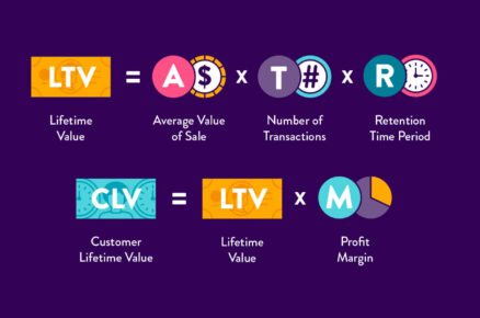
This metric is helpful for calculating your customer lifetime value (LTV) as well as determining the best marketing and pricing strategy.
Cons:
The Average Order Value can be misleading if skewed by a couple of extremely high or extremely low value orders. This is most often encountered when the range of products spans a wide price range.
It’s important to remember that AOV doesn’t show profit unless you use total net profit in place of total revenue.
Relevant Ecommerce Metrics and KPIs:
If you’re adding Average Order Value to your ecommerce dashboard, you might want to also track these related startup metrics for context.
- Customer Acquisition Cost (CAC)
- Gross Profit Margin
- Revenue by Traffic Source
- Shopping Cart Abandonment Rate
Industry Benchmarks
Given the broad range of products available online, the Average Order Value will vary based on the company and product(s). In the United States, most online retailers average about $78 per order.
In order to get a baseline for your company, track your AOV this month compared to a year ago – or even just last month – or find a specific benchmark for your industry / product type.
Research shows that desktop has 20% higher AOV than mobile or tablet AOV.
Additional Notes
AOV can be improved through a variety of tactics including cross-selling (offering complementary products), up-selling (offering a higher-end version of the same product), free shipping with minimum purchase, volume discounts, or coupons.
Want to create a dashboard using this metric? Check out this example Ecommerce Dashboard.
Customer Acquisition Cost
What is Customer Acquisition Cost (CAC)?
Customer Acquisition Cost (CAC) is the average expense of gaining a single customer. This metric includes marketing and sales expenses as well as salaries and overhead associated with attracting and converting a visitor to a customer.
Advice from Ecommerce Experts: Why Customer Acquisition Cost is critical
“Failure to get product/market fit right is very likely the number one cause of startup failure. However… I believe the second biggest cause of startup failure is: the cost of acquiring customers turns out to be higher than expected, and exceeds the ability to monetize those customers.” – David Skok, General Partner at Matrix Partners
“One of the most important metrics for any tech startup companies is CAC, or Customer Acquisition Cost, or some others call it Cost of Acquiring Customers.“ – Faiz Rahman</a>, Senior Investment Analyst at Convergence Ventures
How to calculate Customer Acquisition Cost:
($) Total sales and marketing expenses / (#) new customers acquired = ($) CAC
The cost of acquiring a customer is simply the sum of all marketing and sales expenses (including salary and overhead costs) over a given period divided by the number of new customers added during that same period.
For example, if you spent $15,000 in the past month to acquire new customers (including marketing, sales, salaries, and overhead costs) and had 1000 purchases from new customers, your CAC would be $15.
Pros:
The value of tracking the ecommerce metric CAC is being able to quantify the sales and marketing investments in terms of individual customers. It helps you understand the sustainability and scalability of your business. Reducing acquisition costs is an effective way to increase profits overall and boost the value of each transaction.
This metric is most helpful when tracked in tandem with either the lifetime value of your customers or the Average Order Value. Both of these metrics provide essential context for understanding if your CAC is too high, average, or remarkably low.
Cons:
The cost of acquiring new customers on its own doesn’t provide enough information to make informed decisions. If your CAC is $15 and your Average Order Value is $12, you’ve got a serious problem. However, if your Average Order Value is $50 then you’re in a much better position.
Be sure to track your customer acquisition cost along with other key ecommerce metrics so you have the necessary context to take action.
Relevant Ecommerce Metrics and KPIs:
If you’re adding Customer Acquisition Cost to your ecommerce dashboard, you might want to also track these related ecommerce metrics for context.
Industry Benchmarks
The Customer Acquisition Cost varies significantly depending on the company and product(s). A good reference point is to aim for the lifetime value of your customers (LTV) to be three times the cost of acquisition (i.e. have a 3:1 ratio). You can learn more about LTV:CAC ratio here.
Additional Notes
A related metric to CAC is Cost Per Acquisition (CPA) which focuses on the total cost of acquiring a new customer via a specific channel or campaign. While CPA can be applied as broadly or narrowly as you want, it’s often used in reference to media spend.
Want to create a dashboard using this metric? Check out this example Ecommerce Dashboard.
Listing Conversion Rate
What is Listing Conversion Rate?
This metrics calculates the percentage of buyers who viewed a particular listing and then completed a purchase.
How to calculate Listing Conversion Rate?
(#) purchases from listing / (#) of listing views = (%) Listing Conversion Rate
Pros:
Tracking Listing Conversion Rate helps you assess the quality of your listings in terms of generating revenue. For example, sellers whose listing conversion rates are low across listings may not be a good fit for your marketplace.
Cons:
If the volume of views for a particular listing is low, you should focus on addressing this issue first before getting too caught up in conversion rates.
New Buyer Growth Rate
What is New Buyer Growth Rate?
This metrics calculates how fast you are adding new buyers to your marketplace. Demand is at the core of any two-sided marketplace, so tracking buyer growth rate is an indicator of success.
How to calculate New Buyer Growth Rate?
(#) of new buyers this month – (#) of new buyers last month / (#) of new buyers last month = (%) New Buyer Growth Rate
You could also look into calculating total buyer growth rate for the a period of time. Use the following formula to calculate it:
# of buyers this month – # of buyers last month / # of buyers last month = (%) Buyer Growth Rate
Pros:
An increasing New Buyer Growth Rate is an indication of a profitable business. Not to mention that attracting attract new buyers to the marketplace is likely to stimulate interest from new sellers as well.
Cons:
Tracking New Buyer Growth Rate is useful, but you should also keep an eye on how engaged your buyers are. Ultimately, if the user base is active, it’s safe to assume revenue should be increasing.
New Seller Growth Rate
What is New Seller Growth Rate?
This metrics calculates how fast you are adding new sellers so that you can meet the needs of your buyers. It is particularly important if you are looking to grow your online marketplace.
How to calculate New Seller Growth Rate?
(#) of new sellers this month – (#) of new sellers last month / (#) of new sellers last month = (%) New Seller Growth Rate
You could also look into calculating total seller growth rate for the a period of time. Use the following formula to calculate it:
(#) of sellers this month – (#) of sellers last month / (#) of sellers last month = (%) Seller Growth Rate
Pros:
Tracking changes in new seller growth over periods of time help to understand what matters need to be investigating. For example, if the rate is growing, consider revising your onboarding process, so that these sellers become active faster and start adding listings. If, on the contrary, the rate is slowing down, consider investing in finding new sellers.
Cons:
It is always advisable to consider the wider context when tracking this metric. Therefore, make sure you check the percentage of active listings per seller and the buyer to seller ratio to get an overview of the overall health of the marketplace.
Percentage of Active Listings
How to calculate Percentage of Active Listings?
This metrics calculates the proportion of listings which show up in buyers’ searches. No two marketplaces are the same, so the definition of an active listing may differ based on your business needs and specificity.
How to calculate Percentage of Active Listings?
For this calculation, an active listing is a listing which has had 5 views in the past week. If there are any other circumstances which make your marketplace unique, tweak the definition accordingly and use the following formula:
# of active listings / total # of listings = (%) Percentage of Active Listings
Pros:
Understanding if listings are viewed by users is crucial for the growth of the marketplace. Inactive listings could become a threat to your revenue growth.
Cons:
Focusing on the percentage of engaged users alone can prevent you from noticing other threats to your business, such as a decreasing number of buyers or a decreasing listing conversion rate. Remember key metrics for an online marketplaces fall into three categories–buyer activity, seller activity and revenue–so choose the right mix to get an overview of your business performance.
Percentage of Active Sellers
What is Percentage of Active Sellers?
This metrics calculates the proportion of sellers who are active. No two marketplaces are the same, so the definition of an active listing may differ based on your business needs and specificity.
How to calculate Percentage of Active Sellers?
For this calculation, an active seller is a seller who added a new listing in the last 30 days. If there are any other circumstances which make your marketplace unique, tweak the definition accordingly and use the following formula:
# of active sellers / # of sellers = (%) Percentage of Active Sellers
Pros:
When you are on a mission to grow your marketplace, tracking seller volume alone just doesn’t cut it. Monitoring active sellers will help identify potentially problematic areas and inform strategy so that you can carry on planning your growth.
Cons:
Consider tracking the percentage of active listings and engaged buyers, as well as revenue per seller in order to get a better understanding of the profitability of your online marketplace.
Percentage of Engaged Buyers
What is Percentage of Engaged Buyers?
This metrics calculates the proportion of engaged buyers. No two marketplaces are the same, so the definition of engagement may differ based on your business needs and specificity.
How to calculate Percentage of Engaged Buyers?
For this calculation, engaged users is calculated as someone who has made at least one purchase and searched for something in the last 30 days. If there are any other circumstances which make your marketplace unique, tweak the definition accordingly and use the following formula:
(#) of engaged buyers\ / (#) of buyers = (%) Percentage of Engaged Buyers
Pros:
The most successful marketplaces have an engaged user base, which is great for attracting new sellers and increasing revenue. Therefore, looking deeper than tracking the buyer growth rate is beneficial for addressing early signs of business uncertainty.
Cons:
Focusing on the percentage of engaged buyers alone can prevent you from noticing other threats to your business, such as a decreasing number of total buyers or a decreasing listing conversion rate. Remember key metrics for an online marketplaces fall into three categories–buyer activity, seller activity and revenue–so choose the right mix to get an overview of your business performance.
Percentage of Satisfied Transactions
What is Percentage of Satisfied Transactions?
This metrics calculates the proportion of satisfied transactions.
How to calculate Percentage of Satisfied Transactions?
(#) of satisfied transactions / total (#) of transaction ratings = (%) Percentage of Satisfied Transactions
Pros:
In a two-sided marketplace, user reviews are great indicators of a good reputation. Declining ratings could signal an issue with the reliability of the service.
Cons:
Investigate whether there is one particular seller at fault for the drop in percentage. You could look into measuring percentage of satisfied transaction per seller to help you identify the problem. Otherwise, the drop may indicate a general dissatisfaction with the service sellers are delivering.
Purchase Frequency
What is Purchase Frequency?
Purchase Frequency is the number of times an average customer purchases a good or service from your store in a specified time period.
Why is Purchase Frequency important?
For most ecommerce businesses one of the most powerful ways of growing revenue and profits is to focus on your customer retention. Purchase Frequency alongside Repeat Customer Rate is one of the most commonly used KPIs for tracking this.
Repeat shoppers are cheaper to acquire than new customers. Loyal customers who make frequent purchases are also more likely to advocate your brand and refer other customers.
Purchase Frequency helps you to understand your audience’s purchasing behavior and better structure your marketing activities around your customers’ habits.
How to calculate Purchase Frequency
No. orders / No. unique customers = Purchase Frequency
To calculate Purchase Frequency, divide your total number of orders by the number of unique customers for the same time frame. Purchase Frequency is effectively the average number of orders per customer.
What time period to use to calculate Purchase Frequency will depend on the specifics of your business but it’s most commonly looked at over a 12 month period to take seasonality and promotions into account. You need to allow a time period long enough for a typical customer to make more than one order. For most stores looking at Purchase Frequency for less than a quarter won’t make sense.
Your Purchase Frequency will always be one or greater if you’re using the same period for the number of unique customers as the number of orders. The longer the time frame used, the higher your Purchase Frequency will be.
How’s Purchase Frequency different from Repeat Customer Rate?
Whereas Repeat Customer Rate is concerned with what proportion of your customers have bought from you before, Purchase Frequency indicates the average number of purchases made per customer for a set period of time.
Both are common measures of customer retention in ecommerce businesses but are useful for different things.
If you’re looking for a measure of retention that can be tracked on a daily or weekly basis, Repeat Customer Rate is a better metric. Purchase Frequency by contrast is a laggy metric that can only be looked at for longer periods of time because each individual customer needs time to be able to make multiple purchases in that time period.
How to boost your Purchase Frequency
Whatever industry your business is in, it’s important to have a good Purchase Frequency that shows that your customers find value in your business.
Remember that some businesses won’t typically have people buying from them regularly. Online stores that sell larger, high-value goods can expect to have a lower Purchase Frequency than businesses selling consumable products.
For instance, if you’re a company like Cazoo who sell cars, it’s likely that once a customer has purchased a car they won’t return immediately to purchase another. That’s because customers tend to purchase more expensive high-value goods less frequently.
Regardless of the type of goods your business sells, take a look at a few techniques for encouraging your customers to make more frequent purchases.
1. Start a loyalty program
Rewarding your loyal customers is a great way of boosting customer retention and Purchase Frequency. When customers take the time to sign up for your loyalty program, they may feel more motivated to continue shopping with you instead of going to a competitor. You could use a points system to help encourage customers to shop at your online store and increase their purchase frequency.
You can then encourage your customers to spend more on specific dates like holidays by rewarding them with extra points. Use targeted email campaigns to remind customers of how many points they have and what they could spend those points on.
When customers have points with a specific store, it becomes harder to forgo their hard-earned points and choose a competitor.
2. Focus your marketing efforts on retention
Use strategic marketing campaigns to focus on retaining your current customer base. Email campaigns can be an excellent way of boosting both your Purchase Frequency and Repeat Purchase Rate.
To increase Purchase Frequency, try making your email campaigns ultra-targeted to each customer. For instance, if your store releases a new collection including items that are similar to what they have purchased before, try promoting the newer items.
If you have readily available information on what a customer has bought, use this to promote other products. For example, if a customer just bought a laptop from your store, you could send out an email encouraging them to purchase chargers, cases, and other relevant accessories.
You could also send out personalized emails that contain relevant discounts to each customer. If you know a customer has purchased from the same line of products several times, you could give them a discount code to use for a limited time.
3. Personalize your marketing campaigns
Keep your store at the forefront of your customers’ minds by using retargeting ads. When a customer has made a purchase on your site, you can encourage them to return and make another purchase by personalizing your ads to feature items that complement their most recent purchase.
Consider segmenting your audience based on their unique preferences and purchase history so you can target them with relevant messages that make sense to them.
Make the shopping experience more personal for each customer by implementing a personalized product slideshow that they see when they enter your site.
Limitations of Purchase Frequency
Purchase Frequency is just one of a few different customer retention metrics you should analyze to fully understand your customers’ behavior and satisfaction with your site.
It’s important to note Purchase Frequency is a laggy metric so isn’t good for spotting trends in customer retention in the short term.
As always, take Purchase Frequency as part of the bigger picture along with other metrics.
Relevant ecommerce metrics and KPIs:
If you’re adding Purchase Frequency to your ecommerce dashboard, you might want to also consider tracking these related ecommerce metrics for context.
- Average Order Value
- Customer Acquisition Cost
- Shopping Cart Abandonment Rate
- Conversion Rate
- Net Promoter Score (NPS)
Repeat Customer Rate
What is Repeat Customer Rate?
Repeat Customer Rate is the proportion of your customers who have made at least two purchases during a certain time period.
It is usually expressed as a percentage and is a KPI commonly tracked by ecommerce businesses. It’s particularly relevant for evaluating your overall customer experience and understanding how much value your customers find in your store.
What is a Repeat Customer?
A repeat customer is someone who has purchased twice or more from your site. Usually, there’s no time limit on what counts as a repeat customer. If someone made their first purchase with your site one year ago and only made their second purchase last week, they still count as a repeat customer.
When you measure a Repeat Customer Rate, you may choose to focus on specific time frames. For instance, what proportion of customers who made a purchase this week, month or quarter had made a previous purchase within the same timeframe.
How to calculate Repeat Customer Rate
[ No. customers who’ve purchased before / Total no. customers] × 100 = Repeat Customer Rate (%)
To calculate the Repeat Customer Rate, simply divide the number of return customers by the total number of customers, and multiply by 100 to convert to a percentage. This can be calculated based on a variety of time frames such as daily, weekly, or monthly.
For example, if you have 2000 customers complete a purchase in the past week and 500 of them were returning customers, your Repeat Customer Rate is 25%.
Make sure to only include paying customers – that’s to say customers that have made an active purchase and not those who have just created an account and may have items sitting in their basket.
What is a good Repeat Customer Rate?
There’s no one right answer to this question. Many different factors impact a business’s Repeat Customer Rate.
It’s important to strike the balance between encouraging customers to make repeat purchases and acquiring new customers.
Your Repeat Customer Rate will ultimately depend on your business’s industry and customer satisfaction levels.
Although benchmarks vary from company to company, most ecommerce businesses have 25-30% percent returning customers. This is backed up by Alex Schultz, VP of Growth at Facebook who says, “If you can get 20-30% of customers coming back every month and making a purchase from your store, you should do pretty well”.
If you have closer to 50% repeat customers, you’ll want to invest more in marketing to expand your customer base. If you have less than 25% return customers, you’re missing out on additional revenue and should actively retarget one-time customers to incentivize repeat purchases.
How does Repeat Customer Rate vary by industry?
Ultimately your Repeat Customer Rate will depend a lot on your business’s industry. The biggest factor for repeat customers depends on the type, and range of products you sell. An online store that sells cheaper expendable products should have a higher percentage of repeat customers than one selling expensive goods with a longer lifespan.
Regardless of the type of industry your business is in, it’s important to encourage repeat customers.
Think about your business’s industry and how you may be able to encourage customers to repeat purchase your products.
- Online stores that change which products they sell throughout the year. Clothing and accessory businesses often change the products they sell depending on the season. A repeat customer could buy multiple items from the same store. For example, if you run a jewelry store, you may release seasonal collections that you can encourage the same customers to buy from.
- Businesses that sell more expensive high-value goods. You may have a site that sells a few larger technology goods like laptops and mobile phones. Once customers have made an initial purchase they might then repeat purchase accessories like chargers and cases.
- Online shops that sell consumable products. If you sell food and beverages you should aim for customers to repeat purchase the same item multiple times. Other examples of businesses that sell expendable products include stores selling beauty products and cleaning chemicals.
Pros of Repeat Customer Rate
Tracking the Repeat Customer Rate is useful because returning customers are usually more likely to convert than a new customer.
“It’s cheaper to get past customers to purchase again than it is to find new customers. This is true for most businesses, especially in the crowded online ecommerce arena where ad impressions, clicks, and conversions always seem to be increasing in cost, making new customers more and more expensive to acquire.” – Richard Lazazzera, Founder of A Better Lemonade Stand.
Repeat customers generally spend more than new customers too – research done by Bain & Company found that apparel shoppers spend 67% more per order after shopping with a company for 30 months or more.
Loyal customers also offer your business some of the most valuable marketing opportunities. A happy repeat customer gives your business increased word of mouth advertising by referring your store to a friend.
The Repeat Customer Rate is a more actionable metric for ecommerce businesses than customer churn rate or customer retention rate. It’s also better for monitoring changes to retention than purchase frequency because it can be measured in a shorter time-frame.
Overall, it’s a broad gauge of the overall customer experience and customer satisfaction with your products. Customers who find your products useful, helpful, and/or enjoyable will likely return again and again to make additional purchases.
Cons of Repeat Customer Rate
Measuring your repeat customers is just one snippet of the overall health of an ecommerce business. Depending on what products your store sells it may be less relevant. A decrease in your Repeat Customer Rate may not be a bad thing if it’s caused by strong overall growth in new customers.
How can you boost your Repeat Customer Rate?
If your Repeat Customer Rate is a little on the low side, implement a few strategies to try and encourage customers to make multiple purchases on your site.
- Identify which of your products produce repeat orders and promote them to your existing customers.
- Work out which campaigns pull in customers who later have high repurchase rates and do more of them.
- Segment your customer base into multiple categories based on their shopping behavior and personal preferences. For instance, those who buy the latest releases or those who prefer your classic products. Once you have customer segments, send each one targeted email campaigns that contain similar products to what they’ve previously purchased.
- If you sell seasonal products, send reminder emails alerting your customers to new items you have available at the start of the season.
- Provide incentives like vouchers so customers make further purchases.
Relevant ecommerce metrics and KPIs:
If you’re adding Return Customer Rate to your ecommerce dashboard, you might want to also consider tracking these related ecommerce metrics for context.
- Average Order Value
- Customer Acquisition Cost
- Shopping Cart Abandonment Rate
- Conversion Rate
- Net Promoter Score (NPS)
Revenue by Traffic Source
What is Revenue by Traffic Source?
Revenue by Traffic Source is a breakdown of total revenue by channel such as social, organic search, paid search, referral, etc. This metric highlights the most valuable sources that direct traffic to your ecommerce site or mobile app.
Advice from Ecommerce Experts: Why Revenue by Traffic Source is critical
“The data on the growing and shrinking traffic sources is very interesting because it not only helps us identify new trends in consumer behavior but also helps us identify where marketing dollars should be spent.” – Justin Butlion, Content and Social Marketing Manager of Yotpo.
“Which traffic sources contribute the most cash on a last click basis? If money makes the world go round, Google makes the world wide web go round, contributing a whopping 67% of revenue, 42% organic and 25% CPC. The next best non-direct channel for revenue is actually email. In fact, the combo of Google and Email represents almost three-quarters of revenue (73%).” – Alan Coleman, Founder and CEO of Wolfgang Digital (from Wolfgang E-Commerce Benchmarks 2016 Report)
“Revenue by traffic source is essential since it shows which channel your customers are coming from. If you only track visits or transactions, you’re missing half the story. You only get a handful of chances to reach your most dedicated customers, and spending the time and money to market through an unreliable traffic source is going to cut into your revenues.” – Catalin Zorzini, Owner of Ecommerce-Platforms.com and Founder of Mostash.com
How to calculate Revenue by Traffic Source:
In order to track Revenue by Traffic Source, you’ll need to use an analytics tool (such as Google Analytics or something similar) and set up ecommerce tracking. (See here and here for step-by-step instructions.)
Once each transaction is being tracked, you can breakdown your revenue by the various online sites and sources that direct traffic to your site.
Pros:
Revenue by Traffic Source shows you which channels are most valuable and where to invest more resources. This metric reveals where most of your customers hang out and potentially their intent when they arrive on your site.
If they come from a search engine, they’re likely looking for a specific product or solution. If they’re coming from social, it might be from a friend that recommended your product or from a paid ad. This allows you to better anticipate their expectations and improve the overall customer experience.
Cons:
Assessing revenue based on traffic source only shows one aspect of customer behavior. For example, it’s difficult to track customer/friend referrals that typically get categorized as ‘direct’ traffic. It’s helpful to pair this metric with other demographic information and purchasing habits to truly understand who your customers are and what they care about.
Relevant Ecommerce Metrics and KPIs:
If you’re adding Revenue by Traffic Source to your ecommerce dashboard, you might want to also track these related ecommerce metrics for context.
Industry Benchmarks
This metric varies depending on the company and product(s). It’s best to identify which channels perform the best for your company and then work from there to increase traffic from the most effective sources in terms of value and conversion rates.
Some statistics around traffic sources for ecommerce businesses can be found here as a point of reference.
Additional Notes
There are a couple different attribution models you can use to calculate the traffic source. The most common is last-click or last interaction attribution which gives all the credit to the page viewed immediately prior to visiting your site.
Other options include first-click or first interaction (credits the first page where the online journey began), multi-click (weights each click based on the value you determine for each step), linear (each step weighted equally), time decay (most recent steps weighted more heavily), and position-based (first and last get 40% each and the steps in between split the remaining 20% eveningly).
Learn more about attribution models here.
Shopping Cart Abandonment Rate
What is Shopping Cart Abandonment Rate?
The Shopping Cart Abandonment Rate is the percentage of online shoppers who add items to a virtual shopping cart but then abandon it before completing the purchase. It shows the rate of interested potential customers who leave without buying anything compared to the total number of shopping carts created.
Advice from Ecommerce Experts: Why Shopping Cart Abandonment Rate is critical
“Poor usability is a known factor in cart abandonment. The top 23 sites all gross over $1 billion per year but have a 44% worse checkout user experience. At the average abandonment rate of 68% each of these sites could be losing $3 billion, if not more.” – Hazel Bolton, Optimization Consultant at User Conversion
“Studies show that the average person gets 1 interruption every 8 minutes, while the average employee gets interrupted 56 times a day. This is where cart abandonment emails come into play. By sending out one or more emails, companies can typically recover between 5% and 11% of otherwise lost sales.” – Carl Sednaoui, Director of Marketing at MailCharts
How to calculate Shopping Cart Abandonment Rate:
[1 – [ (#) completed purchases / (#) shopping carts created ]] * 100 = (%) Shopping Cart Abandonment Rate

The Shopping Cart Abandonment Rate is calculated by dividing the total number of completed purchases by the number of shopping carts created. Subtract the result from one and then multiply by 100 for the abandonment rate.
For example, if you have 45 completed purchases and 200 shopping carts created, the shopping cart abandonment rate would be 77.5%.
1 – (45 / 200) x 100 = 77.5%
Pros:
The Shopping Cart Abandonment Rate helps online retailers understand the shopping behavior of their website visitors and customers. This KPI is often an indicator of how intuitive and trustworthy your checkout process is. Tracking the Shopping Cart Abandonment Rate provides a more specific indication of why revenue may go up or down. Most importantly, it can show where there might be a hiccup in converting online visitors to customers.
Decreasing the abandonment rate is an effective way to immediately increase revenue.
Cons:
While incredibly helpful within context, the Shopping Cart Abandonment Rate by itself can be misleading. For example, if you have very few website visitors or online sales, the Shopping Cart Abandonment Rate won’t be all that helpful as the data set is too small to be reliable.
Be sure to track this metric along with other KPIs such as Average Order Value, Gross Profit Margin, Website Speed (or Website Uptime), and Website Conversion Rate.
Another downside to the Shopping Cart Abandonment Rate is that it’s just the initial flag that something is wrong. There are a host of reasons why this metric might increase. Getting at the underlying issue requires further investigation of more detailed metrics. So while the Shopping Cart Abandonment Rate is good for flagging a potential issue, it’s not very helpful in actually solving the issue.
Relevant Ecommerce Metrics and KPIs:
If you’re adding Shopping Cart Abandonment Rate to your ecommerce dashboard, you might want to also track these related ecommerce metrics for context.
Industry Benchmarks
Based on a number of different ecommerce studies, the average shopping cart abandonment rate is 68.81% with the most recent study showing 74.52%.
A higher than normal abandonment rate could be caused by a variety of reasons including a complex checkout process, shipping costs, required sign up, or limited payment options.
Additional Notes
You can learn more about potential causes of a high abandonment rate here and explore tactics to reduce this metric.
Time to Purchase
What is Time to Purchase?
Time to Purchase shows you how long it took for visitors to your site to convert into customers. This can be measured in time as days to transaction or as number of sessions.
Some visitors may make a purchase on their first visit to your site while others may make a purchase on their second, third, fourth, or even later.
Why is it important to measure Time to Purchase?
Knowing your site’s average Time to Purchase can help you optimize your marketing campaigns.
For instance, if you sell high-value products that generally require lots of research and consideration before a customer decides to make a purchase, you could set up targeted email marketing campaigns that provide detailed information on your goods so that customers can make a well-informed decision.
But if you sell less expensive products and your customers tend to make more impulsive purchases, you could create marketing campaigns that focus on flash sales, discounts, and new products.
Knowing your customers’ average Time to Purchase is part of understanding your consumers’ behavior and personalizing your shopping experience to suit them.
How to calculate Time to Purchase
Calculating the Time to Purchase is best done by using ecommerce analytics tools like Google Analytics or similar to find out how many sessions it takes for a customer to make a purchase.
The average number of sessions to transaction just takes the average number of sessions before purchase for all the transactions in your chosen time period, and days to transaction does the same for time.
Using ecommerce analytics software, you’ll be able to drill down into specific consumer behavior when it comes to purchasing.
For instance, you could segment your data to identify trends and find out if certain customers are converting more quickly in a shorter number of sessions.
You can also filter the data to find out if you are improving over time and if there is some seasonal variation. Is the Time to Purchase during the holiday season shorter when people are in a rush to make purchases or is the Time to Purchase longer in the summer months when people are more relaxed?
Equally, you could use the data to segment your marketing efforts and find out which campaigns and online strategies are boosting your ROI and lowering the Time to Purchase.
Relevant ecommerce metrics and KPIs:
If you’re adding Time to Purchase to your ecommerce dashboard, you might want to also consider tracking these related ecommerce metrics for context.
- Shopping Cart Abandonment Rate
- Revenue by Traffic Source
- Repeat Customer Rate
- Customer Acquisition Cost
- Average Order Value
Current Accounts Payable
What are Current Accounts Payable?
Current Accounts Payable is an accounting entry that represents a company’s obligation to pay off a short-term debt to its creditors. Electricity, telephone, and broadband bills fall under this category as do advertising, travel, entertainment, and office supplies. The bills get generated towards the end of the month or a particular billing period. It means that the service provider gave you some service and sends the bill which needs to be paid by a certain date or else you will default.
How to calculate Current Accounts Payable?
bill 1 + bill 2 + … + bill n = ($) Current Accounts Payable
Pros:
Tracking your accounts payable for a certain period of time will help you plan your budget and make sure you can keep all your commitments for the period.
Cons:
Current Accounts Payable is always monitored in relation to Current Accounts Receivable. This way you can get an idea of remaining cashflow for the period.
Current Accounts Receivable
What are Current Accounts Receivable?
Current Accounts Receivable measures the amount of money owed to a business by its debtors. The Current Accounts Receivable metric helps to estimate the upcoming revenue and plan cashflow more accurately.
How to calculate Current Accounts Receivable?
outstanding customer invoice 1 + outstanding customer invoice 2 + … + outstanding customer invoice n = ($) Current Accounts Receivable
Pros:
Tracking your accounts receivable for a certain period of time alongside current accounts payable can help you better plan your cashflow and plan additional team expansion.
Cons:
A high Current Accounts Receivable metric might indicate that a business is incapable of dealing with long-term debtors and thereby losing money. If people or companies don’t pay their bills, they’re considered to be in default.
Gross Profit Margin
What is Gross Profit Margin?
Gross profit margin (GPM) is the percentage of revenue that is actual profit before adjusting for operating costs, such as marketing, overhead, and salaries.
The two factors that determine gross profit margin are revenue and cost of goods sold (COGS). COGS is what it directly costs the company to make a product. Labor costs are part of COGS, for example. COGS also includes variable costs that change as production ramps up or down. Raw materials and packaging are examples of variable costs.
What Does Gross Profit Margin Tell You?
Gross profit margin signals whether your sales and production processes are running efficiently. If you have a low GPM, that may mean your COGS is too high. You could then analyze and improve the production process to lower your costs.
Your gross profit margin should be fairly steady (unless you’re making major changes to your business model). Frequent changes might mean your expenses are changing more often than they should be, or that your sales aren’t steady.
A higher gross profit margin means a lower ratio of COGS to total revenue, which, in turn, means a higher potential for profit. As Mahesh Vellanki, former principal at Redpoint Ventures, put it: “[Gross Margin] is a proxy for the profit potential of a business.”
It’s often helpful to look deeper than just the overall GPM of the company. You can look at the gross margin of specific products to see which ones bring in the most profit. This is useful for choosing where to concentrate your marketing efforts.
Don’t panic if you discover low margins. It’s better to know if your product isn’t profitable so you can take steps to reduce costs or increase revenue.
“It’s okay to have low-margin products. It is not okay to be unaware of the lack of profit those items are generating for your store,” says Meredith Boll, a former partner at Evance Marketing.
How to Calculate Gross Profit Margin
[ ($) Total Revenue – ($) Cost of Goods Sold ] / ($) Total Revenue X 100 = (%) Gross Profit Margin
Calculate your gross profit margin by first subtracting the cost of goods sold from your total revenue. Then, divide the resulting gross profit by the total revenue, and multiply by 100 to generate your gross profit margin (%).
The time frame for your revenue and COGS numbers depends on your sales cycle. You can choose to do daily, weekly, monthly, or whatever makes the most sense for your company.
Say, for example, your total revenue this week is $1,000, and your cost of goods sold is $700. The gross profit in this example is $300. Your gross profit margin would be 30%.
[($1,000 – $700) / $1,000] x 100 = 30%
You’ll use the same basic formula to find the gross profit margin for a single product or for the entire company. Keep in mind that you can’t find the average gross profit margin for your company by combining product GPMs. You’ll need to recalculate by using the total revenue and COGS for the company.
Gross Profit Margin versus Markup
One distinction that can be confusing is that between gross profit margin and markup. You calculate both by using total revenue and COGS, but the two KPIs give you different information:
- Gross profit margin is the gross profit divided by the total revenue.
- Markup is the gross profit divided by the cost of goods sold.
If your total revenue this week is $1,000 and your cost of goods sold is $700, then your gross profit margin would be 30%, and markup would be 42.9%.
[($1,000 – $700) / $1,000] x 100 = 30% Gross Profit Margin
[($1,000 – $700) / $700] x 100 = 42.9% Markup
Average Gross Profit Margin
A “good” gross profit margin will vary by company. But if you’re new to calculating gross profit margin, you may want a baseline for comparison.
Industry averages can give you an idea of a general gross margin to aim for. As of early 2020, online retail had an average GPM of 45%.
Should you track Gross Profit Margin?
Gross profit margin is a critical metric and certainly worth checking periodically. But it fails to account for significant operating costs. That means it may not offer a complete view of your company’s financial health.
Pros
Gross profit margin is a vital health metric because it keeps the focus on growing profits, not just revenue. It immediately provides context because it shows the percentage of profit, unlike gross profit, which shows an absolute profit value without the comparison to total revenue.
This metric also highlights potential areas for improvement. Looking at how profitable a product is will help determine whether to increase prices, reduce production costs, or discontinue a product altogether.
GPM can also help you decide where to invest your marketing spend. For example, say you are running a special promotion to increase product purchases. Tracking gross profit margin is an effective way to monitor and measure the profitability of the promotion. If it’s profitable, you might extend the promotion or run it again at a later date. If not, you can make changes or scrap it altogether.
Cons
Gross profit margin offers a limited view of whether or not a company, as a whole, is profitable. It doesn’t account for operating expenses, such as payroll, overhead, and marketing spend.
For a more complete view of profitability, you would need to calculate net profit margin (NPM). NPM factors in operating costs, taxes, and other expenses. Giles Thomas, an ecommerce growth consultant and the founder of AcquireConvert, notes that you can’t see a clear picture of your profit without looking at overhead. As he puts it:
“If you change your business model, like offering free shipping, you can make more money, but still make less profit because of increased overheads.”
Like any single rate, gross profit margin can’t tell you everything. It is most useful when tracked along with other metrics. Tracking operating income (also known as operating profit) as well as GPM will help you see a more complete picture of how profitable your product or company is. If you have an app, you might also look at revenue per user to see how effective your marketing efforts are.
Enhance Your Dashboard by Tracking Gross Profit Margin
Tracking gross profit margin keeps your focus on profitability, not just revenue. Use this figure to decide whether you need to make changes to pricing or to the production process.
Adding this KPI to your Geckoboard dashboard is particularly useful for monitoring the success of a promotion. You can watch your GPM and see how it changes over the lifetime of the campaign.

If you’re adding gross profit margin to your dashboard, here are a few other ecommerce KPIs you might want to track:
Want to create a dashboard using this metric? Check out this example Ecommerce Dashboard.
Quick Ratio
What is Quick Ratio?
Quick Ratio calculates the ratio of your revenue gains to your revenue losses. It packages all of the important company information into one number to understand the company’s growth efficiency.
How to calculate Quick Ratio:
New MRR + Expansion MRR / Churned MRR + Contraction MRR = Quick Ratio
Pros:
Tracking your Quick Ratio will help you understand your own company better by considering both the effectiveness of your customer acquisition and your retention efforts. This ratio gives you a glimpse into how sales, marketing, product and customer teams are doing. Overall, 4 is a healthy quick ratio for a SaaS business, but you will want to consider the specific context of your own business before you compare yourself to this benchmark.
Cons:
SaaS companies younger than a year or two will have effectively zero churn. For young companies, the Quick Ratio is purely a measure of growth, thus, it is infinitely more interesting to monitor it for more mature companies. In the early stages of a SaaS business, high Quick Ratios are attainable through strong sales, marketing and other customer acquisitions channels. As the company scales and the growth rate slows, maintaining a high Quick Ratio becomes a matter of keeping churn down, and, once it matures, the focus will be on constantly improving the service and continuing to deliver value to customers in order to preserve a positive Quick Ratio.
Ad Click-Through Rate (CTR)
What is Ad Click-Through Rate (CTR)?
This metric calculates the percentage of clicks you will get per 100 ad impressions.
How to calculate Ad Click-Through Rate (CTR)?
((#) Clicks * 100) / (#) Ad impressions = (%) Ad Click-Through Rate
Pros:
Tracking ad CTR is an an easy way to compare ad performance on different sized sites. Most ad servers provide the Click-Through Rates of campaigns, for you to compare them. CTR is a better measure of campaigns performance than just clicks. This is because if you want to compare campaigns which have had different amounts of impressions, then it is unfair to just see which had the most clicks (as more impressions will usually mean more clicks). Using the Click-Through Rate allows you to see what different campaigns could have achieved if they had the same amount of impressions.
Cons:
If the goal of an ad campaign is something other than clicks, it is not always the most useful measure.
Ad Revenue
What is Ad Revenue?
This metric calculates the total amount of money generated from monetizing user engagement on your website.
How to calculate Ad Revenue?
Ad revenue comes in different formats. Some sites have sponsorship agreements, display banners using Google AdSense or a similar publisher display network, or work with an affiliate network. Depending on the monetization model you use, you may be able to get the value of ad revenue directly from the software you’re using, but if you’d like to get a high-level view of performance, you can use the following formula:
((#) Page Views * ($) CPM/ Pageview) / 1000 = ($) Ad Revenue
Pros:
This metrics encompasses the most critical aspects of a website: traffic and monetization to get an overview of your performance and plan you strategy accordingly.
Cons:
There are alternate ways to slice this pie. Some publishers focus on users and revenue per user. Revenue per user is a fine metric, but it severely blurs the line between traffic and monetization. Other publishers put the emphasis on CPM per Ad Impression as the top level metric, rather than CPM per Pageview.
Bounce Rate
What is Bounce Rate?
Bounce Rate is the percentage of visitors to your help center who navigate away from it after viewing only one page.
How to calculate Bounce Rate:
Sessions With Only One Page View / Total Sessions = Bounce Rate
Analytics tools such as Google Analytics make it very easy to track this number.
Pros
Measuring your Bounce Rate helps you to see if viewers are using the content on your help center, or if they are just leaving. If you have a very high bounce rate, it’s likely that customers don’t trust the content they have found, or it’s not relevant to the issue. To overcome this, think about better presenting the information in your help center by improving navigation and menus, having more user-friendly language or adding a table of contents.
Cons:
Some products deep link directly to the right pages in a help center, giving people the exact content they need right away. This would have a high bounce rate but still be delivering users the help they need on the first page they visit. If this is the case, focus more on the bounce rate for important navigation pages. The expectation is that if those page are intuitive they should direct people to click through to the support content they need, so the bounce rate should be lower.
Brand Recall
What is Brand Recall?
The marketing metric Brand Recall is the percentage of individuals who can recollect your brand. Usually, this percentage is calculated by sending out a survey and measuring the results of the respondents. This more traditional metric can be split into two different types – aided and unaided.
Aided brand recall, also referred to as brand awareness, has a consumer identify your brand from a list of competing brands. Unaided brand recall provides a category for the product or service and the consumer responds with whatever brands come to mind for that category.
How to calculate Brand Recall:
[ (#) survey respondents who correctly identified or suggested your brand / (#) survey respondents ] X 100 = (%) Brand Recall
To calculate Brand Recall, simply divide the number of survey respondents who correctly identified or suggested your brand by the total number of survey respondents. Then multiply the result by 100 to convert it to a percentage.
Pros:
Brand Recall is a helpful metric for determining the effectiveness of your brand awareness efforts. It’s the best metric for pre-purchase awareness.
Cons:
The downside to Brand Recall is that it doesn’t actually show purchase intent since awareness doesn’t directly impact purchases. It’s important to track this marketing metric along with key growth metrics so you’re seeing a more complete picture of your marketing efforts.
Relevant Marketing Metrics and KPIs:
If you’re adding Brand Recall to your marketing dashboard, you might want to also consider tracking these related marketing metrics for context.
Industry Benchmarks
Benchmarks are built in for aided brand recall (how many people recognized your competitors compared to your company?), so it’s easy to get customized benchmarks for your company. When you send out an aided brand recall survey, be sure to select competitors at a similar growth stage and obviously with a similar product or service. For example, a startup shouldn’t compare themselves to Coca Cola.
Additional Notes:
Don’t try to use Brand Recall as a leading indicator of growth, but rather as an impact to brand awareness. If your brand recall is quite high (compared to your competitors), you might be able to reduce your investment in brand awareness.
Branded Search Traffic
What is Branded Search Traffic?
Branded Search Traffic is the volume of traffic that comes to your website via branded keywords on search engines such as Google, Bing, Yandex and Baidu.
How to calculate Branded Search Traffic:
Branded Search Traffic is calculated as the volume of visits to your website that arrived via a branded keyword on a search engine over a given period of time e.g. month or quarter. It is generally looked at as a trend over time, to give an indication of how you are growing brand awareness. You can use Google Analytics or Google Webmaster Tools to measure Branded Search Traffic from Google, which is the major search engine in most of the world.
Pros:
Branded Search Traffic is a great measure of high-intent brand awareness. Not only are these people aware of your brand, as measured by Brand Recall, but they are also interested in finding out more about it. This could be seen as an indication of brand awareness driving purchase intent.
Cons:
Often seasonality can cause fluctuations in Branded Search Search Traffic. This makes it hard to understand if you are actually making progress with your brand awareness efforts. For example, if you sell software for automating annual tax returns you’re likely to see spikes in branded search traffic as the annual deadline approaches for submitting tax returns. In this scenario you may be better off comparing branded search traffic to the same period the previous year to understand if you’re making progress.
Cost Per Acquisition (CPA)
https://www.geckoboard.com/best-practice/kpi-examples/cost-per-acquisition-cpa/
What is Cost Per Acquisition?
The marketing metric Cost Per Acquisition is the total cost of acquiring a new customer via a specific channel or campaign. While this can be applied as broadly or narrowly as you want, it’s often used in reference to media spend. In contrast to cost per conversion or cost per impression, CPA focuses on the cost for the complete journey from first contact to customer.
Cost Per Acquisition is also differentiated from Customer Acquisition Cost (CAC) by its granular application – looking at specific channels or campaigns instead of an average cost for acquiring customers across all channels and headcount.
How to calculate Cost Per Acquisition:
Channel or Campaign CPA Calculation:
($) total spent to acquire new customers via specific channel or campaign / (#) new customers acquired via the same channel or campaign = ($) Cost Per Acquisition
Media Spend Calculation:
($) total media spend / (#) new customers acquired via media = ($) Cost Per Acquisition
To calculate the cost per acquisition, simply divide the total cost (whether media spend in total or specific channel/campaign to acquire customers) by the number of new customers acquired from the same channel/campaign.

Pros:
If one of your primary acquisition channels is media, then calculating CPA is helpful in determining the effectiveness of your campaigns. The lower your CPA in relation to your LTV, the higher your profit will be.
Cost Per Acquisition is a KPI that measures the success of various paid marketing channels such as PPC (pay per click), affiliate, display, social media, and content marketing. It can also measure channels that have more indirect costs (e.g. salary, etc.) such as SEO, email, or other platforms.
Cons:
Since CPA is a more granular metric, it’s important to also track other more holistic metrics (Marketing ROI, LTV, Website Conversion Rate, etc.) to gain an accurate picture of all your marketing efforts in relation to the revenue they’re generating.
Relevant Marketing Metrics and KPIs:
If you’re adding Cost Per Acquisition to your marketing dashboard, you might want to also consider tracking these related marketing metrics for context.
Industry Benchmarks
CPA benchmarks vary by industry and channel, but the average CPA for pay per click (PPC) search (across industries) is $59.18 while display (across industries) is just slightly higher at $60.76. For a more detailed list of benchmarks by industry, see this infographic.
The best way to determine if your CPA is below, above or just average is to compare it with an internal benchmark – your LTV (customer lifetime value).
Direct media benchmarks can be found here.
| Type/Channel | Estimated CPA Benchmark |
|---|---|
| PPC Search (across industries) | $59.18 |
| PPC Display (across industries) | $60.76 |
Additional Notes:
Having a really low CPA isn’t necessarily a good thing. It may mean that you’re not investing quickly enough to grow. It’s worth setting a CPA target in the context of your LTV:CAC ratio so you hit a CPA that is low enough that you’re growing profitably but not so low that you’re not growing quickly enough.
LTV:CAC Ratio
What is LTV:CAC Ratio?
To understand the marketing KPI, LTV to CAC ratio, we first need to break down the two components: Lifetime Value (LTV) and Customer Acquisition Cost (CAC).
Lifetime Value (LTV), sometimes referred to as customer lifetime value, is the average revenue a single customer is predicted to generate over the duration of their account.
Customer Acquisition Cost (CAC) is the average expense of gaining a single customer.
The ratio of lifetime value to customer acquisition cost helps you determine how much you should be spending to acquire a customer. Calculating this ratio will show if you’re spending too much per customer or if you’re missing opportunities from not spending enough.

How to calculate LTV to CAC Ratio:
LTV can be calculated a couple different ways:
For SaaS companies:
($) Average monthly revenue per customer X (# months) customer lifetime = ($) LTV
Or
($) Average monthly revenue per customer / monthly churn = ($) LTV
For Ecommerce companies:
($) Average Order Value X (#) Repeat Sales X (# months) Average Retention Time = ($) LTV
For Mobile Apps (note that adding the referral value is optional):
($) Average revenue per user X (1/monthly churn) + ($) Referral value = ($) LTV
For a more precise calculation for LTV, use one of these formulas that factors in gross margin:
($) Average MRR per account X (1/monthly churn) X gross margin (%) = ($) LTV
Or
($) Average annual recurring revenue per account X (1/annual churn) X gross margin (%) = ($) LTV
Or
($) Average Order Value X (#) Repeat Sales X (# months) Average Retention Time X (%) gross margin = ($) LTV

CAC Calculation:
($) Total sales and marketing expenses / (#) new customers acquired = ($) CAC

LTV to CAC Ratio Calculation:
($) LTV / ($) CAC = (#) LTV to (1) CAC Ratio
The average lifetime value of your customers is the average monthly revenue per customer adjusted for monthly churn and gross margin. You can also calculate LTV using annual recurring revenue and annual churn.
The cost of acquiring a customer is simply the sum of all marketing and sales expenses (including salary and overhead costs) over a given period divided by the number of new customers added during that same period.
Once you have both LTV and CAC calculated individually, it’s easy to find the ratio between them. Just divide LTV by CAC. For example, if your customer lifetime value is $3,000 and your expenses for acquiring a customer are $1,000, then your LTV:CAC ratio would be 3:1.
Pros:
Calculating your LTV:CAC ratio is a great way to see if your company is positioned for sustainable growth. This ratio acts as a barometer for determining how much or how little you should spend on marketing and/or sales to maximize your growth and stay ahead of the competition.
Cons:
The LTV:CAC ratio is a leading indicator that’s great for predicting future growth, but it’s a prediction that can easily change. For example, your LTV could drop if a new competitor enters the market driving up your churn. Or your LTV might increase if you make a really positive product change.
Relevant Marketing Metrics and KPIs:
If you’re adding LTV:CAC to your marketing dashboard, you might want to also consider tracking these related marketing metrics for context.
- Monthly Revenue Growth
- Customer Churn
- Customer Growth (# new customers month over month)
Industry Benchmarks
For growing SaaS companies, the industry standard for this ratio is 3X or higher – since a higher ratio means your sales and marketing have a higher ROI. However, higher is not always better. If the ratio is too high, you’re likely restraining your growth by under-spending and giving your competition an advantage.
A ratio of 1:1 means you lose money the more you sell. A good benchmark for LTV to CAC ratio is 3:1 or better. Generally, 4:1 or higher indicates a great business model. If your ratio is 5:1 or higher, you could be growing faster and are likely under-investing in marketing.
Additional Notes:
See this infographic for a more detailed calculation of ecommerce LTV.
Marketing ROI
What is Marketing ROI?
Marketing return on investment (MROI), is a way of demonstrating the profitability of marketing activities.
ROI is usually expressed as a percentage – it’s the ratio of the net revenue generated by a specific initiative divided by the costs.
An ROI that’s greater than zero implies that for every dollar spent on marketing activities you make a profit. An MROI of 50% would imply that every dollar spent on marketing would generate $1.50 in revenue and $0.50 in profit.
You can calculate marketing ROI as a total for all marketing initiatives combined or more usefully as an ROI for specific campaigns or mediums.
It is sometimes referred to as return on marketing investment (ROMI).
Put simply, marketing ROI shows the viability of marketing and how marketing campaigns contribute to a company’s bottom line.
How to calculate Marketing ROI:
You can calculate marketing ROI using multiple formulas, depending on what makes the most sense for your business..
The basic formula is:
[[ Revenue generated by marketing effort ($) – Cost of marketing effort ($) ] × 100 ] / Revenue generated by marketing effort ($) = MROI (%)
As it’s sometimes difficult to track revenue, it may be more convenient to approximate it using a formula like the one below:
[[ No. leads × Lead to customer conversion rate × Average Sales Price ($)] – Cost of campaign ($) ] × 100 ] / Cost of campaign ($) = MROI (%)
To use this marketing ROI formula, you need to identify each individual component.
- Number of leads – the number of people that became a lead.
- Leads to customer rate – how many of those leads converted to customers. If 20 out of 100 leads became customers, the lead to customer rate would be 20% or 0.2.
- Average sales price – the average price that you sell your product. An average is particularly relevant if you sometimes apply discounts and promotions to your products.
Remember your marketing ROI is continually evolving so it’s essential to set a time limit when you calculate the return for each campaign. You may want to measure the return on a specific campaign on a monthly, quarterly, or yearly basis. Reviewing the ROI on short-term and long-term grounds will help give you the best understanding of your marketing ROI.
Cost of marketing efforts
You need to know the total spend on building and promoting the marketing campaign for both formulas. Always include costs like the hourly wages of people working on the project, ad spend, or any other campaign-related costs.
Why is calculating marketing ROI important?
Calculating your marketing return on investment will ultimately make it much easier for you to manage current campaigns, evaluate their success, and plan future marketing strategies.
Justify marketing budgets
Knowing your marketing ROI will help you demonstrate the value of your marketing campaigns to company directors and executives. Once other team members know that your campaigns are profitable, you’ll find it easier to ask for and justify future marketing budgets.
Evaluate marketing efficiency
Tracking your marketing spend and other resources properly will help you evaluate the overall efficiency of your campaigns. If a marketing campaign required a high budget, lots of labor but still didn’t produce a good ROI, you may decide to allocate your marketing budget to another campaign.
Allocate each dollar
Reviewing the precise spend for each campaign will help you evaluate which campaigns have a higher return on investment and deserve further investment. Knowing the ROI of each dollar spent will help inform your future marketing campaigns and how to spend each dollar beneficially.
What to keep in mind when measuring marketing return on investment
When it comes to reviewing your marketing campaigns, it can seem challenging to determine your ROI. Although it’s easier to see rates of return for social media and PPC ads, it’s harder to attribute revenue to other pieces of marketing content like blogs and ebooks.
Regardless of which marketing campaigns you implement, it’s a good idea to keep a few factors in mind to help you review the overall success of each campaign.
- Time spent – How long did it take to build the marketing materials
- Page visits – Add tracking URLs to find out if your content is driving traffic to your chosen landing page.
- Production costs – Review the total spend on labor, supplies, and software that were used to make the campaign.
- Promotional spend – Track how much was spent on promoting the marketing campaign.
- Non-financial ROI – Did your social media following increase, did you receive more page views, or any other bonuses from the campaign? These things could still help build brand awareness and customer trust resulting in purchases further down the line.
Pros of Marketing ROI
Marketing ROI is one of the most important metrics for a marketer to calculate since it proves the effectiveness of the marketing spend. By calculating the marketing ROI you’ll have a concrete number to take to the CEO.
MROI can be used to calculate the overall profitability of your marketing efforts, a single channel or campaign, or even the ROI of media spend (paid advertising).
Remember to consider the non-financial elements that may boost your brand too.
Cons of Marketing ROI
As with many metrics, MROI can be artificially inflated if you pick and choose which campaigns or channels you report. If you want the ROI for a specific channel, that’s great – but be sure to present your MROI in context.
For example, if you’re preparing for a board meeting, you’ll probably want to present your overall marketing ROI (calculated with monthly or annual gross profit and monthly or annual marketing investment), not a specific channel or individual campaign.
Also, remember that the overall goal is to maximize profit, not necessarily marketing ROI. Maximizing profit and long-term value often goes beyond obtaining the highest MROI possible. As always, keep the overall company goal in mind as you monitor and improve MROI to ensure all your efforts align with your business objectives. When calculating the costs of any marketing campaign, it can get complicated when you’re trying to factor in employee time. If you manage both an in-house and freelance team for your marketing efforts it can be challenging to obtain an exact figure for employee time.
Industry Benchmarks
Since MROI varies significantly by channel and business model and can be calculated based on a single campaign or at a company level, it’s too broad to provide a one-size-fits-all benchmark.
The aim is to always make more than a dollar for each dollar you spend on marketing activities.
It might be helpful to set internal benchmarks based on past campaigns or time periods (last quarter or year).
Relevant Marketing Metrics and KPIs:
If you’re adding Marketing ROI to your marketing dashboard, you might want to also consider tracking these related marketing metrics for context.
- Monthly Revenue Growth
- LTV:CAC Ratio
- Cost Per Acquisition (Media Spend)
The difference between MROI and LTV:CAC
Marketing ROI can easily be confused with LTV:CAC ratio and cost per acquisition (CPA).
Let’s take a quick look at the differences:
- MROI focuses on marketing efforts and can be calculated on a broad scale or on a specific channel or campaign
- LTV:CAC ratio concentrates on company-wide growth and includes sales contribution
- Cost per acquisition (CPA) is specific to online media spend. It calculates the cost of acquiring a customer via paid marketing (social, search, etc.). CPA is a direct marketing/response metric
Net Promoter Score (NPS)
What is Net Promoter Score (NPS)?
The Net Promoter Score (NPS) is loyalty metric used in marketing to measure the number of satisfied customers and the average degree of satisfaction. It’s a survey indexed from -100 to 100 that asks the question “On a scale of 0-10, how likely are you to recommend [company] to a friend or colleague?” The NPS score serves as a leading indicator to the viral coefficient and word-of-mouth growth.

How to calculate Net Promoter Score:
[ (#) promoters – (#) detractors ] / (#) total respondents X 100 = (#) Net Promoter Score
The Net Promoter Score classifies respondents who selected any number between 0-6 as a detractor. Respondents who selected 7 or 8 are considered passives and respondents who selected 9 or 10 are considered promoters.
You can calculate your NPS score by subtracting the number of detractors from the number of promoters, divide by the total number of respondents and then multiply by 100. (Note: Although the NPS score is technically a percentage, it is always shown as an integer.)
Pros:
Truly satisfied customers (promoters – those who select 9 or 10 on the survey) will refer their friends and colleagues, so the greater number of satisfied customers, the higher your growth will be. Research has shown that in most industries the Net Promoter Score accounted for 20-60% of growth. Also, the NPS score is a valuable metric because it’s quantifiable and standardized (leading brands across industries use it).
Breaking down respondents by promoter, passive, or detractor gives you the opportunity to follow up with dissatisfied or passive customers and find out why they’re not promoters. It also helps you weed out the personas who may not be a good fit.
Cons:
Using the NPS survey is a more traditional approach for measuring customer satisfaction and obviously, relies on customers taking the time to respond. This means you’ll inevitably lack data from some customers who won’t respond for one reason or another. Some experts suggest that your most dissatisfied customer will not respond to NPS surveys, which can give false results.
Relevant Marketing Metrics and KPIs:
If you’re adding Net Promoter Score to your marketing dashboard, you might want to also consider tracking these related marketing metrics for context.
- Viral Coefficient
- LTV:CAC
- Monthly Revenue Growth
Industry Benchmarks
Since the Net Promoter Score is standardized, a plethora of NPS benchmarks exist in nearly every industry. In general, leading brands rank more than double their competitors. Looking at external NPS benchmarks (other companies in your same industry) can be helpful to a certain extent, but due to the wide array of variables, sometimes setting internal benchmarks by regularly sending NPS surveys can be more actionable and insightful.
In 2016, the average NPS benchmark was 45 for brokerage/investment companies, 28 for software and apps, 23 for online shopping and entertainment businesses, and just 16 for travel websites.
| Industry | Estimated 2016 Benchmarks for Average NPS |
|---|---|
| Brokerage/Investments | 45 |
| Software and Apps | 28 |
| Online Shopping | 23 |
| Online Entertainment | 23 |
| Travel Websites | 16 |
Additional Notes:
The viral coefficient and the net promoter score (NPS) are related, but they function differently. NPS score tracks the number of satisfied customers who are likely to recommend your product or service. In contrast, the viral coefficient measures the number of customers actually recommending or inviting people to use your product or service. As such, NPS is more of a leading indicator than viral coefficient.
Pages Viewed per Session
What is Pages Viewed per Session?
Pages Viewed per Session measures how many pages from your knowledge base have users viewed during one session. This gives you a clue about the knowledge base usage, but also about how easy it is for your users to find the right information.
How to calculate Pages Viewed per Session:
To calculate this ratio, you need to track the total number of pages viewed on your knowledge base against the total number of sessions.
(#) of pages viewed / total (#) of sessions = Pages Viewed per Session
Pros:
Pages Viewed per Session is a good indicator of how frequently and efficiently your knowledge base is being used. If users visit several pages in one session, you may want to investigate the path. If the pages they view are unrelated, it may be an indication that they could not find the right content to solve their problem. You may think about adding related links to ease the user journey. Drilling down into the pages which get the most traffic will also help you understand what the main user pain points are.
Cons:
If you have recently launched a new feature, it may be possible that the number of submitted tickets will increase. If the number of submitted tickets continues to increase, you may consider adding a new article on your help center about the feature so that users can self-serve.
Percentage of New Users
What is Percentage of New Users?
Percentage of New Users is the percentage of new users visiting vs the number of returning visitors who come to your online help center.
How to calculate Percentage of New Users:
New Users / Total Users = Percentage of New Users
Analytics tools such as Google Analytics make it very easy to track this number.
Pros:
Looking at new vs returning users allows you to see what proportion of customers are turning to your help center for self-service support. If you find you have higher volumes of returning users, it may mean that your customers are unaware that your support center exists. If you have a higher volume of new users and few returning users, it could mean that your customer support center isn’t helpful, so your customers are turning to alternative support channels instead.
Cons:
Percentage of New Users helps you identify if the issue is users not knowing about your self-service support or the support center not being good enough. However, to understand how to improve in either area you will like need to use qualitative measures such as user testing.
Press Clippings
What are Press Clippings?
Press Clippings are a measure of how many times your brand name has been mentioned in press such as newspapers, magazines, television or online media.
How to calculate Press Clippings:
Press Clippings are generally calculated as the volume of press mentions of your brand over a given period of time e.g. month or quarter.
For online press mentions you can use a tool such as Google Alerts or Mention.com to track them. However, for offline press mentions in hard copy newspapers or magazines you’ll need to use a press clippings service. This can be a little more expensive.
Pros:
Press Clippings is a useful leading indicator of brand awareness improvement through Public Relations (PR) efforts. The more your brand is mentioned in popular media, the higher awareness will be, often measured by Brand Recall.
Cons:
Not all press mentions are created equal. Some media outlets can have a readership that doesn’t fit your target market. Consequently, only counting press clippings from a predefined list of publications can ensure mentions are relevant. Also, mentions may be in publications with a small readership, which will have less impact than a mention in a widely read publication. Often tiering publications based on readership size can factor in the value of press clippings.
Tracking online mentions can also be hard if your brand name is a popular term. For example, if you provided an automated reading tool called “Reader”, tracking mentions of the term “Reader” would return lots of mentions that were completely unrelated to your brand. However, if you added an additional keyword filter to you monitoring such as “automated reading” you will be able to narrow mentions more specifically to your brand.
Social Media Mentions
What are Social Media Mentions?
Social Media Mentions are a measure of how many times your brand name has been mentioned on social media channels such as Facebook, Twitter and Instagram.
How to calculate Social Media Mentions:
Social Media Mentions are calculated as the volume of mentions of your brand on social media channels over a given period of time e.g. month or quarter. You can use a social media monitoring tool such as Mention.com or HootSuite to track online mentions.
Pros:
Social Media Mentions is a good leading indicator of how your social media efforts are likely to impact overall brand awareness. The thinking is that the more mentions of your brand there are on social media the higher the awareness of your brand is going to be, often measured by Brand Recall.
Cons:
Not all social media mentions are created equal. People who mention your brand on social media may have very small or irrelevant followings for your target market. This may mean that some mentions of your brand on social media have less impact on brand awareness. A solution may be to only measure social media brand mentions from a predefined list of important influencers.
Tracking social media mentions is harder if your brand name is a popular term. For example, if you had an automated reading tool called “Reader”, tracking mentions of the term “Reader” would return lots of mentions that were completely unrelated to your brand. However, if you added an additional keyword filter for “automated reading” you will be able to narrow mentions more specifically to your brand.
Viral Coefficient
What is Viral Coefficient?
Viral Coefficient is the number of new users an existing user generates. This metric calculates the exponential referral cycle – sometimes called virality – that accelerates company growth. Virality is the inherent incentive for customers to refer friends or colleagues to your company.
How to calculate Viral Coefficient:
(#) invitations sent per user X (%) conversion rate = (#) Viral Coefficient
In order to calculate the viral coefficient of your product or service, you need two numbers: the number of invitations sent per user (referrals, shares, or whatever best represents an invitation to use your product/service), and the average conversion rate of those invitations. Then multiply those two metrics to get the viral coefficient (often referred to as the ‘k’ value).
Pros:
Viral coefficient is a good indicator of your company’s growth trajectory. This metric is the result of the product itself, so improving the virality starts with improving the product. The most viral products are the ones that only work if they’re shared. It’s a great way for marketers to measure and predict word-of-mouth growth, which is the most effective marketing channel available.
Cons:
While viral coefficient is a marketing metric, it’s not a metric the marketing department can change on their own. By its nature, virality must be embedded in the product or service to be effective.
It’s important to also consider the viral cycle time. That is, the time it takes from a customer inviting friends to one or more of those friends becoming customers and beginning to refer other people. The shorter the viral cycle time, the faster the company will grow.
Relevant Marketing Metrics and KPIs:
If you’re adding Viral Coefficient to your <a href=”/dashboard-examples/marketing/ target=”_blank” rel=”noopener”>marketing dashboard</a>, you might want to also consider tracking these related marketing metrics for context.
Industry Benchmarks
For a product to be considered ‘viral’, it must have a viral coefficient greater than 1. Product growth accelerates exponentially as either the viral coefficient increases or the viral cycle time decreases (or both).
Additional Notes:
The viral coefficient and the net promoter score (NPS) are related, but they function differently. NPS score tracks the number of satisfied customers who are likely to recommend your product or service. In contrast, the viral coefficient measures the number of customers actually recommending or inviting people to use your product or service.
Website Conversion Rate
What is Website Conversion Rate?
Broadly defined, the website conversion rate shows the percentage of website visitors that take a desired action on your site. This action converts them from visitors to leads (or customers). The desired action might be downloading an ebook, signing up for a trial, completing a purchase, subscribing to a course, downloading a mobile app, booking a demo, or something else.
How to calculate Website Conversion Rate:
(#) conversions / (#) of website sessions = (%) Website Conversion Rate
Calculating your website conversion rate is straightforward as long as you know what a ‘conversion’ is for your site. Simply divide the number of conversions by the number of website sessions to determine your website conversion rate.
If you have multiple conversion opportunities (e.g. downloading an ebook, signing up for a webinar, and subscribing to an email list), then you can calculate this metric two different ways: 1) separately for each conversion using only the sessions from the specific page(s) the offer is listed, or 2) all the conversions combined using all the sessions for the entire website.
Pros:
This metric is helpful in determining how well optimized your website is and shows potential opportunities for greater sales. A higher conversion rate generally means three things: 1) you’re attracting the right audience for your product/service; 2) your copy and messaging/calls to action/graphics/etc. resonate with your audience; and 3) you’ve made the user’s journey easier, more intuitive, and more compelling. Improving your conversion rate starts by improving the user experience.
A lower conversion rate could be caused by a variety of issues including a slow page load time, a broken form, irrelevant or boring copy, attracting the wrong audience, or not enough perceived value in your offer.
Cons:
If your session numbers are low, then you shouldn’t get too caught up in website conversion rate as it’s not a strong enough sample of data to accurately determine the impact of various changes. Instead, focus on increasing sessions before getting caught up in conversion rates.
Relevant Marketing Metrics and KPIs:
If you’re adding Website Conversion Rate to your marketing dashboard, you might want to also consider tracking these related marketing metrics for context.
Industry Benchmarks
Website conversion rates have quite a bit of variance depending on the industry and business model. Generally though, ecommerce conversion rates are lower coming in between 1.84% and 3.71% – while the average conversion rate across industries ranges between 2.35% and 5.31%.
Mobile apps are in a category all their own with even more divergence between conversion rates depending on the category. On average though, mobile app store pages have an estimated conversion rate of 26.4%.
| Type of Business/Industry | Estimated Average Website Conversion Rate Benchmark |
|---|---|
| Ecommerce | 1.84% – 3.71% |
| B2B | 2.23% – 4.31% |
| Average Across Industries (mobile app excluded) | 2.35% – 5.31% |
| Mobile App Store Page | 26.4% |
Additional Notes:
It’s worth noting that conversion rates will vary massively depending what the conversion is. For example, the conversion rate for downloading a free piece of content is likely to be higher than it will be for a paid purchase. It’s best to track different types of conversions separately using a tool like goals in Google Analytics.
Website Traffic Growth
What is Website Traffic Growth?
Website traffic growth is a marketing metric that measures the increase or decrease in visitors to your site typically either month-over-month or year-over-year.
How to calculate Website Traffic Growth:
Monthly Growth Rate:
[ (#) sessions from current month – (#) sessions from previous month ] / # session from previous month X 100 = (%) Monthly Growth Rate
Yearly Growth Rate:
[ (#) sessions from current year – (#) sessions from previous year ] / # session from previous year X 100 = (%) Yearly Growth Rate
You can calculate your website traffic growth by first subtracting the number of sessions last month (or year) from the number of sessions this month (or year). Then divide the result by the number of session last month (or year) and multiply the outcome by 100 to convert to a percentage.
Pros:
Website traffic growth is a key metric for any marketer to track and improve because increasing traffic increases the number of potential customers you can acquire. It also indicates the health of your top-of-the-funnel activities (i.e. social media, paid ads, SEO, etc. – the channels that drive new visits to your website).
Of course, there are plenty of other specific session numbers and dimensions (# of organic sessions, session length, session source, site engagement, blog sessions, etc.), but this one marketing metric provides a quick overview of your website traffic and how it’s growing. Website traffic growth is a good leading indicator for lead and revenue growth.
Cons:
If you only track website traffic growth, you might see a false positive if your conversion rate drops while your session numbers slowly increase. It’s important to track both the traffic and conversion rate together to get an accurate picture of your overall marketing efforts. Tracking the conversion rate with this metric helps you identify if you’re attracting the right type of visitors (the type that converts) or not with your marketing efforts.
Website traffic growth mostly indicates growth in awareness, however, you have to be aware that it won’t necessarily result in revenue. For example, if you’re attracting the wrong type of visitors or don’t have a compelling enough message or offering, then website traffic growth is simply a vanity metric.
Relevant Marketing Metrics and KPIs:
If you’re adding Website Traffic Growth to your marketing dashboard, you might want to also consider tracking these related marketing metrics for context.
Industry Benchmarks
As with many metrics, website traffic growth will vary widely based on company stage and audience. However, a monthly growth rate of 10-20% is generally considered a good benchmark.
Additional Notes:
This is a good metric to track, but don’t make it your primary metric as a marketer (unless you’re a publisher who makes ad revenue simply by attracting a visitor) because growing website traffic won’t necessarily result in revenue or lead growth.
Average Revenue Per Account (ARPA)
What is Average Revenue Per Account (ARPA)?
The SaaS Metric Average Revenue Per Account (ARPA) is the revenue generated per account, usually calculated on a monthly or yearly basis. It is sometimes called Average Revenue Per User (ARPU) or Average Revenue Per Customer (ARPC). In some businesses, it’s possible for a customer to have multiple accounts, so these customer-based metrics can vary from ARPA.
Advice from VCs: Why ARPA is critical
“It is useful to look at this for just the new customers booked in the month. Plot a trendline to show you the average price point that your new customers have chosen.” – David Skok, General Partner at Matrix Partners
How to calculate Average Revenue Per Account:
($) Total monthly recurring revenue / (#) total accounts = ($) Average Revenue Per Account (ARPA)
ARPA is calculated by dividing your total monthly recurring revenue (MRR) by the total number of accounts. This can easily be converted to a yearly metric by replacing the MRR with annual recurring revenue (ARR).
There are two other types of ARPA: new and existing. This is particularly relevant if you significantly change your pricing and want a more accurate average revenue per new account. It’s also helpful to understand how your ARPA is evolving based on the behavior of existing accounts compared to new accounts.
Average revenue per existing account is calculated using the same formula, but segmenting both the MRR and number of accounts to the time period you want (perhaps last year).
Average revenue per new account is also calculated with the same formula shown above, but limits the MRR and number of accounts to whatever time period you specify as ‘new’ (perhaps this year).
Pros:
ARPA is valuable for comparing groups or cohorts of accounts by month. This is helpful for exposing trends in account expansion and contraction, evaluating pricing plans (are you leaving money on the table?), and understanding how your ARPA is evolving.
Cons:
Average Revenue Per Account can easily become a vanity metric if you don’t track this metric in the context of your Net MRR Growth Rate, LTV:CAC Ratio, and other key SaaS metrics. One of the biggest criticisms of this metric is how outliers – accounts generating extremely high or extremely low revenue – can skew the average, often giving a false positive (ARPA looks higher because of one or two massive accounts). This generally happens when there’s a very wide pricing range – for example $25/month up to $10,000/month. Keep this metric in check by tracking other relevant SaaS metrics alongside it.
Relevant SaaS Metrics and KPIs:
If you’re adding Average Revenue Per Account to your SaaS dashboard, you might want to also consider tracking these related SaaS metrics for context.
Industry Benchmarks
The Average Revenue Per Account is going to vary depending on your product and pricing. Focus on internal benchmarks such as your ARPA from last quarter or last year.
CAC Payback Period
What is CAC Payback Period?
The SaaS Metric CAC Payback Period is the number of months it takes to earn back the money invested in acquiring customers. It shows your break even point. This metric often goes by Time to Recover CAC or Months to Recover CAC.
Advice from VCs: Why CAC Payback Period is critical
“CAC payback period determines how much cash the company needs to grow.” – Tom Tunguz, Partner at Redpoint Ventures
How to calculate CAC Payback Period:
($) CAC / [ ($) ARPA X (%) Gross Margin ] = (#) Months to Recover CAC
In order to calculate CAC Payback Period, you need to know three other key metrics: Customer Acquisition Cost (CAC), Average Revenue Per Account (ARPA), and Gross Margin percent. Divide the customer acquisition cost by the average revenue per account multiplied by gross margin percent. This gives you the number of months it takes to recover CAC.
Pros:
CAC Payback Period helps you know how much cash they need before turning a profit. It’s one of the best measures of capital efficiency for a SaaS company. The shorter the payback period is, the more profitable the company will be. Reducing the time to recover CAC also helps reduce the CAC that is lost from customers who churn.
Cons:
As with other key SaaS Metrics, Time to Payback CAC should be tracked in the context of relevant metrics such as Lifetime Value to Customer Acquisition Cost ratio (LTV:CAC).
Relevant SaaS Metrics and KPIs:
If you’re adding Time to Recover CAC to your SaaS dashboard, you might want to also consider tracking these related SaaS metrics for context.
- Customer Acquisition Cost (CAC)
- LTV:CAC Ratio
- Average Revenue Per Account (ARPA)
- Gross MRR Churn Rate
Industry Benchmarks
The general benchmark for startups to recover CAC is 12 months or less. High performing SaaS companies have an average CAC payback period of 5-7 months.
Larger enterprises can (and often do) have a longer CAC Payback Period since they have greater access to capital.
Additional Notes
“Many startups require 15 to 18 months to recoup the acquisition costs on a new customer, which puts an enormous strain on capital. Unless your investors are willing to keep pumping in cash, focus on keeping your CAC low enough to be recovered in a year.” – David Skok, General Partner at Matrix Partners
Want to create a SaaS dashboard using this metric? Check out this example SaaS Metric Dashboard.
Completion Rate
What is Completion Rate?
Completion Rate measures the percentage of users who complete a specific business goal or a series of goals e.g. sharing a document, subscribing to a mailing list, connecting a dashboard to a screen. Within your onboarding process, it will be an indicator of whether the users who have activated your service are ready to move to the next step in your funnel.
How to calculate Completion Rate:
(#)of users who completed the goal(s) / total (#)of users who have activated the service = Completion Rate
You can use either Google Analytics or Mixpanel to track your key events.
Pros:
Completion Rate is a leading indicator of how well your users respond to your onboarding efforts. A low completion rate could prompt your team to reevaluate the onboarding process in order to optimize it according to the current customer behaviour. Spend some time understanding the customer behaviour before setting up your key goals.
Cons:
If the number of users who have activated your account is low, you should probably focus your attention on increasing the Activation Rate before tackling Completion Rate.
Customer Lifetime Value (LTV)
What is Customer Lifetime Value (LTV)?
LTV measures the revenue your business makes from any given customer. It is an estimate of the average gross revenue that a customer will generate before they churn.
How to calculate Customer Lifetime Value (LTV):
Average Revenue Per Account (ARPU) / Customer Churn Rate = Customer Lifetime Value (LTV)
Pros:
Customer Lifetime Value helps you make important business decisions about sales, marketing, product development, and customer support. Some useful applications include tracking your LTV to Cost of Acquiring a Customer (CAC) ratio, measuring LTV for each marketing channel in order to identify those channels which acquire the most valuable users or minimizing churn by nurturing customers with the highest LTV in order to maximize MRR growth.
Cons:
LTV is a great indicator for planning future growth, but it can also fluctuate. For businesses with a small number of customers, the estimated value is likely to change from month-to-month due to the small sample size. Churn rate going up or the implementation of new features can also impact its value.
Expansion MRR Rate
What is Expansion MRR Rate?
The SaaS Metric Expansion Monthly Recurring Revenue (MRR) Rate is additional recurring revenue generated from existing customers through either add-ons, upsells or cross-sells.
Advice from VCs: Why Expansion MRR Rate is critical
“Expansion MRR shows if the company can deliver more and more value to customers and monetize that value. Being able to generate expansion MRR is extremely valuable, especially longer term. Most of the best later-stage SaaS companies get a significant portion of their growth from existing customers.” – Christoph Janz, Co-founder & Managing Partner, Point Nine Angel VC
“Account expansion is a proxy for latent demand.” – Tom Tunguz, Partner at Redpoint Ventures
How to calculate Expansion MRR Rate:
[ ($) Total Expansion MRR at end of the month – ($) Total Expansion MRR at the beginning of the month ] / ($) Total Expansion MRR at the beginning of the month X 100 = (%) Expansion MRR Rate
To calculate the month over month revenue generated from expansion (i.e. upsells, cross-sells, and add-ons), subtract the total expansion MRR of the end of the month from the total expansion MRR at the beginning month. Then divide the result by the expansion MRR from the beginning of the month and multiply by 100 to create a percentage.
For example, if the expansion MRR at the beginning of the month is $1500 and then $2000 at the end of the month, the expansion MRR rate would be 33%.
($2000 – $1500) / $1500 X 100 = 33%
Pros:
When existing customers generate more recurring revenue for the company (i.e. they upgrade their account), it’s a great indicator they’re receiving more value and the product is generating more demand. Increasing expansion MRR is vital for long term sustainable growth since it often costs less than generating new business. This is why it’s important to measure the expansion MRR rate separate from net MRR churn rate where expansion and churn are combined in a single metric.
Cons:
As with other key SaaS metrics, tracking expansion MRR rate in isolation can be misleading – particularly if churn is also increasing.
Relevant SaaS Metrics and KPIs:
If you’re adding Expansion MRR Rate to your SaaS dashboard, you might want to also consider tracking these related SaaS metrics for context.
Industry Benchmarks
While there’s not a specific benchmark for Expansion MRR Rate, it’s good practice to aim for increasing it to exceed gross churn rate. When expansion exceeds gross churn, it’s called negative churn and can be calculated using Net MRR Churn Rate.
Additional Notes
“The highest correlated factor to post-money valuations for Series A SaaS companies isn’t revenue or revenue growth, but negative churn. Revenue growth correlates to post-money with a 0.18 R^2. Revenue correlates at 0.3 R^2. Negative churn, or account expansion, correlates at 0.54 R^2.” – Tom Tunguz, Partner at Redpoint Ventures
To learn more about the benefits of account expansion (or expansion MRR), read this post or this one on the importance of renewals.
Gross MRR Churn Rate
What is Gross MRR Churn Rate?
Gross Monthly Recurring Revenue (MRR) Churn Rate is the percentage of revenue lost due to cancellation or downgrades. It estimates the total loss to the company, in contrast to Net MRR Churn Rate that calculates the relative loss to the company by subtracting expansion MRR.
The inverse of this metric is Gross MRR Retention Rate which focuses on the revenue retained from month-to-month.
Advice from VCs: Why Gross MRR Churn Rate is critical
“A high churn rate is toxic to any SaaS business.” – Christoph Janz, co-founder and managing partner at Point Nine Angel VC
“Lots of churn definitions out there. It all boils down to a low Gross MRR Churn as this number indicates if a business is healthy. Net MRR can be “improved” by expansion and new logos, but if the Gross MRR Churn is above 1-2% there seems to be an issue with the product or the ROI story.” – Alexander Bruehl, Angel Investor at BM Advisors
How to calculate Gross MRR Churn Rate:
($) Total MRR Churn this month / ($) Total MRR at the start of this month X 100 = (%) Gross MRR Churn Rate
Calculate Gross MRR Churn Rate by dividing the total MRR churn (for the month) by the total MRR (for the month) and then multiply that by 100 to generate a percentage. For example, if the total MRR churn last month was $2000 and the total MRR (measured at the start of the current month) is $50,000, then the Gross MRR Churn Rate would be 4%. The churn being calculated happens after the measure of MRR.
$2000 (churn for all of July) / $50,000 (MRR as of July 1st) x 100 = 4%
Gross MRR Churn Rate can also be calculated on a cohort basis instead of monthly. (A cohort tracks a group of customers who subscribed around the same time. Learn more about cohorts or download a free cohort analysis template.) The formula is quite similar to monthly version – simply change the figures to reflect the duration of the cohort, not a single month. See the adapted calculation below.
($) Total MRR Churn from cohort / ($) Total Cohort MRR X 100 = (%) Gross MRR Churn Rate for Cohort
($) Total MRR Churn from cohort / ($) Total Cohort MRR X 100 = (%) Gross MRR Churn Rate for Cohort
Pros:
In general, churn is a reflection of targeting the right customers and making the product increasingly valuable. Tracking gross churn instead of net churn helps businesses see exactly how much revenue is being lost without ‘sugar coating it’ (i.e. subtracting expansion MRR first). And as a result, gross MRR churn rate more clearly and accurately shows how satisfactory the product is and/or if the business is attracting the right customers.
Cons:
If presenting SaaS metrics to investors, it can be useful to calculate and track Net MRR Churn Rate since it’s possible to have negative churn. (Negative churn happens when the expansion MRR for the month exceeds the churn MRR – learn more here.)
By definition, negative churn is not possible when calculating Gross MRR Churn Rate (lowest possible rate is 0%).
Relevant SaaS Metrics and KPIs:
If you’re adding Gross MRR Churn Rate to your SaaS dashboard, you might want to also consider tracking these related SaaS metrics for context.
Industry Benchmarks
Benchmarks for churn rate vary significantly depending on company stage (SMB, Mid-Market, or Enterprise). There’s also quite a bit of ambiguity around benchmarks for gross vs net churn and customer vs revenue churn. Many of the available benchmarks focus on customer churn instead of revenue churn, but the range for each company segment can still be helpful.
“The maximum viable churn for a company depends on the company’s runway and the rate at which the startup can grow accounts through up-sell and cross-sell. It goes without saying that less churn is always better, but estimating an upper-bound for churn can be helpful for financial modeling and internal prioritization of customer success efforts.” – Tom Tunguz, Partner at Redpoint Ventures
Additional Notes
For a more thorough look at churn rate benchmarks, read this post. Or to learn more about cohort analysis, check out this free template.
Monthly Recurring Revenue (MRR) Closed vs Quota
What is MRR Closed vs Quota?
MRR Closed vs Quota is the amount of new MRR closed by a SaaS sales team vs the quota or target they were set.
How to calculate MRR Closed vs Quota:
MRR Closed / MRR Quota = MRR Closed vs Quota
For example, if a sales rep had closed $8,000 of MRR against a quota of $10,000 then there MRR Closed vs Quota would be 80%.
$8,000 / $10,000 = 80%
Pros:
Sales people are intrinsically target oriented and also competitive. Measuring their progress against an MRR target and comparing their progress against peers taps into these competitive and target orientated traits do drive motivation.
Cons:
Whilst MRR closed is what a sales team are targeted on, it does not mean money in the bank for a business. Even after a deal is closed issues can arise such as customers not paying or churning. Whilst it’s a great motivational tool for a sales team actual MRR paid may be more useful for financial planning.
Net MRR Churn Rate
What is Net MRR Churn Rate?
Another common SaaS metric, Net Monthly Recurring Revenue (MRR) Churn Rate is the measure of lost revenue month over month (due to cancellations and account downgrades) after factoring in any revenue from existing customers (i.e. upgrades / expansion). It shows revenue churn minus expansion. This is in contrast to Gross MRR Churn Rate that estimates the total loss to the company not including expansion.
Advice from VCs: Why Net MRR Churn Rate is critical
“MRR churn sucks the blood out of your business. That’s why I think that SaaS companies should work very hard to get MRR churn down, as close to zero as possible, or even better achieve negative MRR churn.” – Christoph Janz, co-founder and managing partner at Point Nine Angel VC
How to calculate Net MRR Churn Rate:
[ ($) MRR Churn – ($) Expansion MRR ] / ($) Total MRR at the start of the Month X 100 = (%) Net MRR Churn Rate
Net MRR Churn Rate is calculated by first subtracting expansion MRR from churn MRR. (Remember that churn includes both cancellations and account downgrades or ‘contractions.’) Then divide the result by the total MRR at the start of the month and multiply by 100 to convert to a percentage. For example, if a company’s total MRR for the month is $50,000 with churn of $2000 and account expansion of $800, the net MRR churn rate would be 2.4% for that month.
($2000 – $800) / $50,000 X 100 = 2.4%
It’s possible to end up with a Net Negative MRR Churn Rate. This happens when the expansion MRR for the month exceeds the churn MRR (including cancellations and downgrades). Continuing with our example above, if the total MRR is $50,000 but churn is $1500 and expansion is $2000, then the net (negative) MRR churn rate would be -1%.
Net MRR Churn Rate can also be calculated on a cohort basis instead of monthly. The formula is quite similar to monthly version – simply change the figures to reflect the duration of the cohort, not a single month. See the adapted calculation below.
[ ($) Churn MRR from cohort – ($) Expansion MRR from cohort ] / ($) Total Cohort MRR X 100 = (%) Net MRR Churn Rate for Cohort
Pros:
Tracking the Net MRR Churn Rate is essential for understanding the health of a SaaS business since it’s one of the most significant hindrances to growth. By factoring in expansion MRR, net churn focuses on sustainability – can the business keep growing with this churn rate? Ideally, companies should aim for zero or even a negative churn rate to optimize the impact of new MRR.
Companies that achieve net negative churn rate can actually grow even if they don’t add any new MRR (this isn’t recommended, but shows the power of negative churn).
Cons:
In general, churn is a reflection of targeting the right customers and making the product more and more valuable. Net MRR Churn Rate can hide useful information if tracked exclusively since it combines unhappy customers (those who cancel) and happy customers (those who upgrade or expand their account). This information can be parsed out by tracking Expansion MRR and Gross MRR Churn Rate.
Relevant SaaS Metrics and KPIs:
If you’re adding Net MRR Churn Rate to your SaaS dashboard, you might want to also consider tracking these related SaaS metrics for context.
Industry Benchmarks
Benchmarks for churn rate vary significantly depending on company stage (SMB, Mid-Market, or Enterprise). There’s also quite a bit of ambiguity around benchmarks for gross vs net churn and customer vs revenue churn. Many of the available benchmarks focus on customer churn instead of revenue churn, but the range for each company segment can still be helpful.
“The maximum viable churn for a company depends on the company’s runway and the rate at which the startup can grow accounts through up-sell and cross-sell. It goes without saying that less churn is always better, but estimating an upper-bound for churn can be helpful for financial modeling and internal prioritization of customer success efforts.” – Tom Tunguz, Partner at Redpoint Ventures
Additional Notes
Learn more about Negative Churn here or here. For a more thorough look at churn rate benchmarks, read this post. Or to learn more about cohort analysis, check out this free template.
Net MRR Growth Rate
What is Net MRR Growth Rate?
Net Monthly Recurring Revenue (MRR) Growth Rate measures the month over month percentage increase in net MRR. It’s one of the most common and important SaaS metrics. Since MRR changes as new revenue is added and customers churn, upgrade or downgrade, the growth rate shows the net variation of those factors from month-to-month. The net growth rate provides a solid indicator of how quickly your SaaS company is growing.
Advice from VCs: Why Net MRR Growth Rate is critical
“MRR Growth Rate is one of the the top metrics SaaS companies should track because it answers the question ‘How fast is the company growing?’” – Tom Tunguz, Partner at Redpoint Ventures
“To me, [Net MRR Growth] is the foundation of any healthy business. If a company can’t reach a sustainable ratio of 3.5-4x more added MRR than lost MRR, the business can’t ‘get legs.’” – Alexander Bruehl, Angel Investor at BM Advisors
How to calculate Net MRR Growth Rate:
Net MRR Calculation:
($) Existing MRR + ($) new business + ($) reactivation + ($) expansion – ($) churn – ($) contraction = ($) Net MRR
Net MRR Growth Rate calculation:
[ ($) Net MRR Month B – ($) Net MRR Month A ] / ($) Net MRR Month A X 100 = (%) MRR Growth Rate
Calculating Net MRR Growth Rate starts by understanding your Net MRR. First, add your existing MRR, new business, reactivation, and expansion MRR. Then take that sum and subtract churn and downgrades to get your Net MRR. Run this calculation for at least this month and last month (obviously, you can calculate this for all previous months if you want to see a longer trend).
Once you have the Net MRR for at least the past two months, calculate the growth rate by subtracting the first month Net MRR from the second month Net MRR. Divide the result by the first month MRR and then multiply by 100 to turn it into a percentage. For example, if you have $1000 MRR the first month and $3500 the second month, your growth rate would be 250%.
($3500 – $1000) / $1000 x 100 = 250%
Pros:
As a more contextual metric, Net MRR Growth Rate helps SaaS companies measure comparative progress (month-over-month) instead of an absolute figure (Net MRR), which can be deceiving if tracked by itself. Not only is the growth rate helpful for founders, but investors are also keen to see this metric as they evaluate the startup’s current and potential growth.
Cons:
The month-over-month growth rate can be misleading for very early stage startups since it’s likely that they will see exponential growth at the beginning. The mistaken expectation is that the growth rate will stay the same or even increase, when in reality, the growth rate often decreases (from the initial exponential rate) as the company matures.
For example, a startup might have a growth rate of 150%, 76%, and 88% over the first couple months. But at this point, it’s too early to determine what a sustainable growth rate will be. It’s quite likely the growth rate will drop as the company matures. When measuring the Net MRR Growth Rate, calculate a longer trend (12-18 months) to ensure your percentages reflect an accurate trend and not a one-time exponential growth curve.
Relevant SaaS Metrics and KPIs:
If you’re adding Net MRR Growth Rate to your SaaS dashboard, you might want to also consider tracking these related SaaS metrics for context.
Industry Benchmarks
Growth rate benchmarks vary by company stage but on average, companies fall between 15% and 45% for year-over-year growth. Businesses with less than $2 million in annual revenue generally have much higher growth rates according to a Pacific Crest SaaS Survey.
Startups seeking post-seed/pre-series A funding should target a 15%+ Net MRR Growth Rate (month-over-month).
Additional Notes
Christoph Janz, Co-founder and Managing Partner at Point Nine Angel VC, has put together a helpful, free planning tool for startup founders to cross-check their estimated MRR growth for the coming year.
“The ability to accelerate monthly revenues while decreasing monthly burn is the #1 thing I look for in a growth stage business.” – Steve Schlenker, Managing Partner at DN Capital
Signup to Subscriber Conversion Rate
What is Signup to Subscriber Conversion Rate?
Signup to Subscriber Conversion Rate is the percentage of people who signup for a freemium or trial version of your product and convert to become a paying customer.
How to calculate Signup to Subscriber Conversion Rate:
Signup to Subscriber Conversion Rate is calculated by dividing the total number of new paying subscribers by the total number of signups in a given period.
Paying Subscribers / Total Signups = Signup to Subscriber Conversion Rate
This is normally looked at on a cohort basis or rolling average of weekly or monthly signups. For example, if you had 2000 signups in a month and 200 of them converted to become paying subscribers then your conversion rate would be 10%.
200 / 2000 = 10%
Also, depending on the length of the trial or average time it takes for somebody to move from a free user to a paid user it is often worth having a cut-off point for conversions in the calculation. For example, if you have a 30 day trial you may track the percentage of signups who converted after 35 days.
Pros:
Signup to Subscriber Conversion Rate helps multiple teams understand their progress. The marketing team identify if their marketing efforts are generating good quality signups, customer success can see if they’re providing the right level of support during trial and product can identify if they’re improving the first-run experience for signups through their product optimization.
Cons:
Often signup to subscriber conversion rate can be negatively impacted by a high volume of low quality signups, or positively impacted by a low volume of quality signups. It’s always worth looking at the volumes of signups and subscribers to understand if it’s product or onboarding improvements that are driving movements or the types of signups being generated.
Activity Per Rep
What is Activity Per Rep?
The sales metric Activity Per Rep is the total number of tasks (or activities) that a sales representative completes in a given time period. This includes phone calls (dials and call connects), emails, meetings, presentations, demos, proposals, and live chats. Basically, any activity that draws the lead further into the sales cycle should be counted. Activities are usually tracked daily, but can also be tracked weekly or monthly.
How to calculate Activity Per Rep:
Add (#) of activities completed for each rep for given time period (usually daily) = Total (#) of Activities Per Rep (daily)
Pros:
Activity Per Rep is a leading indicator that helps sales reps and sales managers proactively monitor progress on overall goals (lagging indicators) such as deals won or total revenue. It also helps sales managers understand if a rep is focusing on the right tasks. For example, if a rep has high activity levels but are constantly missing their target, it would be an indicator to the manager that the rep needs coaching to prioritize the right tasks.
The number of activities required to close a lead may vary depending on the source (i.e. hot or cold lead), product, and industry, but companies should know the average number of activities required for their product/service. With this benchmark in mind, it’s easy to track a sales reps progress toward their quotas by calculating the number of activities they’ve completed.
Cons:
Tracked alone, Activity Per Rep can provide a skewed perspective since it doesn’t account for the quality of the activities. While this sales metric generally indicates progress towards deals won and total revenue, it’s not a guarantee.
For example, if a sales rep completes the most activities of the team, but has the fewest deals won, there is likely a problem with the quality of the activities. For a more accurate picture, Activity Per Rep should be tracked along with other sales metrics and KPIs – such as SQL to Win Conversion Rate (deals won), Sales Pipeline Volume (are the activities pushing leads through the sales cycle?), and Average Handle Time.
Relevant Sales Metrics and KPIs:
If you’re adding Activity Per Rep to your sales KPI dashboard, you might want to also consider tracking these related sales metrics for context.
- Sales Pipeline Volume vs Goal
- SQL to Win Conversion Rate
- Average Handle Time
- Average Follow-up Attempts
Industry Benchmarks and Examples
Bridge Group 2015 Inside Sales Report shows that more conversations per day correlate with higher quota attainment. While benchmarks vary significantly based on company and product/service, the research found on average that inside sales reps make 52 dials (phone call attempts) per day. Of those 52 calls, sales reps have an average of 6.7 meaningful conversations. (Source)
| SaaS Companies | Estimated Benchmark for Sales Rep Activity |
|---|---|
| Average # of Dials Per Rep (Daily) | 52 dials per rep |
| Average # of Meaningful Conversations Per Rep (Daily) | 6.6 meaningful conversations per rep |
Additional Notes:
Activity Per Rep is also closely related to Average Follow-up Attempts since a single lead generally requires multiple calls, conversations, and emails to convert to a closed deal.
The sales metric Average Follow-up Attempts refers to the average number of activities your sales reps make to close a lead (whether or not the lead converts to a customer). You can drill down on this figure by calculating average follow-up attempts for only closed leads. This will provide a benchmark that’s specific to your company, product, and industry.
How to calculate Average Follow Up Attempts:
Total (#) of Follow-up Attempts / Total (#) of Leads = Average (#) Follow-up Attempts Per Lead
Pros:
In 2007 it took 3.68 cold call attempts to reach a prospect, according to research by TeleNet and Ovation Sales Group. Today it takes 8 attempts. However, the average sales rep only makes 2 attempts to reach a prospect, according to research by Sirius Decisions. Mindful of this, it’s imperative for sales leaders to monitor the average number of follow-up attempts made to reach a lead.
Between the years 2008 and 2012, sales reps made on average only 1.3 call attempts to a new lead before giving up, based on research conducted by InsideSales.com. Ken Krogue, president and co-founder of InsideSales.com, has blogged and spoken on this topic and the methods necessary to implement improved contact strategies (Krogue, 2012). He advocates making 8-12 calls in order to dramatically improve contact rates. Companies will likely increase the number of leads moving down their sales pipeline by being more persistent in contacting them.
Cons:
While follow-up is clearly important, it’s critical not to annoy the prospect. You need to ensure reps aren’t following up with the same prospect every hour. 48 hours between follow-ups tends to be best. The medium of follow-up is also important. Mixing up between phone, email, voicemail and social media will deliver the best results. Don’t get stuck using a single follow-up method.
Effective persistence requires the right tone of voice. Teach your reps to be empathetic to a prospect’s busy life. Establish zero tolerance for angry responses. Once a rep has completed a certain number of follow-ups through varied channels, discontinue communication with the prospect by sending an email. This final communication notifies the prospect that communication has stopped because it doesn’t seem like a good time and also opens the door for re-direction (i.e. is there anyone else in the business they should get in-touch with?).
Relevant Sales Metrics and KPIs:
If you’re adding Average Follow-up Attempts to your sales KPI dashboard, you might want to also consider tracking these related sales metrics for context.
- Average Sales Cycle Length
- Lead Response Time
- Activity Per Rep
Industry Benchmarks and Examples
When deciding your target benchmark, it’s important to consider the type of leads you’re dealing with and the sales cycle length. For example, outbound calling is likely to require more follow-up because the prospects are colder, while inbound leads are likely to be warmer so the benchmark will be lower.
The current actual sales average seems to be between 1.3 call attempts (InsideSales.com research) and 2 attempts (Sirius Decisions Research). When it comes to what you should be targeting, research from TeleNet and Ovation Sales Group suggests that it takes around 8 attempts to reach a prospect and InsideSales.com suggest 8-12 attempts.
Somewhere around 8 seems like a sensible average, however, a shorter sales cycle or warmer leads will need a lower target as the number of follow-up attempts needed are likely to be fewer and following-up 8 times may annoy and alienate the prospect.
Also, following-up on a prospect meeting is very different. According to the Marketing Donut 80% of sales require 5 follow-up calls after the meeting, however, 44% of salespeople give up after 1 call.
| Type of Follow-up Activity | Benchmark for Reaching a Prospect |
|---|---|
| Phone only | 8 call attempts |
| In-person meeting (with phone follow-up) | 5 call attempts |
Additional Notes:
Useful advice on being persistent in a nice way: Hubspot Blog Post on Average Lead Response Time
Average Purchase Value
What is Average Purchase Value?
Broadly defined, the sales metric Average Purchase Value is the average dollar amount spent (in an individual transaction) on your product or service. You could either calculate it based on the value of the overall contract, annual value, monthly value, weekly value or daily value depending on your business model and the length of the average contract. The time period should be defined based on your purchase regularity.
How to calculate Average Purchase Value:
Total ($) Value of Orders / (#) of Orders over a Defined Period = ($) Average Purchase Value
Pros:
- Understand the average first time order of a new customer.
- See if activities feeding into sales are generating higher value or lower value deals
- Understand if competitive pricing pressure is driving deal size down.
- If you know average purchase value you can calculate the volume of deals you need to generate. From there, you can also understand how many opportunities you need based on your opportunity (or Sales Qualified Lead (SQL)) to Deal conversion rate. And even look at how many Leads (Marketing Qualified Leads (MQL)) you need to generate those opportunities.
Cons:
This sales metric is not to be confused with Customer Lifetime Value, known as LTV or CLV, which looks at the value of a customer over the entire course of their relationship with you. CLV is more focused on understanding if the economics of your Cost of Sale or Cost of Acquiring a Customer (CAC) add up. However, Average Purchase Value is more focused on understanding changes in value at first purchase point. This enables you to understand whether your sales and marketing activities are driving higher or lower value customers into your customer base.
Relevant Sales Metrics and KPIs:
If you’re adding Average Purchase Value to your sales KPI dashboard, you might want to also consider tracking these related sales metrics for context.
- Customer Lifetime Value (LTV or CLV)
- Cost of Sale
- Lead Response Time
- Average Sales Cycle Length
Industry Benchmarks and Examples
Average Purchase Value varies greatly depending on your business model. For B2B Base One and B2B Marketing surveyed B2B buyers and found that the median purchase size was £732k. However, excluding some very large outliers they settled on a more realistic average purchase value of £69k. This is still quite high and will vary greatly depending on whether you’re targeting SMB, mid-market or enterprise companies, as well as what your cost of sale are. All-in-all only you can work out what your Average Purchase Value should be to make the economics of your business stack up. Sources: Buyerspere Report, Online Order Value
| Type of Business/Purchase | Benchmark (estimated) Purchase Value |
|---|---|
| UK Average B2B Media | £69k |
| US B2C Online E-commerce | $78 |
Additional Notes:
Average Order Value (AOV) is more Ecommerce focused, looking at the value of each basket conversion. Average Purchase Value may also be known as Average Contract Value (ACV), which simply looks at the value of the entire contract signed.
Average Sales Cycle Length
What is Average Sales Cycle Length?
The sales metric Average Sales Cycle Length is the amount of time from your first touch with a prospect to closing the deal, averaged across all won deals.
How to calculate Average Sales Cycle Length:
Step 1:
Add (#) of days from first contact to customer conversion for all deals = Total (#) of days for all sales combined </p>
Step 2:
Total (#) of days for all sales combined / (#) of deals = (#) of days for Average Sales Cycle </p>
Pros:
Average Sales Length helps introduce predictability into your sales forecasting. Using this sales metric, if you get a certain number of leads, you’ll know what your sales figures may look like a few days, weeks or months down the line. Also, if you set a KPI to reduce your Average Sales Cycle Length then you can accelerate revenue growth, a tactic often used for high growth companies.
Cons:
Generally, your sales cycle length will be shorter if you’re selling to SMBs and longer if you’re selling to enterprises. It’s worth noting that a product which requires customization can take longer to sell vs an off-the-shelf package which will tend to be shorter. Similarly, the source of the lead tends to impact the length of the sales cycle length. For example, outbound methods (e.g. cold calling lead lists and email marketing cold lead lists) tend to have a longer sales cycle length because the customer doesn’t have much purchase intent at the point of engagement compared to inbound leads via a website or referral. With all this in mind, you may want to segment the average sales cycle length by lead source, prospect size and the product you’re selling to ensure you have an accurate picture of what to expect. This will also help you find opportunities to reduce the sales cycle length.
Relevant Sales Metrics and KPIs:
If you’re adding Average Sales Cycle Length to your sales KPI dashboard, you might want to also consider tracking these related sales metrics for context.
- Sales Pipeline
- SQL to Win Conversion Rate
- Revenue Growth
- Average Purchase Value
- Average Handle Time
Industry Benchmarks and Examples
Implisit analysed the pipelines of hundreds of companies and found the average length from Lead to Opportunity (otherwise known as Marketing Qualified Lead (MQL) to Sales Qualified Lead (SQL))was 84 days and the average length from Opportunity to Close (otherwise known as Sales Qualified Lead (SQL) to Deal) was 18 days. So the average Lead to Close length is 102 days. However, this varies hugely based on what the source of the opportunity was.
| B2B Companies | Benchmark for Sales Cycle Length |
|---|---|
| Average Lead to Opportunity Length | 84 days |
| Average Opportunity to Close Length | 18 days |
| Average Sales Cycle Length | 102 days |
Additional Notes:
Average Sales Cycle Length is a good sales metric to use in conjunction with Average Handle Time (AHT). AHT is the total amount of time a sales rep spends on a lead throughout the sales cycle. This includes call time, research time, issue resolution, emails, meetings, etc. When Average Sales Cycle Length is compared to Average Handle Time, you’re able to determine how many sales reps you need based on your current or forecasted number of leads.
Lead Response Time
What is Lead Response Time?
The sales metric Lead Response Time is the average time it takes for a sales rep to follow-up with a lead after self-identifying as a lead (submitting a form, downloading an ebook, etc.). This is more meaningful if you calculate the average time it takes to follow-up on a lead segmented by lead source since the warmer a lead is the more important it is to follow-up quickly. For example, someone requesting a demo of software is warmer than someone who simply downloaded a whitepaper.
How to calculate Lead Response Time:
Step 1:
Time/date of new contact – time/date of follow up = (#) of min/hrs/days to respond
Step 2:
Sum of (#) min/hrs/day to respond for all contacts / (#) contacts = Avg (#) of min/hrs/days to respond
Pros:
The company that responds to a lead first dramatically increases their chances of winning the deal. According to InsideSales, “50% of buyers choose the vendor that responds first.” The report cites 2007 data from Dr. James Oldroyd which found “the odds of the lead entering the sales process, or becoming qualified, are 21 times greater when contacted within five minutes versus 30 minutes after the lead was submitted.”
Showing respect, urgency and importance to the prospect increases your chances of winning the deal. Keeping on top of this sales metric ensures you are giving yourself the best opportunity of converting leads.
Cons:
Treating all leads equally for lead response time makes the metric less valuable. For example, someone who downloads a whitepaper doesn’t necessarily expect an immediate response, while someone who has booked a demo or contacted you through a contact sales form will likely expect a much quicker lead response time. This means you need to segment leads and define separate service level agreements (SLAs) with your sales team based on what source the lead has come from. Essentially, the higher the lead score the more urgent it is to respond to the lead. It’s also important to look at the number of follow-up attempts made to contact a prospect, because it’s unlikely that you will reach a prospect at the first attempt, so just looking at the first response attempt can be misleading. Focus on the number of follow-up attempts to respond to a lead. Also, consider the communications method as email is likely to be less effective than a phone call. An alternate perspective suggests focusing on the quality of conversation instead of how quickly you can contact the lead.
Relevant Sales Metrics and KPIs:
If you’re adding Lead Response Time to your sales KPI dashboard, you might want to also consider tracking these related sales metrics for context.
- (#) of Follow-up Attempts
- Average (#) of Follow-up Attempts for leads that convert
- Average Sales Cycle Length (#) days/weeks/months
Industry Benchmarks
There are a lot of benchmarks on this, and lead response times vary largely based on company size, industry and lead type as we’ve mentioned. According to InsideSales.com, the benchmark for American businesses to compare themselves to “the rest” for first phone response to a Web lead submission is about 3 hours. About half of companies that responded by phone are responding in less than 3 hours.
They also found that lead response time varies massively based on industry. For example, Healthcare was the slowest with an average lead response time of 2 hours and 5 minutes, meanwhile telecommunications performed best with an average response time of 16 minutes, which is much closer to the optimum 5 minute response time. Also, smaller companies tend to respond quicker as smaller companies (1-300 employees) respond in 48 minutes on average, whilst the largest companies 2501+ employees take 1 hour 28 minutes. Source
| Industry / Company Size | Avg Response to Web Lead Submission (ideal: 5 min) |
|---|---|
| Healthcare | 2 hours and 5 minutes |
| Telecommunications | 16 minutes |
| Small companies (1-300 employees) | 48 minutes |
| Large companies (2501+ employees) | 1 hour and 28 minutes |
Additional Notes:
Average Lead Response Time – Sales Data from Hubspot
Lead Velocity Rate
What is Lead Velocity Rate?
The Lead Velocity Rate is the growth percentage of qualified leads month over month. It measures your pipeline development. That is, how many (quality) potential customers you’re currently working on converting to actual customers.
Advice from VCs: Why Lead Velocity Rate is critical
“[Lead Velocity Rate] is real-time, not lagging, and it clearly predicts your future revenues and growth. And it’s more important strategically than your revenue growth this month or this quarter. Hit your LVR goal every month… and you’re golden. And you’ll see the future of your business 12-18 months out, clear as can be.” – Jason Lemkin, VC and Founder of SaaStr
“Looking at the current pipeline value as well as the historic pipeline development lets you peek into the future and estimate (and sometimes guesstimate) how growth could look in the next few months.” – Christoph Janz, Co-founder & Managing Partner, Point Nine Angel VC
How to calculate Lead Velocity Rate:
[ (#) Qualified leads current month – (#) Qualified leads last month ] / (#) Qualified leads last month X 100 = (%) Lead Velocity Rate
Lead Velocity Rate (LVR) can be calculated by first subtracting the number of qualified leads last month from the number of qualified leads this month. Then divide by the number of qualified leads last month and multiply by 100 to convert it to a percentage.
Pros:
Lead Velocity Rate (LVR) is a helpful leading indicator of sales revenue. While actual revenue may fluctuate, steadily increasing the number of qualified leads each month is a reliable predictor of future growth and revenue.
The primary advantage of tracking LVR is having a real-time indicator of growth (in contrast to MRR or other revenue metrics that are lagging indicators). If you see that you’re trailing in leads for the month, you can immediately take action to generate more qualified leads before the month is over.
Cons:
The obvious downside to LVR is that it’s not actual revenue. If there are hiccups in the sales process (i.e. leads aren’t actually getting closed), then this metric becomes unreliable. This can be avoided by tracking LVR along with other key metrics such as MQL to SQL Conversion Rate and SQL to Win Conversion Rate.
It’s critical to use qualified leads when calculating LVR, otherwise it can quickly become a vanity metric that doesn’t correlate to actual revenue growth.
Relevant SaaS Metrics and KPIs:
If you’re adding Lead Velocity Rate to your SaaS dashboard, you might want to also consider tracking these related SaaS metrics for context.
Industry Benchmarks
“Does the company have 6x+ the amount of pipeline to their bookings plan (target revenue)? If so, you can be confident they will achieve the next period’s plan.” – Tom Tunguz, Partner at Redpoint Ventures
Lead Velocity Rate will vary widely based on company, industry, and product/service. It’s best to start with your MRR Growth Rate target and then calculate the number of qualified leads you need in order to close that amount of revenue. Use MQL to SQL Conversion Rate and SQL to Win Conversion Rate to estimate how many leads will close.
Additional Notes
If you want to calculate a more specific velocity rate for each stage of your pipeline, check out this detailed post.
“This metric is less relevant for SaaS startups with very low ARPA (Average Revenue Per Account) and very short sales cycles but extremely relevant for SaaS companies selling bigger deals. For SaaS startups with a low ARPA, I look at the development of free trials instead.” – Christoph Janz, Co-founder & Managing Partner, Point Nine Angel VC
MQL to SQL Conversion Rate
What is Marketing Qualified Lead (MQL) to Sales Qualified Lead (SQL) Conversion Rate?
Marketing Qualified Leads, commonly known as MQLs, are individuals who have indicated they’re more interested than other leads, but not quite ready to fully commit. Ideally, you should only allow certain, designated forms to trigger the promotion of a lead to the MQL stage, specifically those that gate bottom of the funnel offers like demo requests, buying guides, and other sales-ready calls to action.
Sales Qualified Leads (SQLs) are individuals that your sales team has accepted as ready for a direct sales follow up. Using this stage will help your sales and marketing teams stay in sync regarding the quality and volume of leads that you are handing over to your sales team.
The sales metric MQL to SQL conversion rate is the percentage of marketing qualified leads that get converted to sales qualified leads. It’s one of the best ways to determine lead quality and an excellent indicator of how well your marketing team is qualifying and screening leads to maintain a high quality pipeline.
How to calculate MQL to SQL Conversion Rate:
(#) of Sales Qualified Leads / (#) of Marketing Qualified Leads = (#) MQL to SQL Conversion Rate

Pros:
- Understand the efficiency of you sales development reps in terms of converting Marketing Qualified Leads into Sales Qualified Leads for Account Executives to follow-up on.
- Understand if there are issues with the quality of leads being passed to your sales team from marketing.
Cons:
Similar to SQL to Win Conversion Rate, MQL to SQL conversion rates can be skewed by your average sales cycles length. If it spans multiple months, then looking at MQLs created then converted to SQLs within a month won’t tell you an accurate story because there should be no expectation of converting MQLs within a month.
It’s important to look at Average Sales Cycle Length, to understand over what timeframe you should expect an MQL to convert on average and factor that into the KPI calculation. For example, if your average conversion time from MQL to SQL is 3 months, you should take SQLs created in month 3 and divide them by MQLs created in month 1.
Relevant Sales Metrics and KPIs:
If you’re adding MQL to SQL Conversion Rate to your sales KPI dashboard, you might want to also consider tracking these related sales metrics for context.
Industry Benchmarks and Examples
Implisit analyzed the pipelines of hundreds of companies and found that the average conversion rate from Lead to Opportunity (another way of saying MQL to SQL) was 13%, and took an average of 84 days to convert. However, this varies hugely based on what the source of the lead was.
For example, website lead converted at 31.3%, customer and employee referrals at 24.7% and webinars at 17.8%. Meanwhile, email campaigns convert at just 0.9%, lead lists at 2.5% and events at 4.2%. Source.
| Lead Source for B2B Companies | Benchmark for MQL to SQL Conversion Rate |
|---|---|
| Website Lead | 31.3% |
| Customer/Employee Referral | 24.7% |
| Webinars | 17.8% |
| Events | 4.2% |
| Lead Lists | 2.5% |
| Email Campaigns | 0.9% |
Additional Notes:
The sales KPI, MQL to SQL Conversion Rate is also known as Lead to Opportunity Conversion Rate.
Some businesses add a Sales Accepted Lead (SAL) stage between MQL and SQL. SALs are leads that have passed certain acceptance criteria but that need further qualification, usually a Sales Development Rep, before being accepted by an Account Exec as a SQL.
Pipeline Volume vs Goal
What is Pipeline Volume vs Goal?
The sales metric Pipeline Volume vs Goal compares the number of leads in your sales pipeline to your target goal (the number leads required to hit your quota). This is a more complex KPI made up of a combination of sales metrics – one for each stage of your sales pipeline. Note: you’ll need to know your conversion rates for each stage of your pipeline.
How to calculate Pipeline Volume vs Goal:
Step 1: Define each stage in your sales pipeline. For this example, we’ll use the following stages.
- Marketing Qualified Lead (MQL)
- Sales Qualified Lead (SQL)
- Sales Accepted Lead (SAL)
- Deals Won
Step 2: Calculate the conversion rate between each stage.
(#) of SQLs / (#) of MQLs = (#) MQL to SQL Conversion Rate
- SQL to SAL Conversion Rate:
(#) of SALs / (#) of SQL = (#) SQL to SAL Conversion Rate
- SAL to Win Conversion Rate:
(#) of Deals Won / (#) of SAL = (#) Win Conversion Rate
Step 3: Calculate your goal for (#) of deals won. Note: see here for directions on how to calculate Average Purchase Value.
($) Monthly Revenue Goal / ($) Average Purchase Value = (#) Deals Won Goal
Step 4: Work backwards to calculate the Pipeline Volume Goal for each stage.
(#) Deals Won Goal / (#) Win Conv Rate = (#) SAL Vol Goal
(#) SAL Vol Goal / (#) SQL to SAL Conv Rate = (#) SQL Vol Goal
(#) SQL Vol Goal / (#) MQL to SQL Conv Rate = (#) MQL Vol Goal
Example:
Since this is a more complex sales metric, here is an example calculation that illustrates the above steps. (We won’t calculate the actual conversion rates since a more detailed explanation can be found here for MQL to SQL Conversion Rates and here for SQL to Win Conversion Rates.)
- $20,000 (Monthly Revenue Goal) / $2,000 (Average Purchase Value) = 10 (Deals Won Goal)
- 10 (Deals Won Goal) / 20% (Win Conv Rate) = 50 SAL Volume Goal
- 50 (SAL Vol Goal) / 50% (SQL to SAL Conv Rate) = 100 SQL Vol Goal
- 100 (SQL Vol Goal) / 10% (MQL to SQL Conv Rate) = 1,000 MQL Vol Goal
Pros:
Pipeline Volume vs Goal is a leading KPI that helps you proactively determine if you’re on track to meet your sales quota. By identifying the goal for each stage, you can easily see gaps in the pipeline and make the necessary adjustments to resume hitting your overall revenue goals.
Over time, you may need to adjust the goal for each stage as your conversion rate changes and revenue goals increase. Managing your pipeline is an ongoing process and should involve regular reviews.
Cons:
While Pipeline Volume vs Goal is a great leading KPI, it only shows an aspect of your overall sales progress. You’ll want to track this sales metric alongside other lagging indicators such as Monthly Revenue, Average Deal Size, and Average Sales Cycle Length.
Relevant Sales Metrics:
If you’re adding Pipeline Volume vs Goal to your sales KPI dashboard, you might want to also consider tracking these related sales metrics for context.
Industry Benchmarks and Examples
Pipeline Volume vs Goal will vary widely based on company, industry, and product/service. It’s best to use the benchmarks for MQL to SQL Conversion Rate and SQL to Win Conversion Rate to calculate what your pipeline volume should be at each stage.
Additional Notes:
If you’re just starting out and don’t have consistent conversion rates yet, you can also calculate your pipeline volume by weighting each stage and using closing probability benchmarks (called a Weighted Sales Pipeline). This post by Pipeliner CRM Blog explains the process in detail.
SQL to Win Conversion Rate
What is Sales Qualified Lead (SQL) to Win Conversion Rate?
Sales Qualified Leads (SQLs) are individuals that your sales team has accepted as ready for a direct sales follow up. Using this stage will help your sales and marketing teams stay in sync regarding the quality and volume of leads that you are handing over to your sales team.
The sales metric SQL to win conversion rate is the percentage of sales qualified leads that convert to customers (deals won). By monitoring the conversion rate at this stage, your team will be able to identify potential opportunities to improve the overall sales cycle.
How to calculate SQL to Win Conversion Rate:
(#) of Deals Won / (#) of Sales Qualified Leads = (#) Win Conversion Rate
Pros:
- Understand efficiency of deal closers.
- Understand if there are issues with quality of opportunities generated
Cons:
If your sales cycles span three months, looking at SQLs created then converted to customers within a month won’t tell you an accurate story because there should be no expectation of converting deals within a month.
It’s important to look at Average Sales Cycle Length, to understand over what timeframe you should expect an SQL to convert on average and factor that into the KPI calculation. For example, if your average conversion time from SQL to customer is 3 months, you should take deals closed in month 3 and divide them by SQLs created in month 1.
Relevant Sales Metrics and KPIs:
If you’re adding SQL to Win Conversion Rate to your sales KPI dashboard, you might want to also consider tracking these related sales metrics for context.
Industry Benchmarks and Examples
Implisit analyzed the pipelines of hundreds of companies and found that the average conversion rate from opportunity to customer (another way of saying SQL to Win Conversion Rate) was 6%, and took an average of 18 days to close. However, this varies widely based on what the source of the opportunity was. For example, customer and employee referrals converted at 14.7%, social media at 8.5% and email campaigns at 7.8%. Meanwhile, lead lists convert at just 0.9%, events at 1.0% and webinars at 2.5%. Source.
| Lead Source for B2B companies | Benchmark SQL to Win Conversion Rate |
|---|---|
| Customer/Employee Referral | 14.7% |
| Social Media | 8.5% |
| Email Campaigns | 7.8% |
| Webinars | 2.5% |
| Events | 1.0% |
| Lead Lists | 0.9% |
Additional Notes:
Can also be known Opportunity to Win Conversion Rate. Some businesses add an additional stage after SQL which is called Sales Accepted Lead (SAL) when an Account Executive accepts the lead from a Sales Development Rep, which will introduce different conversion rates and length of time between each stage.
App Ranking
What is App Ranking?
App Ranking is the listing position of your app in an app store or marketplace. The most common app marketplaces are Apple App Store, Google Play, and Amazon Appstore.
Advice from Mobile App Experts
“In the world of apps, ranking is just as important when it comes to standing out in a sea of more than 1.3 million apps. Simply put, better rankings mean more downloads and easier discovery.” – Alex Walz, Head of Growth at Lighter Capital
“The rankings in Apple’s App Store can make or break an app development company.” – Jim Edwards, Founding Editor at Business Insider UK
How to calculate App Ranking
While the exact algorithm for how apps get ranked hasn’t been shared by Apple, Google, or Amazon, there are several known factors that impact the ranking. These include rating count (how many ratings your app has), installs (how many people have installed your app), trends (how quickly your app is growing), and rating (how many stars people give your app). For a more in-depth look at calculating App Ranking, see here.
Tracking your App Ranking is easy when you use a tool like appfigures.
Pros:
App Ranking indicates how likely potential users are to find and install your app. This mobile app metric is particularly useful when segmented further by country and category. Since it’s the combination of several other factors (average rating, number of ratings, installs, etc.), this ranking speaks to the overall awareness, usefulness, and satisfaction of your app.
Cons:
App Ranking can be quite volatile (especially in the Apple App Store), which can make it more of a distraction in the short-term. If for some reason you’re not relying on organic traffic (i.e. people discovering your app through the app marketplace or paid advertising), then App Ranking could be a vanity metric.
Relevant Mobile App Metrics and KPIs:
- Cost Per Install
- Retention Rate
- Average Revenue Per User
- App Rating Count
Industry Benchmarks
App Ranking benchmarks vary significantly depending on category, quality, and growth. Obviously, the higher your app ranks within a given category, the better. To learn more about the science behind App Rankings, see here.
Average Revenue Per User (ARPU)
What is Average Revenue Per User (ARPU)?
The Average Revenue Per User (ARPU) is the revenue generated (on average) by each active person using your app. This is a very similar metric to Average Revenue Per Account (ARPA), generally used for SaaS models. The difference is that SaaS models tend to look at this based on account level (which may have multiple users within one business), while consumer apps tend to monetize individual users.
Advice from Mobile App Experts
“Aside from apps that provide enough value to justify a subscription model, the important thing is acquiring users and keeping them engaged. The average revenue for an active user is fairly constant, regardless of the monetization method.” – Mark Wilcox, Developer at Developer Economics
How to calculate Average Revenue Per User
($) Total revenue generated during specific time period / (#) Active users during the same period = ($) Average Revenue Per User
ARPU can be calculated by dividing the total revenue generated during a specific time period (e.g. week, month, quarter) by the total number of active users during that same time.
For example, if you generated $200 last month and had 4000 active user during that month, your Average Revenue Per User would be $0.05.
$200 / 4000 = $0.05 ARPU
Pros:
Average Revenue Per User is helpful for determining the ROI of your marketing efforts and calculating the lifetime value of your customers. This metric is also beneficial for evaluating pricing structure (should you charge more?) and understanding how ARPU is changing over time.
Cons:
ARPU can easily become a vanity metric if it’s not tracked in the context of other metrics such as total revenue or LTV:CAC Ratio. Also, if you have a subscription app without other in-app purchases, your ARPU is going to be predetermined by your subscription price and this metric won’t need to be calculated. A subscription app likely won’t change the ARPU very often (unless you change your pricing frequently) making it less valuable to track this metric.
Relevant Mobile App Metrics and KPIs:
Industry Benchmarks
The Average Revenue Per User fluctuates considerably depending on the country, app category, and pricing model. In general, subscription apps tend to have significantly higher ARPU than other revenue models which all come in around $0.04 per month.
Cost Per Install
What is Cost Per Install?
Cost Per Install (CPI) is the price to acquire a new customer from paid advertisements. This metric refers to paid installs in contrast to organic installs.
Advice from Mobile App Experts
“CPI is best used in combination with ARPU to calculate the return on investment for your marketing efforts.” – Alex Walz, Head of Growth at Lighter Capital
“Cost Per Install remains to be one of the most important metrics for mobile app owners to measure. For companies that extend their existing business on mobile, CPI is a real indicator of investment they need to make to include mobile into the mix of channels they use to reach out to their customers.” – Artyom Dogtiev, Content Editor at Soku Media
How to calculate Cost Per Install
($) Ad spend / (#) new installs from ad = ($) Cost Per Install
Cost Per Install is calculated by dividing the ad spend (over a specific time period) by the number of new installs from that same period.
For example, if you spent $200 on ads for your mobile app and generated 130 new installs, your Cost Per Install would be $1.53.
200 / 130 = $1.53
Pros:
Cost Per Install is a more specific metric for Customer Acquisition Cost (CAC) and helps determine the viability and sustainability of your paid advertisements. The key is to track CPI along with Average Revenue Per User (ARPU) so you can make sure you’re generating more revenue than you’re spending to acquire those users.
Cons:
CPI shows a narrow segment of what it costs to acquire new users or customers for your mobile app. Other ways of generating users include organic traffic (usually from searching the app store or from a high app ranking), user referral, co-marketing partnerships, or other content marketing efforts (i.e. blog, website, or email).
Another downside to Cost Per Install is that it only indicates the initial capture of a new user. Since it’s quite unlikely that you’ll retain 100% of new users, CPI is a snapshot that can become a vanity number if other metrics such as session length and engagement aren’t tracked.
Relevant Mobile App Metrics and KPIs:
Industry Benchmarks
The benchmarks for CPI vary significantly depending on the type of app, industry, and country. The global average across all app types is $0.53 USD for Android and $1.24 USD for both iPhones and iPads. For more specifics, see these CPI benchmarks.
| Device Type | Average CPI (globally as of March 2016) |
|---|---|
| Android | $0.53 USD |
| iPhone | $1.24 USD |
| iPad | $1.24 USD |
Additional Notes
For a more precise calculation of CPI that takes into account uninstalls, app ranking, and referrals from paid ads, see this explanation of effective CPI.
Retention Rate
What is Retention Rate?
The Retention Rate is the percentage of people who continue to use your app over a given period of time (week, month, or quarter). It’s the inverse of user churn. (If your 90-day Retention Rate is 25%, then your churn is 75%.)
The Retention Rate can also involve a cohort analysis to determine how users who downloaded the app around the same time (usually within the same month) fare compared to other clustered users (cohorts).
Advice from Mobile App Experts
“Understanding your app’s retention rate and how it stacks up to the benchmark rates seen in your vertical and across the larger mobile ecosystem is an essential part of figuring out your customer engagement and retention strategy. Retaining new app users isn’t easy, with more than 75% of users failing to return the day after first use, on average.” – Todd Grennan, Senior Content Producer at Appboy
“Knowing your retention gives you a much better indication of your app’s success and current customer-base. Your app might have 100,000 downloads, but how many of these people are actually active?” – Alex Walz, Head of Growth at Lighter Capital
How to calculate Retention Rate
Aggregate Retention Rate:
(#) Monthly active users / (#) Installs = (%) Aggregate Retention Rate
Cohort Analysis:
(#) Users retained at the end of time period / (#) installs at start of time period = (%) Retention Rate for Cohort
Calculating the Retention Rate can be done a couple of different ways. Your Aggregate Retention Rate is simply the total number of monthly active users divided by the total number of installs.
If you want to compare specific time periods (Retention Rate for Cohorts), first determine what cohort you want to analyze – weekly, monthly, quarterly, or perhaps something more custom to your specific app. Then divide the number of users retained at the end of the time period by the number of installs at the start of the time period to get the percent of retained users.
For example, if you have 5000 app installs at the beginning of the month and 1250 of those users are retained at the end of the month, your Retention Rate would be 25%.
1250 / 5000 = 25% Retention Rate
Pros:
The Retention Rate is a leading indicator of growth trends and potential revenue. It shows the stickiness of the product. The Retention Rate is a much more insightful metric than downloads or acquisition because it doesn’t matter how many installs you have if you’re not able to retain those users.
It’s particularly helpful to analyze user retention by cohorts to better understand user behavior and determine possible causes for significant changes or trends.
Cons:
Tracking only the aggregate Retention Rate may distort the current trend of retaining users. For example, if you make a significant improvement to the user experience, your retention rate might go up. But if you’re still tracking it in aggregate, you may not notice very much of a change.
This is why cohort analysis – tracking and comparing Retention Rates by specific time periods – is so important.
Relevant Mobile App Metrics and KPIs:
Industry Benchmarks
Although exact benchmarks vary by industry, mobile apps on average have a 30-day Retention Rate of 42% and a 90-day Retention Rate of 25%. The average 30-day rate broken down by industry ranges from 27% to 43%, but for higher performing apps, that range is 32% to 66%. See more details here.
While the average hovers around 20% 90-day retention, it’s best to aim for 25% or higher depending on your industry.
| Mobile App Industry | Average Retention Rate Benchmark for 30+ days | Average Retention Rate Benchmark for 90+ days |
|---|---|---|
| Media & Entertainment | 43% | 24% |
| eCommerce/Retail | 37% | 18% |
| Travel & Lifestyle | 36% | 18% |
| Technology | 33% | 19% |
| Gaming | 27% | 10% |
Session Length
What is Session Length?
The Session Length of an app is the amount of time from when a user launches the app until they stop using or leave the app. It tracks the duration of an individual, continuous experience in the app. Depending on the type of app, Session Length can be defined more narrowly as needed (e.g. a streaming app may timeout after a certain duration or track time running in the background).
Advice from Mobile App Experts
“It is important for app publishers to understand whether their app’s mission is best served by keeping users in the app as long as possible or by returning them as quickly as possible, and only session length can tell them that. Session length is not the only metric for measuring engagement, but it is one that really matters.” – Henry Cipolla, CTO of Localytics
How to calculate Session Length
Time user becomes inactive – time app was launched = (#) Session Length
The most basic calculation for Session Length is the time the app was launched subtracted from the time the user becomes inactive (or leaves the app). Of course this should be customized to fit your app type and objectives.
Tools like Mixpanel or Google Analytics make it easy to customize and track exactly what you determine to be Session Length for your app.
Pros:
Session length is a critical mobile app metric because it provides the baseline for user engagement. Depending on the purpose of your app, you can determine if users are staying in the app long enough to complete desired actions (e.g. complete a purchase, connect with more people, share content, spend an increasing amount of time, achieve a new level, or unlock add-ons or special features).
For example, if you have a commerce app and the checkout process takes four minutes, you need to make sure people are staying in the app for at least four minutes or shorten the checkout process.
Cons:
For some apps, increasing Session Length may not be the objective which means this metric is less helpful as a measure of engagement. An example of this might be a security app like Google Authenticator (only need it long enough to get the code) or 1Password or perhaps even a service app like Uber or Lyft where the longer someone is in the app the more likely they are to be frustrated (i.e. not able to request or secure a driver).
Understanding the objective your app and the expected user behavior is critical for effectively tracking and improving Session Length.
Relevant Mobile App Metrics and KPIs:
Industry Benchmarks
On average, mobile users will spend approximately five minutes in an app. Of course, this varies notably based on app type. Gaming, media and entertainment apps tend to engage users for longer while social networking and ecommerce apps fall on the shorter spectrum of Session Length.
It’s important to track Session Length against the objectives for your specific app. It’s helpful to compare your current Session Length with both industry benchmarks for your type of app and historical trends for your app (i.e. Session Length from last year/month compared to this year/month).
Absence Rate
What is Absence Rate?
This metric calculates the rate of unplanned absence due to sickness or other causes. The rate can be measured for an individual, team, or the company as a whole. Each number gives information about the vitality of the company.
How to calculate Absence Rate?
(#) of days absent / total number of working days = Absence Rate
Pros:
If you are supporting a large or dispersed team this rate can give you an indication of the “health” of those teams, departments or locations at a glance. An absence rate of 1.5% is considered normal. A lower rate may indicate employees are afraid of taking unscheduled absences, preferring presenteeism that could indicate issues with company culture. A higher rate may indicate another range of issues impacting employee wellbeing.
Cons:
This is a metric that requires some digging into once you know what the rate is. It’s also good to check what the average is for your local industry and country as a comparison, as these can vary greatly based on local terms and conditions. Like any other type of “average” it’s important to know your data points behind the numbers in order to make well-informed interventions.
Application Completion Rate
What is Application Completion Rate?
This metric calculates how many candidates who start an application for an open role at your company go ahead and submit it for consideration.
How to calculate Application Completion Rate?
# of submitted applications / Total # of candidates who started an application = Application Completion Rate
Pros:
Tracking Application Completion Rate helps hiring managers optimize their recruitment processes, used in conjunction with your career site analytics (for example Page Views, Bounce Rate etc.). Finding the right talent is a difficult task, therefore they need to make sure there are no unnecessary drop-offs. Employers need to pay attention to the overall user experience in their online application. Things such as limiting the number of irrelevant data fields and ensuring that the application is mobile accessible are just a few ways to increase yield in the application process.
Cons:
Focusing on Application Completion Rate only can detract attention from the quality of the applications received. Ideally, you want to attract the right candidates, not just increase the completion rate. Too many unfit applications will likely increase the team’s workload and your time to fill.
Setting up systems in order to gather this data may also be challenging.
Candidates per Hire
What is Candidates per Hire?
This metric supports your marketing and candidate experience metrics and can be used to predict the candidate numbers needed in your pipeline to make a successful hire for a similar role.
How to calculate Candidates per Hire:
Total # candidates / Total # hires = Candidates per Hire
You may want to segment the total candidate number to a particular role or level for a more accurate number, especially if you are using this number for pipeline predictions.
Pros:
This metric can provide insight about how many candidates you are likely to need in your pipeline before you will make a hire. Over time as you hire more people in the same role, your prediction of the number of Candidates per Hire will become more reliable.
Further segmenting your data by candidates who progress to interview stages per hire can also help you ascertain the average number of conversations you’ll need to have to make a hire.
A significantly high number of Candidates per Hire may also indicate a larger issue and be an indicator to help you rectify them. Such issues could include a poor candidate experience (compare with drop off rates), poor marketing strategy (attracting too many applicants with the wrong skillset) or unrealistic expectations for the role or hiring process.
Cons:
This metric will not provide a lot of useful insight when used as average over an entire recruitment period across a number of roles, or for roles that you’ve only made a single hire for. So you’ll need to segment your data in order for it to be a useful predictor of future pipeline hiring or an indicator of the success or failure of either your recruitment marketing or hiring strategy.
As well, using Candidates per Hire for one role will not always be an accurate benchmark for a similar role when different skills are required for the hire. Depending on the complexity of the role, and how often you hire for this role, you can expect this number will vary.
For example, over a 12 month period you may need 47 candidates per each Frontend Engineer you hire, whereas, for a one time hire of an Office Manager, the number of candidates may be 103.
Candidates per Opening
What is Candidates per Opening?
This metric supports your marketing and candidate experience metrics and can be used to predict the candidate numbers needed in your pipeline to make a successful hire for a similar role.
How to calculate Candidates per Opening:
Total # of candidate applications over a period / Total # open positions of the same role over the same period = Candidates per Opening
Pros:
This metric will give you an overview of your hiring marketing efforts over a set period of time.
You can further segment the metric not just by role, but by department or seniority to give you more detail on specific marketing campaigns.
You can also cross-reference this metric with Source of Hire to help focus your marketing on either existing candidate channels or help explore new candidate channels.
Cons:
You’ll also need to be aware of how your Applicant Tracking Software populates the total number of applications or candidates you have. Some systems will merge duplicate applications from the same person, others will leave them separate.
This metric is part of a wider group of hiring KPI’s, and should be used in conjunction with them to understand the big picture of what’s happening.
As a stand-alone KPI this metric is too broad and doesn’t go into the detail of whether your marketing efforts have actually secured you a successful hire for your company.
What is Cost per Hire (CPH)?
This metric calculates the average cost your company spends on new hires.
How to calculate Cost per Hire (CPH):
( Internal Recruiting Costs + External Recruiting Costs ) / total # of hires = Cost per Hire (CPH)
To accurately track this number, you should be keeping a record of all your recruitment spending and ensure you are using the same timeframe for spend and hires.
Some example spending you might include: external recruiter costs, advertising and platform fees, cost of time for your internal hiring teams, etc.
Pros:
Tracking Cost per Hire helps hiring teams create recruitment budgets and stick to them. It’s easier to allocate the right budget to the right activities if you consistently quantify your recruiting expenditure.
Comparing this data with Source of Hire and Candidates per Hire will help validate whether you’re putting effort into the right areas.
Cons:
Sticking too much to optimizing cost per hire can affect quality of hire. The best people might be expensive or take longer to acquire, but they’re a guarantee for long-term success. For example, if you notice that cost per hire has tripled since the beginning of the year, it wouldn’t necessarily be a bad thing. You might have hired better (and more highly paid) recruiters, or advertised in paid (instead of free) job boards, which can result in better hires, despite their cost.
Employee Net Promoter Score
What is Employee Net Promoter Score (eNPS)?
This is a method for measuring how willing the employees are to recommend their workplace to friends and acquaintances.
How to calculate Employee Net Promoter Score (eNPS)?
eNPS is built based on the employees’ answers to the following question: On a scale from 0-10 (zero being not at all) how likely is it that you would recommend your employer to a friend or acquaintance?
Answers are then divided into three categories:
0-6 = ”Critics” or “Detractors”
7-8 = ”Passives”
9-10 = ”Ambassadors” or “Promoters”
To calculate eNPS, use the following formula:
( ( # of Promoters – # of Detractors ) / Total # of Respondents ) * 100 = eNPS
Pros:
The major benefit with the eNPS is that it is a quick and and easy way to get an overview of how loyal and engaged a company’s employees are. eNPS is an excellent over time measurement metric that gives the possibility to see if different factors affect the employees over a period of time.
Cons:
When using the eNPS method, keep in mind that the values on how likely the employees are to recommend the company do not say anything about other variables that make the employees thrive. Using this question alone makes it difficult to understand the underlying reasons behind promoting or not promoting the company. It is most useful when compared against previous eNPS scores.
Use ePNS as a starting point and think about designing more comprehensive surveys, or a few follow-up questions to gain a better understanding of people’s motivations, engagement levels and to gain input into their view of company direction.
Gender Pay Gap
What is Gender Pay Gap?
This metric calculates the mean figure (the difference between the average pay) of women and non-binary people’s pay against men’s pay in the same role or level.
How to calculate Gender Pay Gap?
To prepare, sort your salary data by job title and gender, then calculate the hourly rate for each.
Hourly rate is used so that there is no discrepancies between part-time and full-time staff, if all your staff work the exact same hours then you can use their annual salary instead of hourly rate.
Step one: For each gender in your company, calculate the sum total of their hourly rates.
hourly rate (1) + hourly rate (2) + hourly rate (3) + … = sum total of hourly rate
Step two: For each gender in your company, calculate the mean hourly rate.
sum total of hourly rate for one gender / total # of people of that gender = mean hourly rate
Step three: Calculate the pay difference for women in your company.
mean hourly rate for men – mean hourly rate for women = pay difference for women
Repeat this step, replacing women’s mean hourly rate with your non-binary people’s hourly rate to calculate the pay difference for non-binary people in your company.
Step four: Convert the pay difference to a percentage to establish the Gender Pay Gap.
pay difference for women / mean hourly rate for men * 100 = Gender Pay Gap %
Repeat this step, replacing women’s pay difference with your non-binary people’s pay difference to calculate the Gender Pay Gap for non-binary people in your company. You could also compare this to the mean hourly rate for women to determine if there is a Gender Pay Gap between non-binary people and women in your company.
Pros:
Understanding your Gender Pay Gap will help you discover salary inconsistencies and potential indirectly discriminatory pay and remuneration strategies as your company grows.
Cons:
Like using any average to understand a complex set of data, it’s important to consider the data you’re using and take into account what roles are being performed, and to what level.
If your company has generic job titles regardless of skill and experience level, then your Gender Pay Gap is unlikely to give you much insight on whether there is any inequality across your pay and remuneration strategy because the data will be too broad.
Gender Ratio
What is Gender Ratio?
This metrics calculates the proportion of people who identify as a certain gender across your business.
It is used to compare the amount of people across two genders (or groups of genders e.g. women and non-binary to men). It’s most commonly used to calculate the women to men ratio (also known as Sex Ratio or Male to Female Ratio).
How to calculate Gender Ratio?
First decide what two genders or groups of genders you’ll be comparing. For the example below, we’ve shown the calculation for the number of women to men.
# of female employees : # of male employees = Women to Men Gender Ratio
You can further simplify this ratio by dividing the number on each side by their highest common factor. For example if your Women to Men Gender Ratio is 28:84 you can simplify this to 1:3 meaning for every one woman, there are three men in your company.
You may also wish to show the ratio as a percentage of your whole workforce. To do that calculate the percentage of each gender or groups of genders in your company with the following formula and compare it with another gender shown as a percentage of the business.
( # of employees of one gender / total # of employees ) * 100 = % of gender in the company
Pros:
Knowing your Gender Ratio will help with your effort to create an inclusive and diverse workplace and allow you to identify whether there is any over or under representation in your company.
Cons:
Ratios can only show the relationship between two numbers. Only showing two genders (if more are represented in your company) or grouping genders can feel exclusionary to that group of people when shared or distort your data.
As with any metric related to diversity and inclusion, it’s important to understand what this ratio means to your company.
Headcount
What is Headcount?
The number of staff and or consultants you have in your company at this present moment, either presented as headcount or Full-Time Equivalent (FTE).
How to calculate Headcount:
If you are just looking at headcount, then this number will be the total number of employees and or consultants in your company, accessed either via your Human Resources Information System (HRIS) or payroll information.
If you are looking for the number of FTE, this will be:
Total # weekly hours being worked in the company / # standard working hours per week = Full-Time Equivalent (FTE)
Pros:
Knowing how many staff and or consultants you have at any one point is a useful piece of information to have on hand.
If your company is growing, and you are regularly hiring new staff this metric is a great way to keep on top of your numbers, plus you can always break it down by department or location numbers depending on your company needs.
Knowing your FTE as well as your headcount will tell you the number of weekly hours you have in the company. FTE is often used for planning purposes, including financial declarations, insurance purposes and benefit plans.
Cons:
Having accurate information on your headcount and FTE is essential for every company, so make sure you know your numbers!
Hires by Department
What is Hires by Department?
This metric gives you the number of hires you have made by department over your targeted recruitment period.
How to calculate Hires by Department?
# of hires in each department across the same period of time = Hires by Department
Pros:
Unlike Hires by Month, understanding Hires by Department, particularly if you have targets per team, will help you identify if your hiring strategy is effective across the business or needs to be adjusted depending on your progress. It can also help you identify if one department has a higher volume of hires which is may be distorting
Cons:
Depending on the size of your company and recruitment goals you may wish to consider how you either identify or exclude replacements/backfill hires, promotions or internal transfers from one department to another, as these may inflate your hiring targets.
Hires by Month
What is Hires by Month?
This metric tells you the number of hires you have made in any particular month.
How to calculate Hires by Month?
# of hires in each month = Hires by Month
You may also want to calculate the average number of Hires by Month over a period of time:
# of hires in the time period / # of months in the time period = Average number of Hires by Month
Pros:
For companies that have hiring targets over any set period, this metric will give you a month by month track of the progress you are making against them. For teams doing a lot of hiring across teams this metric can also be more insightful when broken down by department too.
When compared to previous periods of time e.g. now vs. a year ago, it can also help you potentially identify trends such as a seasonality.
Cons:
As a stand-alone metric this doesn’t won’t tell you much more than whether you’re making hires or not in a given period. For deeper insights into whether your hiring strategy is effective, compare it with other hiring metrics such as Time to Fill and Source of Hire for the same period of time.
Length of Service
What is Length of Service?
This metric calculates the average length of service, or tenure, that your workers have within your business. You can further dive into details like team or age ranges with this metric for comparisons.
How to calculate Length of Service?
Total employment time / Number of employees = Length of service
Make sure you use the same format for the total employment time per employee (e.g. month, years).
Pros:
For larger companies you may want to know the average length of service you have within your teams, and also how that splits across different experience levels. A lower number in more senior positions, with a larger number in more junior positions may indicate that you have senior retention issues or need more support at a mid level.
Cons:
For new companies this metric may not give you any valuable insight, particularly if everyone has started around the same time, or if you are in your early stages and you are going through high turnover. For companies that have a small group of longer serving employees, with another group of newer serving employees, you might not be able to rely on the average, as a typical indicator, without removing those on the extremes or similar.
For example, if you have 4 employees with 5 or more years service, 12 employees with 3 or more years service, and 26 employees with 2 years service or less, you’d find the longer serving employees service gets diminished with this metric. In which case grouping employees with <2 years, >2 years, >4 years service may be more effective.
New Hire Turnover Rate
What is New Hire Turnover Rate?
This metric calculates the percentage of new hires who leave the company within a given period of time.
How to calculate New Hire Turnover Rate?
When gathering your data, you’ll first need to establish your criteria for what is considered a separation for this metric. e.g. hires who’ve passed probation, leaving within the first year, etc.
You’ll also want to gather data from the same time period. e.g. over one calendar year.
( # of separations during the time period / average number of employees during the same time period ) * 100 = New Hire Turnover Rate
Pros:
Tracking New Hire Turnover Rate gives you an indication of the effectiveness of your hiring and onboarding strategy.
New starters who pass their probation and remain in your company for over a year are a good indication that your company has successfully matched both external representations and job roles with your hiring strategy.
Cons:
Focusing only on New Hire Turnover Rate could prevent you from noticing bigger employee movement trends. For example, if your overall turnover rate is going up, this could indicate that your management is not as effective as it could be.
New Starters per Month
What is New Starters per Month?
This metric keeps track of your new hires first day on a monthly basis.
How to calculate New Starters per Month?
As a numerical value for a given month:
(#) new hire 1 + (#) new hire 2 + … + (#) new hire 3 n = (#) New Starters
Another way to show this information is in list form using: New starter name and start date. You may also want to show their job title or department.
Pros:
Successful onboarding is central to getting a new starter settled as soon as possible. Having a visualisation of this will focus attention and act as a reminder that there are new starters around.
Tracking the number of new starters per month can also help to communicate your recruitment progress with the rest of your team.
Cons:
If you have a high volume of new starters displaying this information in list form may not be as useful as the numerical value.
While this metric is useful for keeping a pulse on how many new faces there are joining the company it won’t provide any indication to their success within the business. Consider analysing it alongside other metrics such as your New Hire Turnover Rate for richer insight into your onboarding processes.
Passive Candidate Hire Rate
What is Passive Candidate Hire Rate?
This metric indicates how effective your passive candidate hiring strategy is by determining the percentage of Passive Candidate Hires from your total number of hires.
Here, Passive Candidates refer to candidates who’ve entered your hiring pipeline typically as a result of your sourcing efforts, they most likely are not actively searching for roles and in other employment. Candidates who enter your hiring channel themselves (e.g. applied for a role) or are referred are not considered Passive.
How to calculate Passive Candidate Hire Rate?
Make sure you to use data from the same period of time, e.g. one quarter or calendar year. Total # passive candidates hired (during X period) / total # hired (during X period) = Passive Candidate Response Rate
( total # of Passive Candidate Hires / total # of Hires ) * 100 = Passive Candidate Response Rate
Pros:
Your Passive Candidate Response Rate reflects both on your talent team, and the wider candidate experience. The higher this number, the more likely your strategy for engaging and attracting Passive Candidates is working.
Cons:
Depending on the volume of hiring you may wish to use this metric for more unique or hard to fill roles, where your talent team can be evaluated for the relationship they build with passive candidates.
Permanent to Freelance Staff Ratio
What is Permanent to Freelance Staff Ratio?
This metric calculates the proportion of permanent to freelance staff in your company.
How to calculate Permanent to Freelance Staff Ratio?
(#) of permanent staff : (#) of freelance staff = Permanent to Freelance Ratio
You can further simplify this ratio by dividing the number on each side by their highest common factor. For example, if your Permanent to Freelance Staff Ratio is 14:56 you can simplify this to 1:4 meaning for every one freelancer, there are four permanent staff members in your company.
You may also want to show the ratio as a percentage of your whole workforce:
( (#) of freelance staff / total (#) of staff ) * 100 = (%) of Freelance Staff
Pros:
Tracking this ratio can help you identify potential threats to the stability of your business. For example, if your engineering team is mainly made up of freelance staff, it could jeopardize your long-term business objectives as you look to scale.
Cons:
For companies with a large number of short term and long term freelancers, it may be helpful to distinguish between the two to avoid a skewed view of your workforce. For example, recruiting a number of marketing freelancers to help with a product launch who leave once you’ve gone to market or seasonal workers.
Source of Hire
What is Source of Hire (SoH)?
This metric shows you where the people you hire are finding your role(s). You can also apply this formula to understand where all of your candidates are coming from and the impact across stages.
How to calculate Source of Hire (SoH)?
To calculate Source of Hire as a percentage of hires from a channel/ source e.g. job board, referral, careers page, you would use the following formula:
# of hires / total # of candidates from a particular source = % of hires from a particular source
You can also track total number of hires, applicants, or interviewees per source.
Pros:
Source of Hire data can provide insights on where you can reduce costs, how to best allocate your advertising budgets, how effective your hiring team is, and which recruiting platforms or agencies to invest in.
For a more comprehensive understanding, it is useful to break down the Source of Hire percentage by team and roles.
The same formula is used to track total number of hires, applicants, or interviewees per source. It can also be used to track effectiveness of each hiring stage e.g. applications, interviews, offers.
It’s up to you how granular you want your sources to be. Breaking down by each individual job board or platform for example will give you a detailed sense of what’s effective. You may also wish to look at the bigger picture and break down your Source of Hire by what is also known as Origins: whether your hires applied directly, were sourced (i.e. someone on your recruiting team approached them about the role), were referred (i.e. someone on the wider team recommended them), or have come via an external recruiter/agency.
Cons:
Sometimes Source of Hire may introduce bias into the selection process. To avoid that, consider tracking Source of Hire for every hiring stage. For example, if you’ve hired a few good employees through a particular external recruiter, you may always turn to them, in which case your Source of Hire metric will be influenced in favor of that recruiter, but your company may be missing out on talent from other sources. Also, it’s always useful to pair Source of Hire with other metrics, such as Time to Fill to be able to make better decisions.
Time to Fill
What is Time to Fill?
Time to Fill is the number of calendar days between advertising a role and the role being filled.
You can also define a different starting point for Time to Fill, such as when the hiring manager approves the job description, when headcount is allocated for the role etc.
How to calculate Time to Fill:
To calculate the average time to fill across multiple roles, you’ll first need to count the calendar days between your starting point (e.g. role launching on careers site) until the role is filled, for each role. Then use the following formula to work out the average:
( Time to Fill position 1 + Time to Fill position 2 + … + Time to Fill position n ) / # of roles recruited for in that time period = Time to Fill
For example, if you have hired three Engineers with 30, 40 and 50 days time to fill respectively, then your average time to fill is (30+40+50)/3 = 40 days.
Pros:
Tracking Time to Fill helps you plan your recruitment activity better and also serves as a warning sign when your hiring process takes too long.
Measurement of the start and end point needs to be consistent – most ATS now measure this from the date a role is published to once an offer has been accepted.
Cons:
If your time to fill is too long, look at breaking it down per hiring stage. You may find you only need to optimize for one stage, rather than plan a full recruitment process overhaul.
Including open positions, or trying to identify a company Time to Fill will skew your average without reflecting the efficiency of your hiring process.
Training Expenses
What are Training Expenses?
This metric keeps track of your training expenses.
How to calculate Training Expenses?
($) training expense 1 + ($) training expense 2 + … = ($) Training Expenses
You can also measure how much of your training budget has been spent, using the following formula:
($) total training expenses / ($) total training budget = (%) Training Budget Spent
Or to establish the average spend per employee, use the following formula:
($) total training expenses / (#) eligible employees = Average Training Spend
Pros:
Companies that want to retain talent generally invest in the development of individuals on their team. Some businesses allocate a fixed allowance per employee, while others have a more ad-hoc approach to training. Whatever your approach, understanding your training expenses will give you insight into the uptake of any allocated budget, highlight whether it’s being used too quickly and needs revision and help with financial planning.
Cons:
Tracking training expenses is a useful data point to have, but make sure you also track how satisfied your employees are as a result of the training and the impact of that training on employee performance.
Yield Ratio
What is Yield Ratio?
Yield ratios measure what percentage of candidates passes from one stage of the hiring process to another. It is usually used to measure how many candidates were hired from a total number of applications. But, their usefulness can expand beyond that to reflect every stage of the hiring pipeline and source of hire.
How to calculate Yield Ratio?
# of solid candidates resulting from stage n / total # of candidates who came in at stage n = Yield Ratio for stage n
Pros:
Yield metrics can help you figure out whether your recruitment strategies and sources are effective. For example, you could assess an external agency’s services as a candidate source. Imagine you received 200 resumes from an agency and only 5% of them passed through your screening call phase. This low yield could signify a problem. You might need to communicate more clearly with your external agency about position requirements. Or, maybe, the agency’s audience just isn’t right for you. You could also compare recruitment ratios from different sources like recruitment agencies, employee referrals and job boards to see which source is most effective for you.
Cons:
In general, the more yield ratios decrease over time, the more efficient your process becomes. It’s an indication that you’re employing better screening techniques. However, make sure that decreasing numbers of candidates who pass through each stage isn’t impacting the quality of hire. Also, when you want to measure the quality of a particular source, e.g. an external recruiter, passing more candidates from the ‘application’ to the ‘screening call’ phase could be a good thing. It could mean that this particular recruiter brings in a lot of good candidates.
Agent Touches per Ticket
Agent Touches per Ticket measures how many times an agent replies to a customer before coming to a resolution.
Similar to Average Handle Time, this resolution effort metric gives you a measure of the time an agent spends working on a single support interaction, as well as an idea of the effort required by the customer to get their issue resolved.
There can be a huge difference in how customers perceive tickets with a lot of touches. If, say, an agent resolved an issue and did so with a few extra replies here and there to build a friendly rapport this may result in a more satisfied customer. By measuring the number of agent touches you can try to find that sweet spot between “robotic” and “overly chatty”.
This metric is also referred to as Replies per Resolution and Replies per Ticket.
Get our free 52 page Customer Support KPI handbook

What does Agent Touches per Ticket tell you?
Typically you’ll find that your Customer satisfaction (CSAT) score and Average Resolution Times tend to decline when the number of ticket touches increases. There will always be complex tickets that require a lot of back and forth between an agent and customer, so focus on the median number of touches per ticket across your organization to establish a baseline to measure performance against.
Follow this up by monitoring the tickets above the median to look for any anomalies in the trend. If an agent has a higher than average number of ticket touches it may indicate that they’re reaching out to customers unprepared, or need to ask for help more. You can rectify this by providing more training and coaching for your agents and by creating more documentation or support tools.
It’s also worth taking a step back and considering how your Ticket Volume and First Response Time (FRT) impact on your agent touches per ticket. For example, there’s a risk that focusing on a rapid first response could lead to unnecessary follow-up replies that eventually have a detrimental effect on the number of replies per ticket.
How to calculate Average Ticket Touches?
Total Number of Ticket Touches / Total Number of Resolved Tickets = Average Ticket Touches (mean)
You can calculate your mean Average Agent Touches per Ticket by taking the total number of replies on resolved conversations and dividing that by the total number of resolved conversations with at least one reply within the currently selected time period.
To calculate your median, list all the touch times in value order and find the middle value.
You could also filter your Average Ticket Touches by agent, team or time zone to see where improvements can be made.
Give your support team a boost
With Geckoboard’s real-time dashboards, everyone knows exactly what’s happening in CS right now.

Should you track Agent Touches per Ticket?
Agent Touches per Ticket is just one of several resolution effort metrics (other examples include handle time and requester wait time) that help measure a team’s ability to handle different kinds of support scenarios. Your baseline should reflect the type of product or service your organization offers and your approach to support, as well as the team’s structure.
Let’s say you’re analysing the performance of an individual support agent and their average ticket touches are higher this month compared with the previous three. By individually reviewing those tickets that needed the most replies before resolution you can identify which types of tickets, subjects or processes that agent might be struggling with. Or it might point to a bigger problem, such as an underlying issue with the product or service.
It’s worth noting that a lower Agent Touches per Ticket average doesn’t always mean that things are going as well as they could. It’s important that agents don’t feel overly pressured to reduce their ticket touches when there’s a genuine need to go back and forth with customers.
You also have to consider the potential impact on your CSAT score. Pressing too hard on economising touches, for example, might mean you start to cut out those extra personable replies that help build a rapport between agent and customer. In essence, your average ticket touches shouldn’t be too high, but it should always be set aside to give customers the best support experience.
Average Handle Time (AHT)
What is First Response Time?
Average Handle Time (AHT) measures the average length of time an agent spends on each call or ticket they open. Typically used in call centers to determine the average length of contact for a customer on a call, it can also be used to measure chat and email queues as well.
Though similar to Average Resolution Time, in that they both measure the time it takes to resolve a customer’s issue, AHT doesn’t include the time a customer spends in queue or the regular “pending” intervals that you get on tickets. It only measures the time an agent works on the call itself, which includes average talk time, average hold time, and total follow-up time.
Get our free 52 page Customer Support KPI handbook

What does Average Handle Time Tell You?
Average Handle Time is commonly used to assess the efficiency of call center agents and the customer service organization as a whole. It can be an effective metric for establishing benchmarks that the call center can build from or creating customer service goals to strive for.
Depending on a company’s approach to the customer experience and the products/services they offer, AHT is typically used to help reduce the time customers spend on hold, increase the numbers of calls handled by agents, and to improve customer satisfaction. It’s also used to help optimize call times, but it’s a careful balance between a lower AHT, where agents feel pressured to hurry customers off the phone and a higher AHT, where agents aren’t moving conversations on quickly enough. The reality is there’s no shortcut to fulfilling a customer’s needs. Your AHT should be enough for customers to get the appropriate support they need balanced with what your support team is capable of, both in terms of skills and coverage.
If you need to reduce your average handle time you might consider improving your help documentation, particularly your internal knowledge base. Here you can tailor the content to help them troubleshoot during a call.
How to calculate Average Handle Time?
(Total call time + total hold time + follow up time) / No. Calls = Average Handle Time
You can calculate your Average Handle Time by adding together the total time spent on calls, the time customers spent on hold and the time spent following-up with customers and dividing that total with the number of calls in that same time period. Follow-up time totals up the time it takes to get back to a customer if the case is not resolved on the initial call, even if that takes multiple calls.
For organizations who offer email and chat support options alongside phone, there’s no hold times for calculating your AHT for email and chat.
Give your support team a boost
With Geckoboard’s real-time dashboards, everyone knows exactly what’s happening in CS right now.
<img src=”https://www.geckoboard.com/uploads/customer-support-dashboards-banner-f6862e.png alt=”Customer support dashboards baner”>
Should you track Average Handle Time?
Average Handle Time is a useful metric to understand how long agents, on average, spend on each call or ticket they open. For larger support teams spanning different response channels AHT can help measure your agents’ productivity and output, which can then inform future staffing and coverage requirements.
For phone support in particular, AHT enables you to optimize your customer calls so that you find that sweet spot between rushing and pondering through calls. The duration of a call, coupled with how effective it was from the customer’s perspective can have a big influence on your Customer Satisfaction (CSAT) score.
When agents are capable of delivering flexible, supportive conversations that avoid unnecessary distractions and tangents this can lead to low AHT and better customer experiences.
Average Reply Time (ART)
What is First Response Time?
Average Reply Time (ART) measures the time elapsed between a customer messaging support and an agent replying to it. Unlike First Response Time, Average Reply Time includes any time a customer has to wait for a reply. It is not limited to First Touch.
Get our free 52 page Customer Support KPI handbook

Why is it important to measure Average Reply Time?
Reply time is often a major source of dissatisfaction among customers and by measuring yours you can help make sure that customers aren’t kept waiting for long periods of time.
When customers take the time to call or send a message to your business it’s likely as a result of having a problem which is why it’s so important to respond promptly, whether it’s the first contact or a later interaction.
According to Forrester Research, 77% of customers say that valuing their time is the most important thing a company can do to provide them with good online customer service.
Higher levels of customer satisfaction are linked to quicker response times. According to research done by HubSpot, 90% of customers rate an ‘immediate’ response to a customer service question as ‘important’ or ‘very important’, and 60% of customers define ‘immediate’ as 10 minutes or less.
How to calculate Average Reply Time
Average Reply Time is simply the average time a customer has to wait for a response. This is calculated by summing all the time between receiving a customer message and a reply being sent and dividing it by the number of customer messages.
Automated responses, those that are sent by chatbots, should not be included.
Total customer time spent waiting for a reply / No. of customer messages needing a reply = Average Reply Time
Usually, CS teams prefer to look at Average Reply Time that doesn’t count time outside of business working hours. So, as an example, if a customer emailed at 11:00 pm on a Sunday, but office hours didn’t begin until 9:00 am on Monday, and the customer is not replied to until 10:00 am, the reply time for that customer would be 1 hour rather than 10.
However, looking at your Average Reply Time as the customer actually experiences it (i.e. including all hours) is also useful and may justify extending support coverage to more time zones or even the weekend.
Ticketing systems like Zendesk, Freshdesk, Help Scout and Intercom will calculate the Average Reply Time for you automatically.
Filtering Average Reply Time by team, agent, or time zone can be useful for identifying areas for improvement.
Average Reply Time, and customer expectations over what’s acceptable vary depending on the channel. Customers generally expect to wait longer if they send their queries via email as opposed to through chat, social media, or picking up the phone and calling.
Give your support team a boost
With Geckoboard’s real-time dashboards, everyone knows exactly what’s happening in CS right now.

How does Average Reply Time differ from First Response Time?
Average Reply Time and First Response Time are the same except First Response Time (FRT) only includes the time taken to reply to first contacts from a customer. Average Reply Time meanwhile includes all the time a customer waits for a response irrespective of whether it’s the first message or not.
Both are average times taken from a ticket being received to it being answered, and both are KPIs commonly tracked by CS teams.
First Response Time is the more popular metric because of how strongly it ties to CSAT. When a customer raises a ticket for the first time a quick initial reply reassures them that the business cares about solving their problem and provides an indication of what kind of experience they’re likely to have.
However Average Reply Time is a useful health metric to ensure that follow up enquiries aren’t being neglected.
Teams may find their First Response Time is longer than their Average Response Time. This is not necessarily a bad thing as spending more time on a first reply may lead to better Average Resolution Times.
Industry benchmarks for Average Reply Time
As we say with all benchmarks, there’s huge variation between industries and businesses. With First Response Time there’s also a large difference between channels. Acceptable First Response Times are slower for email than chat and social media.
A recent study of SuperOffice customers reported an Average Reply Time for email of 12 hours and 10 minutes. But the fastest companies have an average response time of one minute.
A fast reply time can help your business stand out from competitors, but it’s also important not to rush replies at the expense of them being useful as this can harm overall customer satisfaction. First Contact Resolution Rate, Average Resolution Time and Agent Touches per Ticket can be useful health metrics to track to ensure this isn’t happening.
Other relevant Customer Support Metrics and KPIs
- Agent Touches per Ticket
- Average Handle Time (AHT)
- Average Resolution Time
- Customer Satisfaction (CSAT)
- First Contact Resolution Rate (FCR)
- First Response Time (FRT)
Average Resolution Time
What is Average Resolution Time?
Average Resolution Time is the average time taken by your support agents to solve all opened tickets in a given time frame. Measuring on a per-agent basis allows you to see who is taking longer to solve tickets. Your Average Resolution Time will vary depending on the complexity of the customer service issue and the ratio of available agents to queued tickets in the measured time frame.
This metric is also referred to as Average Time to Resolution, Average Ticket Resolution Time and Mean Time To Resolution (MTTR).
Get our free 52 page Customer Support KPI handbook

How to calculate Average Resolution Time?
Total Resolution Time for all tickets solved / No. tickets solved = Average Resolution Time
Calculate your Average Resolution Time by dividing the total resolution time for all tickets solved in a specific time frame by the total number of tickets solved in that same time frame.
You can also make the same calculation, but filter out tickets marked as pending and on-hold.
What do Resolution Times Tell You?
If your Average Resolution Time begins to increase, you’ll need to investigate the underlying problem. It could indicate either that your support team needs additional help and training to handle more complex customer queries, or a lack of coordination between the support team and those brought in to assist with complex queries e.g. engineering.
There can be multiple resolution times in the life cycle of a ticket. First Resolution Time counts the duration between when a ticket is first created and the first timestamp the ticket is marked as solved, whereas Full Resolution Time counts the final, or most recent, marking as solved. This means that if a ticket is reopened the full resolution time will extend. First Resolution Time can be preferable when customers are offered a long duration, say 14 days, to reopen a ticket after it’s marked as solved.
You’ll want to see these two resolution times as close together as possible. Maintaining a low Full Resolution Time that is close to First Resolution Time means that your team is solving issues first time without having to reopen tickets. If, however, your resolution times are too far apart then you might need to improve your Next Issue Avoidance. This metric looks at how many customers have more than one issue in a given time frame (often looked at over a week or a month). Let’s say a customer’s ticket has been resolved and thereby counts as the First Resolution Time, but then it’s reopened and continued because of an issue unrelated to the original, this then extends the Full Resolution Time. Perhaps while that ticket was open and the original issue was being looked at a chance was missed to flag up any additional issues the customer had that could be solved in the meantime.
A ticket’s resolution time will also be affected by being marked as pending and on-hold during its lifecycle. Pending means you’re waiting to hear back from the customer before you can proceed, while on-hold is when you’re waiting for input or resolution from a third party. With their potential to lengthen your resolution times, and often in circumstances beyond your control (e.g. a customer begins annual leave while a ticket is pending), you might want to consider filtering out tickets marked as pending and on-hold.
Give your support team a boost
With Geckoboard’s real-time dashboards, everyone knows exactly what’s happening in CS right now.

Should you track Average Resolution Rate?
Average Resolution Time is an important metric for tracking the performance of experienced support teams and individual agents, in addition to highlighting potential improvements to internal workflows and processes.
This metric can potentially impact directly on your customer satisfaction (CSAT) score and reflects your team’s efficiency, in that people don’t want to wait a long time to have their problems resolved. However, focusing solely on resolution time is not necessarily a good idea. You need to look deeper at the reasons behind the numbers.
When used in combination with effective tagging and categorization of tickets you can see if the tickets that are taking the longest to be solved correlate with those that require, for example, additional engineering work (to fix bugs) or input from finance. If the numbers support that view, you can begin exploring the deeper reasoning behind the delays. Is there a bottleneck, where one individual’s knowledge and skills are key to the resolution of these types of tickets? If so, then there may be ways to reduce the number of times you need to call upon them e.g. subject training for support agents or improving your self-service content. As for bug report tickets, resolution times can be affected when the technical information needed to understand and replicate the issue is insufficient or missing. In this instance, a support team might benefit from a technical link person to inspect bug reports before they get passed onto Engineering.
Looking at Average Resolution Time in isolation can also mean you miss key context. You could, for example, have two customers with the same technical issue handled by different agents. For the first customer their ticket was created and solved in the space of two weeks. In that time the first agent updated the customer at every stage so they felt in control and reassured. The second customer’s ticket took only one week to be solved, but the second agent failed to keep the customer informed, re-routed it and replied a week later to say it was fixed. Even though the resolution times showed the second customer’s issue was solved quicker, it resulted in a poorer experience. And a missed opportunity to improve Next Issue Avoidance.
Call Abandonment Rate
What is Call Abandonment Rate?
Call Abandonment Rate is the proportion of inbound calls to a call center where the customer hangs before their call is answered by an agent. It is a key metric for measuring the performance of your call center and overall customer service.
Get our free 52 page Customer Support KPI handbook

Why is it important to monitor your Call Abandonment Rate?
For companies that provide phone support as a channel, Call Abandonment Rate is an essential customer support KPI that should be consistently monitored.
A high Call Abandonment Rate is most often the result of long hold times and is likely to result in poor customer satisfaction.
Other problems affecting Call Abandonment Rate include poorly designed IVR (Interactive Voice Response) menus and excess transferring between departments.
A low Call Abandonment Rate (around 5% is considered acceptable) usually indicates calls are being answered promptly. Fewer abandoned calls generally means that your transference or IVR settings are correct and easy for customers to understand.
Remember that a low Call Abandonment Rate doesn’t necessarily mean customers are receiving a great experience. The call may not answer their query satisfactorily or their issue may require multiple calls to resolve.
How to calculate Call Abandonment Rate
Call Abandonment Rate is calculated by dividing the number of calls abandoned by the total number of calls received.
[No. calls Abandoned / Total no. calls] × 100 = Abandonment Rate (%)
Call Abandonment Rate is usually expressed as a percentage so in the formulae above we multiply the ratio by 100.
Sometimes you may need to calculate the number of calls abandoned first by deducting the number of calls answered from the total number of calls received.
No. calls abandoned = No. calls received – No. call answered
Resulting in:
[No. calls received – no. calls answered / Total no. calls] × 100 = Abandonment Rate (%)
When calculating Call Abandonment Rate it is common to exclude calls that are very short to avoid misdials and other accidental calls from affecting the stats. However, care is required not to adversely impact the metric by excluding too many calls. It’s also important to track the drop off of callers hanging up while going through a self service menu Instead of counting towards the call abandonment rate, this just counts against the success of the process.
Why are Call Center Calls abandoned?
The reasons for a call being abandoned include:
- The customer hanging up out of frustration because they were left waiting too long. This effect will be amplified if the customer is being charged for the call.
- The caller found the solution to their problem on their own and therefore ended the call.
- The customer decided that the call center wouldn’t be able to help them with their query so they ended the call.
- The customer was disconnected unintentionally from the call.
- Frustrating IVR menu choices, making it difficult for the caller to get through to an agent.
Unless there’s a technical issue causing calls to be dropped, or customers are struggling through a poorly designed IRV system, callers hanging up out of frustration is typically the main issue that needs addressing.
How to improve Call Abandonment Rate
Call Abandonment correlates strongly with customer satisfaction, so it’s an important metric to keep low for companies that provide phone support.
Here are some tactics you can apply to lower your Call Abandonment Rate:
1. Monitor your current call wait time and number of calls on hold in realtime
By monitoring the number of calls currently on hold and your current wait time you can take action when either number reaches a certain threshold. This may include reallocating more of the team to answering calls or trying to wrap up current calls more quickly.
Using a realtime dashboard for this can be extremely helpful. Customer support dashboards give you a live view of the service levels your team is delivering across different channels. This helps you keep tabs on all your metrics and quickly take action if you’re falling behind.

2. Look for general efficiencies to reduce the number of calls
By investing more in self service options, or fixing common issues that result in customer calls, you can reduce the overall number of calls and therefore wait times. In addition to improving Abandonment Rate, it’s also likely to improve CSAT and your Customer Effort Score (CES) as customers will either experience fewer issues or will be able to resolve more themselves.
Another strategy for reducing overall number of calls is to provide more channels e.g. chat support which may resolve customer issues faster or require the customer to waste less time.
Be careful not to just make it harder to reach the call center as this is likely to negatively impact your customer satisfaction. The same can be said for paid support lines – while you may receive fewer calls, your customers may feel less supported.
3. Find ways to reduce the time spent on each call
By finding ways to reduce the amount of time spent on each call, agents can be freed up to answer more calls.
Techniques here may include better training, improved tooling, and smarter allocation of calls using automated systems upfront.
4. Offer callbacks
By offering to call customers back, customers can avoid long wait times and get on with their day. Call backs need to be timely to avoid custom frustration. However, callbacks are not always efficient from an agent’s perspective as customers may not pick up first try etc. Solutions where the customer picks a convenient time slot help address this problem.
Generally it’s preferable for all parties to answer inbound calls promptly, but offering callbacks during periods of high demand can help prevent long call queues resulting in high abandonment and low customer satisfaction.
If you do offer callbacks you need to make sure customers hanging up after arranging a callback are not classed as abandoned calls.
5. Improve your agents scheduling
Check your agent scheduling against your call data and try to make sure you have most agents allocated when you expect most calls.
If an event is planned (e.g. a new product release or a pricing change) that’s likely to result in a spike of calls try and anticipate that and arrange schedules accordingly. Demand is often also seasonal. This is especially the case for B2C businesses who may need to make special provisions for busy periods like Chrismtas.
If the strategies above fail to make a dent in your Call Abandonment Rate then your only remaining option may be to hire more agents.
Give your support team a boost
With Geckoboard’s real-time dashboards, everyone knows exactly what’s happening in CS right now.

Industry benchmarks for Call Abandonment Rate
As with all KPIs, benchmarks vary widely between industry and business to business so can only act as a loose guide.
According to Hubspot, typical Call Abandonment Rates are between 5 and 8% and 80% of calls are answered within 20 seconds. If your call abandonment rate is creeping towards 10%, you’re reaching the high territory.
There’s a limit to how low Call Abandonment Rate can be, some calls will end for reasons outside of your control. For example the caller may drop connection or need to go do something else. If your Abandonment Rate is already low, improving it further is unlikely to meaningfully improve Customer Satisfaction.
Other relevant Customer Support Metrics and KPIs
- Average Handle Time
- Customer Satisfaction (CSAT)
- First Contact Resolution Rate (FCR)
- First Response Time (FRT)
- Ticket Backlog
Conversations Per Teammate
What is Conversations Per Teammate?
Conversations Per Teammate track the number of customer interactions every support team member has. This is most often tracked on a daily basis (i.e. Conversations Per Teammate Per Day).
Get our free 52 page Customer Support KPI handbook

Advice from Customer Support Experts
“At Intercom, we track the number of conversations that each teammate handles (more traditional customer support operations would call them cases). It’s a great way of showing when and where the team is being overworked and needs backup.” – Jeff Gardner, Director of Customer Support, Intercom
How to calculate Conversations Per Teammate
[ Sum of (#) conversation by specific teammate ] = (#) Conversations Per Teammate
Conversations Per Teammate is calculated by simply tracking the number of conversations each teammate handles. While you can calculate the total manually, customer support software will usually track this for you.
This metric can be calculated and tracked on a daily (most common), weekly, or monthly basis.
Pros:
Conversations Per Teammate helps you track the bandwidth of your team and highlights when team members need backup. It’s also helpful for understanding how the workload is being divided up.
Cons:
Not all conversations are equal, so Conversations Per Teammate might be misleading if one team member spends most of their day working on just a handful of really challenging responses while others handle a higher number of easier conversations.
Also, conversations aren’t just about quantity. The quality of each conversation – usually measured by Customer Satisfaction – is equally important, if not more so. Be wary of putting too much focus on this metric at the expense of providing remarkable support to your customers.
Give your support team a boost
With Geckoboard’s real-time dashboards, everyone knows exactly what’s happening in CS right now.

Relevant Customer Support Metrics and KPIs:
If you’re adding Conversations Per Teammate to your support dashboard, you might want to also consider tracking these related customer support metrics for context.
Industry Benchmarks
Conversations Per Teammate will be unique to your team and how you handle your ticket queue. For example, if you stagger the hours of your global support team to provide 24/7 support, some team members will likely answer more tickets than others depending on the time of day and the location of your customers.
If you want to estimate a per-day benchmark for your team, divide the total average number of conversations per week by the number of team members you have. Then divide it by either 5 or 7 depending on when you offer support (business days only or 7/days/week). This gives you a starting number that you can discuss and tweak as the workload changes.
For example, if you average a total of 600 conversations per week, offer support 5 days a week, and have 4 team members, your daily benchmark would be 30 conversations per day.
( 600 conversations / 5 working days ) / 4 teammates = 30 Conversations Per Teammate Per Day
Customer Effort Score (CES)
What is Customer Effort Score?
Customer Effort Score (CES) is a type of customer satisfaction survey that asks customers to rate the ease of using products or services. This is either presented by asking how they agree with a statement (“The company made it easy for me to solve my problem”, for example), asking a question (“How easy was it to solve your problem?” for instance) or rating their level of effort.
There are several types of CES surveys that differ in the way you calculate and score them. The Likert scale asks respondents to rate items on a level of agreement, typically on a 5- or 7-point scale ranging from “strongly disagree” to “strongly agree”. Likert scales are useful because they don’t expect a simple “agree” or “disagree” answer from the respondent, but rather allow for degrees of opinion, and even no opinion at all. Therefore quantitative data is obtained, which means that the data can be analysed with relative ease. However, it’s often the case that people avoid choosing the extreme “strongly…” options on the scale, even if an extreme choice would be the most accurate.
The numerical 1 to 10 scale asks respondents to answer a question in the 10-point range. For any numbered scale the type of question you ask will determine how lower or higher numbers are scored. For instance, if you’re asking customers how easy it was to solve their problem, 10 is good. Conversely, 1 is good if you’re asking customers how easy it was to solve their problem. The 1 to 10 scale offers greater variability when compared to 5- or 7-point Likert scales, particularly if you’re seeing the vast majority of respondents opting for the top or bottom ends of the 5- or 7-point scales. However, numerical scales can be highly ambiguous for respondents and so difficult to extract real meaning from the results.
Another popular scale uses happy, neutral and unhappy Emoticons to replace words or numbers in a 3-point scale. While eye-catching in their appearance, research has suggested that respondents to these types of survey spend less time reading the question and response options than respondents to the questions without emoticons.
Get our free 52 page Customer Support KPI handbook

How to calculate Customer Effort Score?
If you’re using the 10-point scale, take the total sum of your Customer Effort survey scores and divide it by the number of survey responses you received to calculate the average score. If you’re using the Likert scale you’ll need to substitute the response options with numbers.
Total Sum of Customer Effort Survey Scores / Number of Survey Responses = Customer Effort Score
If you’re using Emoticons or a simple Agree or Disagree scale, you can subtract the number of negative responses from the positive responses. The neutral responses can be ignored. This is similar to how Net Promoter Score (NPS) is calculated.
% “Happy” Customer Effort Survey responses / % “Unhappy” Customer Effort Survey responses = Customer Effort Score
Give your support team a boost
With Geckoboard’s real-time dashboards, everyone knows exactly what’s happening in CS right now.

What do Customer Effort Scores tell you?
Implementing a Customer Effort Score survey can enable you to highlight which areas of your support operations need improvement, particularly when paired with your Customer Satisfaction (CSAT) score. If your CES is good and CSAT high it indicates that you’re making the experience convenient for customers. A worse CES score coupled with a lower CSAT suggests there’s room for improvement to make their experience easier.
However, it’s always worth seeing if the picture changes when you consider the different buying stages your customers are at. You might, for instance, notice that your good CES and higher CSAT only accounts for paying customers telling you that contacting you about billing issues was easy to do. Whereas, in fact, your trialists are finding it harder to do so. Paying customers are, on the whole, more likely to share their experience, while your struggling trialists are probably not going to give their time to tell you.
Your CES score also corresponds to the number of received tickets. If you’re making it too hard for customers to contact you then perhaps you might be receiving fewer tickets than you ought to be. Instances where you might refer customers to your Help Center first before contacting you might seem like you’re putting up a barrier. Are they choosing to use that channel to look for their answer, or is that the point that they give up?
With no clear industry standard to compare against, performing a CES benchmark against competitors is difficult. Also, whether or not your CES is a good one depends on your question and the metrics you use.
Should you track Customer Effort Score?
Your Customer Effort score is a key health metric because it can shed light on how effective your support experience is. Are your customers able to get the help they need from the different support channels you offer and is clear which offers them the fastest solution for their context? They do, however, rely on customers taking the time to respond. You have to factor in that some customers, for many different reasons, won’t respond.
Also, Customer Effort Score surveys can tell you a customer had difficulty solving a problem, but, like your NPS and CSAT, they can’t always tell you why. You always have to try to close the feedback loop and follow up with your customers to better understand how and where you can make improvements.
Customer Satisfaction (CSAT)
What is Customer Satisfaction Score (CSAT)?
CSAT measures your customers’ satisfaction with the service they receive. Customers are sent a short survey after an interaction with someone in the Support team asking them to rate the help they received. The method of scoring can vary (with the most common being ranking service on a scale of 1-5 or Good/Bad). A team’s CSAT score is then calculated as the percentage of positive survey scores.
Our Customer Support Experience Report highlighted that for 48% of Support leaders, CSAT was the most important metric.

How do you calculate CSAT?
CSAT is simply the percentage of all the CSAT survey responses you receive that are positive.
CSAT (%) = (No. positive responses / Total no. responses) * 100
For example, if you had 300 positive responses out of 400 total responses your CSAT score would be 75%.
300 / 400 x 100 = 75%
The definition of positive responses depends on the scale being used. In the example of scoring 1 – 5 (1 being bad and 5 being great) any scores above 4 would be included as positive responses.
CSAT can be calculated for different time periods e.g. today, this week, last 30 days, this year and often it’s useful to look at a combination.
Monitoring CSAT for the current day can alert you to dissatisfied customers quickly enough that you may be able to still turn things around by following up with the customer or agent.
However, to track trends in overall team performance, and whether initiatives to improve customer satisfaction are paying off you will need to track CSAT by week or month for a longer period of time.
Why measure CSAT?
Ultimately, the goal of most Customer Support teams is to provide excellent customer service. CSAT is the best single KPI for measuring the quality of the service provided and tracking how your team is performing against this goal. All other important Customer Support metrics (like First Response Time (FRT) and Average Resolution Time (ART)) ultimately feed into a team’s CSAT score.
CSAT surveys are easy to implement, often being included in your ticketing solution.
In addition to being a great metric to track the performance of your support team over time, many teams choose to follow up on each negative CSAT survey response as it comes in to find out what went wrong and to get an insight as to where the product or service is not meeting the customer’s expectations.
CSAT versus NPS: which is better?
Though both track customer sentiment, each does so in a different way. CSAT scores are based on a customer’s recent support interaction whereas Net Promoter Score (NPS) looks at how likely the customer is to recommend the brand/service to others.
CSAT surveys usually take place shortly after an interaction whereas NPS surveys are normally collected periodically (e.g. every six months).
The advantage of using CSAT over NPS for Customer Support teams is that it better measures their contribution.
While NPS may be a better measure of how satisfied customers are with your overall product/service it is influenced by many things outside of the Customer Support team’s direct influence. Pricing, product performance, customer service and brand all contribute and it can be difficult to isolate the relative importance of each.
Our view is that all Support teams should track CSAT, but NPS is also useful for identifying ways to better serve your customers’ needs.
Here are some useful resources if you’re working with NPS:
- CSAT vs NPS vs CES: Which customer satisfaction metric is best?
- NPS industry benchmarks by Delighted
Limitations of CSAT
CSAT is dependent on your customers taking time to respond to the survey. Naturally, not all customers do, so you’ll never get a full picture of how all your customers feel. Those responding are often on either end of the scale and are either very happy or very unhappy. Meaning you’re not always tracking those who lie content or somewhere in the middle. It’s good practice to try and get as many customers to respond as possible and to track your response rate.
Satisfaction surveys can sometimes be misinterpreted by customers and the score they give is not necessarily an accurate representation of how they feel. Here are a couple examples; the customer might use the survey as a place to score the brand as a whole rather than one interaction or they could be frustrated by how hard it was to reach someone even though the service they received was great. With the latter, it’s worth considering Customer Effort Score (CES) a key health metric for understanding how easy it is for your customers to get help.
It’s also worth noting that not all tools track CSAT in the same way, some may artificially inflate your score. Read our post on the hidden intricacies of CSAT.
What is considered a good CSAT score?
As CSAT is such a common metric for CS teams to track, plenty of benchmarks reports exist.
However, while industry benchmarks provide useful general pointers, it’s important to remember every business is unique, with different systems, products, and customers. Also, benchmark reports rarely share differences in methodology for how teams measure CSAT or overall response rates – another reason comparisons should be taken with a pinch of salt.
Customer satisfaction industry benchmark resources
To get the most from industry benchmarking and to compare your team’s CSAT score to see how you’re faring, try and find reports that show data for companies of a similar size, structure and industry to your own.
Here are a few places you can view industry benchmarks for CSAT:
- Zendesk’s Industry Benchmark Analysis on Customer Service
- Freshdesk’s Customer Happiness Benchmark Report
- American Customer Satisfaction Index Benchmarks by Industry
Internal benchmarks
Comparing your CSAT score to historic team performance or to other teams within the company (perhaps Support teams for other regions or brands) is another useful approach.
For more help benchmarking, see this post: How to figure out if your CSAT benchmark is realistic (checklist included)
How to create a good customer satisfaction survey
To get the most representative CSAT score possible you want survey response rates to be high. To achieve this you should make your survey as quick and easy as possible to complete. Here are some resources on nailing your satisfaction surveys:
- How to Design Customer Satisfaction Surveys That Get Results [+Templates]
- 9 Simple Ways to Boost Customer Satisfaction Survey Response Rates
How to find out your CSAT in your ticketing tool
Most modern ticketing systems have the ability to measure CSAT built-in. Here are a few ways to find and track your CSAT score in popular Support platforms:
- Zendesk: Viewing your CSAT (customer satisfaction) score and ratings
- Intercom: Measure customer satisfaction with conversation ratings
- Freshdesk: Setting up customer satisfaction surveys
There are also standalone tools like Delighted for sending CSAT surveys and recording your results.
If CSAT and your other important metrics are spread across multiple tools and you’d like to be able to bring them all into one place, try sharing your data on an easy to read dashboard with Geckoboard.
How to improve your CSAT score
If you’re looking to improve your CSAT score, how do you go about it?
Here are a few of the suggestions we’ve heard from our customers, partners and the Support team here at Geckoboard.
Training
Often, when your CSAT score is below your expectation it is a knowledge issue. Looking in more detail at negative scores for trends and identifying areas where the team may need further training is a good place to start.
Communicate your goals
If your team isn’t aware or regularly reminded of the overall goal they’re working towards, how can they know what impact their performance has? Sharing your CSAT score alongside other metrics helps agents become familiar with what impacts this score and how their actions can shift it.
Setting up a real-time dashboard for your team ensures all your agents can see what’s going at a team level right now.

Automation and processes
Are there ways you could reduce the time agents spend on certain tasks? Automating simple tasks and building processes to remove friction can give busy Support teams breathing space to focus on more complicated queries and higher value customers where they can add more value. Make sure your team is triaging effectively so that tickets are assigned based on agents’ skill sets. You might set up a chatbot to field your most common queries, or you could prepare a number of template responses to save agents time when a simple request comes through.
Here are some tips and resources that may be useful when looking to become more efficient within Support:
- Create triggers for when a conversation has too many updates
- Give tickets a priority score to help agents prioritize their workload
- Set up basic chatbots
- Perform a workflow audit
- Review your tagging process and build a taxonomy to ensure accuracy
- Create reply templates for common queries
For more suggestions on ways to boost efficiency, take a look at our comprehensive resource for Customer Service, UNSTUCK.

Improve First Response Time (FRT)
FRT and CSAT are closely linked. Customers want to receive a response quickly, if you leave them waiting around they’re less likely to give a great satisfaction score even if you solve the issue as soon as you speak with them.
By improving your FRT, you’ll most likely see an improvement to your overall CSAT score too. Reconsider scheduling or shift patterns to cover the lines during your busiest time, make sure all agents are well-trained and confident and finally, consider new channels for Support that allow a faster response.
Quality conversations
Maintaining a high level of service means spending time looking at the quality of the conversations your team is having. Here are some suggestions on how make sure they’re top tier:
- Review all negative scores – why not jump on a call with the customer to find out what went wrong?
- Discuss great and not so great conversations regularly in team meetings
- Use tools such as Klaus to allow individual team members to review and rate each other’s conversations making sure that the same level of service is delivered for every customer.
- If you have an agent incentive scheme, include quality scores to promote excellent service.
Monitor supporting metrics
It’s useful to track other KPIs in addition to CSAT to get a broader picture of how your team is performing and identify opportunities for improvement.
KPIs such as Ticket Volume and First Response Time (FRT) give an indication of the workload faced by a support team and can explain variations in CSAT.
Take a look at these KPIs for more detail on calculating, pros, and cons of each:
- Ticket Volume
- Ticket Backlog
- First Response Time (FRT)
- First Contact Resolution Rate (FCR)
- Customer Effort Score (CES)
- Net Promoter Score (NPS)

Meet your customer’s expectations
Your customers are likely to have certain expectations of the service your company provides. In order to keep customers happy and avoid frustration, give them information they need to be aware of what they can expect so they’re not in the dark. Let them know they’re 3rd in the queue or tell them an average wait time for a response.
The Effortless Experience (a popular book for Support teams) argues that you don’t need to blow your customers away, you just need to make the experience of dealing with their issue as hassle free as possible.
Become UNSTUCK
For more tips and ideas to improve the way your team works, we’ve compiled a huge list of recommendations from contributors across the world of Support in UNSTUCK: The Inspiration Playbook for Customer Service Teams.
Using Geckoboard dashboards to impact your CSAT score
CSAT is one of the most popular metrics among Geckoboard customers in Support teams. We’ve interviewed tons of customers over the years but here are a few of our favourite case studies where teams have used dashboards to positively impact their CSAT score:
- How the Staffbase Customer Care Team Consistently Exceeds their CSAT Goal (>97%)
- How Simplicity and Focus has Helped COBB Tuning Maintain a CSAT Score of 95% with 10,000 Tickets per Month
- JustPark share their Real-Time Customer Support Dashboard and how transparency of their metrics has enabled Agents to do a better job
- Vend share their Support Team Leaderboard Dashboard that helped achieve a 16% increase in their CSAT score
Escalation Rate
What is Escalation Rate?
Escalation Rate is the percentage of support tickets that have been escalated to a new support tier. It might be that you escalate vertically to a senior teammate or horizontally to call on more teammates to assist or advise – even to someone with the relevant specialist knowledge in a different team.
Get our free 52 page Customer Support KPI handbook

How to Calculate Escalation Rate
No. Support Tickets Escalated From First Tier / Total No. Of Support Tickets = Escalation Rate
Calculate your Escalation Rate by dividing the number of escalated support tickets by the total number of support tickets.
Escalation Rates can also be broken down to track how many tickets are escalated up through the different support tiers in your company, or by how many tickets have been escalated by different teammates.
This metric can be calculated and tracked on a daily, weekly, or monthly basis.
What Does Escalation Rate Tell You?
Not all support tickets can be resolved by the first teammate who responds. Tickets that require deeper subject knowledge are often escalated to teammates with more specialization, but a growing Escalation Rate can indicate either an ongoing problem with your product or service, that the pathways to reach to an agent with the right subject knowledge aren’t clear enough, or that your support team requires additional help or training.
Tracking the number of interactions needed to resolve tickets may also highlight opportunities for senior teammates to proactively jump into conversations to avoid escalations, in particular situations where a frustrated customer demands an escalation.
“Customers are generally very understanding when escalated tickets are delayed – as long as they are kept informed”, begins popular blogger Joe the IT Guy. “The majority of angry complaints come from end users who logged their ticket and then had no idea what was being done with it. Wherever a ticket is on its resolution/escalation journey, it’s the duty of the service desk to follow it – and chase it – until resolution. All the while keeping the customer informed of its whereabouts and the latest updates on progress and expected resolution time.”
Give your support team a boost
With Geckoboard’s real-time dashboards, everyone knows exactly what’s happening in CS right now.

Should you track Escalation Rate?
Escalation Rate is a vital metric for measuring the effectiveness of your first line support tier, particularly when you have a large team of agents with varying specializations.
Being alerted to an increasing Escalation Rate enables you to investigate and address potential issues with your support operations, including the training and onboarding of agents. In contrast, if the Escalation Rate is low, it indicates that your team is able to handle these tickets on their own, saving time and money.
Of course, not all support tickets are created equally. Some tickets are easier to solve than others. These may indicate the presence of larger issues or originate from customers who already have a rapport with a teammate.
For smaller teams of agents, or if you’re at the early stages of building a team and your support process, it may be too early to track your Escalation Rate.
Other metrics to track alongside Escalation Rate
Your Escalation Rate pairs well with First Contact Resolution Rate (FCR), First Response Time (FRT) and Overall Resolution Time as these can all help measure how effective the support process is at solving tickets quickly and smoothly.
Your escalation rate also correlates with Customer Satisfaction (CSAT). Customers generally dislike interacting with more than one agent to solve their issue, as this can lead to answering repetitive questions and a disheartening feeling that they’re being bounced around. In many cases customers who demand an escalation have passed the point where they’d consider leaving a good customer satisfaction rating, even if a manager has stepped in to resolve the issue.
This puts the onus on providing a seamless changeover, particularly when people from different teams take the reins. As Zendesk’s Tara Ramroop says: “Developers and customer service agents might read the same information contained in a ticket in different ways, which could result in conflicting ticket management styles and hinder time to resolution.”
Even if your first line support tier is quick with their initial responses if that results in too many ticket escalations it can come at a cost to your CSAT.
First Contact Resolution Rate (FCR)
First Contact Resolution rate is a metric that’s useful for you when tracking and improving customer service efficiency as well as customer experience. However, it’s a metric that has some potential pitfalls and shouldn’t be used on its own.
What is First Contact Resolution rate?
First Contact Resolution rate, also known as FCR, is a metric that measures the percentage of customers’ questions and requests solved at first contact.
You know that an issue is solved at the first contact when the answer is ‘yes’ to the two questions below:
- Is this the first time the customer has reached out with this request or question?
- Is the issue at hand fixed?
How you define fixed is very important. In Zendesk and similar tools it usually depends on the customer support representative flagging the ticket as solved. If the customer gets back in touch regarding the same issue within a certain period of time the issue is reopened.
How to calculate First Contact Resolution rate
Get your First Contact Resolution rate with this calculation:
(#) issues resolved on first contact / (#) total no issues X 100 = First contact resolution rate (%)
Let’s say that over a month, your customer service team has dealt with 175 questions and requests from your customers. Out of that, 112 of these issues were resolved at first contact.
The calculations for your First Contact Resolution rate would therefore look like this:
(112 / 175) x 100 = 64%
Why you should keep an eye on FCR
First Contact Resolution rate can be a useful way to track efficiency, how well your CS team responds to enquiries, and can be a good indicator of customer satisfaction.
Customers, who spend less time and put in less effort in solving issues with the product or service they’re buying, are happier. And as the Harvard Business Review explains, this is key to customer satisfaction:
“First, delighting customers doesn’t build loyalty; reducing their effort – the work they must do to get their problem solved – does. Second, acting deliberately on this insight can help improve customer service, reduce customer service costs, and decrease customer churn.”
The less effort for the customer the better.
First Contact Resolution rate vs. First Response Time
As FCR measures what proportion of tickets are solved on first touch, it doesn’t track how fast customer support is at giving an initial response to the customers. The First Response Time metric tracks just that.
A quick first reply minimises how long a customer has to wait for a response. FCR measures what proportion of first responses solve the customer’s problem.
Unlike First Response Time, FCR doesn’t encourage replying to the customer as soon as possible at any cost. The condition that a ticket must be resolved emphasizes the importance of quality replies that help resolve customers’ issues.
Ideally though you want both a high FCR and a low first response time.
Give your support team a boost
With Geckoboard’s real-time dashboards, everyone knows exactly what’s happening in CS right now.

Problems with using First Contact Resolution Rate as a metric
There are also downsides to First Contact Resolution Rate that are important to keep in mind when using it.
Many think that a higher First Contact Resolution rate means that your company has a good and efficient customer service. But a high FCR may just mean you’re not doing enough to improve your documentation, build self service systems, or address bugs. Focusing too much on FCR can perversely disincentivize improvements because reducing simpler issues that can be solved quickly means the CS team are left with more complicated issues that can’t be solved on first touch.
The FCR metric can disincentivize teams to improve their self-service systems and documentation. This is because easier tickets to solve, that help keep FCR low, are reduced. The support team are left with harder tickets to resolve and FCR goes down – despite the user getting a better experience.
How quickly you respond to an inquiry is vital to ensuring customer satisfaction. Customers don’t want to wait too long before they get help. However, the First Contact Resolution Rate metric doesn’t take into account how long it takes customer support to send an initial reply to the customer. It’s no good spending days crafting the perfect one touch reply if your customer is left waiting.
Another drawback of FCR is that it’s very dependent on how you define an inquiry as being resolved. It’s important to consider this, as you don’t want to incentivise a team to mark tickets as solved when they in reality aren’t. You should also keep in mind that just because a customer doesn’t reply to an answer it doesn’t necessarily mean that the question or request has been solved.
Even though the First Contact Resolution Rate tracks efficiency and feeds into customer satisfaction, most CS teams choose to focus on CSAT.
FCR can be a useful metric, but it should always be paired with CSAT and First Response Time.your customer service.
What’s a good First Contact Resolution rate?
It’s always good to have a benchmark where you can compare yourself and your rates with others. This gives you an idea of where you are. However, finding a benchmark that is actually valid when it comes to First Contact Resolution is tricky.
Across industries many claim that the benchmark for FCR is around 65-75%. But that doesn’t mean that you have a good or bad First Contact Resolution rate if you are above or below 65 % and 75 % because First Contact Resolution rates vary widely from company to company. The rate depends on what kind of service or product you offer. Companies who offer technical products will most likely have a harder time resolving issues on first contact compared to, for instance, an ecommerce company.
There are also many other factors that can affect your First Contact Resolution rate as it all comes down to how your company handles tickets and which tools you have in place to work with it. Your firm might have an amazing self-service system so you don’t get easy calls as the customers can find their answers in other places. This setup would give you a lower First Contact Resolution rate.
On the other hand, another company might not have this self-service system. That means they would get more calls from customers who have easy requests and questions. In this case, the company would have a higher FCR rate than you. However, that doesn’t necessarily mean that they have better customer service.
In other words, you won’t find a universal standard for the good First Contact Resolution rate. Service Quality Measurement Group claim that every time your company increases its FCR rate with 1%, your customer satisfaction also increases with 1 % – but we’re skeptical.
The more effort a customer needs to put in to get an issue or question resolved the less likely they are to stay loyal to the company. How much effort customers feel they need to spend to get an issue resolved is something FCR doesn’t track. That however is what Customer Effort Score (CES) is designed to measure. CES is determined using a short survey that asks customers how easy they found it to interact with your company. Answers can help you increase your efficiency as well as your customer satisfaction.
Boost your dashboard with First Contact Resolution rate
Tracking First Contact Resolution rate on a live customer support dashboard keeps you focused on improving your customer service, not just improving your efficiency. You can use this rate to set up your own goals for how many issues should be fixed at first contact.
Add this KPI to your Geckoboard dashboard and you effectively monitor your First Contact Resolution rates across customer service channels.
If you’re adding First Contact Resolution rate to your dashboard, you might be interested in tracking some other Customer Support KPIs such as these:
First Response Time (FRT)
What is First Response Time?
First Response Time (FRT) is the time elapsed between a customer raising a ticket and an agent first responding to it. Many companies include a baseline FRT in their service level agreements (SLA), which means they must respond to customers within a specified timeframe.
Unless your support coverage is 24/7, your Average First Response Time is best measured in business hours, so your average isn’t affected by requests received on nights or weekends.
First Response Time is also sometimes called First Reply Time.
Get our free 52 page Customer Support KPI handbook

What does Average Response Time tell you?
Your Average First Response Time goes hand-in-hand with customer satisfaction (CSAT). Customers don’t like to wait in queues for getting their issues resolved. “We’ve found that timeliness and speed has a direct correlation with satisfaction”, begins Luis Hernandez, VP of Customer Success at Geckoboard. “A first response perceived as fast, can set you on the right track for a positive first impression.”
Faster response times demonstrate to customers that you’re here and ready to help them, even if that first response is a brief reply to reassure them that you’re looking into their issue. As Tim Woo, Marketing Director for Framed Data, says “Contrary to what we would assume, most customers prefer a quick but ‘ineffective’ response over a calculated, delayed answer. Immediate ‘your inquiry has been received’ responses are standard, so wow your customers with a quick, personalized first response.”
These quick responses help avoid situations where the customer either starts a new chat in another bid to get your attention, or leaves entirely. You’ve now got an opportunity to make your next reply as helpful and comprehensive as it needs to be, rather than rushing a series of replies that will only increase your Touches per Ticket.
How to calculate Average First Response Time?
Sum of First Response Times / Number of Tickets = Average First Response Time
You can calculate your average First Response Time based on a sum of all first response times divided by the number of resolved tickets. FRTs are usually quoted in minutes, hours and days.
It can be a good idea to calculate your FRT based on the median instead of the average to avoid outliers skewing the data.
Your calculation should also exclude automated responses (like those from chatbots or virtual assistants) and tickets that arrive outside of your stated business hours.
You could also filter your First Response Time by agent, team or time zone to see where improvements can be made.
Fortunately, ticketing systems like Zendesk and Help Scout can automatically calculate FRT for you.
Give your support team a boost
With Geckoboard’s real-time dashboards, everyone knows exactly what’s happening in CS right now.

Should you track First Response Time?
Your First Response Time plays a crucial role in determining the levels of customer satisfaction. As Jamie Edwards, COO and Co-founder of Kayako, says “First reply time is more important than overall reply times because it’s an acknowledgment to the customer that their issue is being looked into.”
In most cases, if you lower the time taken to respond to queries, the higher the level of customer satisfaction. Different support channels also come with different expectations of response times. In terms of industry benchmarks, customers contacting you by email generally expect a response within 24 hours. For social, the recommended benchmark is to respond in 60 minutes or less. For phone, the generally accepted response time is three minutes.
However, speed means very little when your team lacks the tools and training they need to solve your customers’ issues. It’s important to look at the trend of average first response time to check whether it’s increasing or decreasing over a period. If you find that there’s one or more agents who are struggling to keep up, (particularly if they’re missing your SLA target) find out what might be slowing them down and suggest ways they can improve their workflow.
It’s also good practice to work with your team to find your “Goldilocks Zone”, where you set a balanced FRT target that enables your team to reply to customers in good time but not to the point where it becomes stressful and impacts on the quality of their responses. This is also where detailed and organised help documentation can help, both internal and customer-facing. Not only do they enable customers to self-serve when your coverage is lower but they also provide your agents with ready-made first responses for common issues.
Knowledge Base Views
What is Knowledge Base Views?
Knowledge base views measures the volume of views you get on your support center or help center pages on your website. Most businesses have a knowledge base page to help customers answer the most common questions about their service on their own.
Get our free 52 page Customer Support KPI handbook

How to calculate Knowledge Base Views
You can use either Google Analytics or Mixpanel to track traffic on this page.
Give your support team a boost
With Geckoboard’s real-time dashboards, everyone knows exactly what’s happening in CS right now.

Pros:
Setting up and monitoring a knowledge base page will not only give your users autonomy in solving their own problems, but it will also give you an indication of what are the most common issues they are facing. This presents an opportunity to improve certain features or work on the user experience to make sure customers are satisfied with your product.
Cons:
If your knowledge base gets thousands of hits per month, look to the articles with views in the single and low double digits first. Consider eliminating very low-volume articles that take substantial time to keep updated. You’d be surprised how many customers and reps won’t complain, and how much extra time you’ll save on editing and updating those articles.
Most Common Issues
What are Most Common Issues?
Most Common Issues calculates the volume of tickets received on a particular topic.
Get our free 52 page Customer Support KPI handbook

How to calculate Most Common Issues:
To calculate this metric, you just need to tag the most common issues your customers experience e.g. signup issues, cancellations issues, feature not loading. Count all the tickets you receive per issue over a period of time e.g. day, week, month, quarter and you will have a better understanding of what the main pain points are that customers experience.
Give your support team a boost
With Geckoboard’s real-time dashboards, everyone knows exactly what’s happening in CS right now.

Pros:
Identifying the most common issues has a cross team impact. For example, a high volume of tickets raised about a particular feature could prompt the product development team to redesign the feature or the customer support team to anticipate a high number of cancellation requests from customers who use that feature.
Cons:
For smaller volumes of tickets on a particular topic, it may be useful to expand the time period in order to identify any trends that may impact the business as a whole.
Percentage of Positive Votes
What is Percentage of Positive Votes?
Some help centers allow your customers to cast a vote on the helpfulness of an article. Percentage of Positive Votes helps you understand which articles are getting the most positive reactions.
Get our free 52 page Customer Support KPI handbook

How to calculate Percentage of Positive Votes:
Number of Positive Votes / Total Votes = Percentage of Positive Votes
Popular help center apps such as Zendesk have built in functionality to allow article readers to vote on helpfulness.
Give your support team a boost
With Geckoboard’s real-time dashboards, everyone knows exactly what’s happening in CS right now.

Pros:
Looking at the percentage of positive votes helps identify which articles are most helpful. You can also review poorly performing articles and republish with better consistency. If you track your publishing/amendment dates you can also identify if changes are improving this metric. If an article fails to acquire positive votes even after several revisions, consider that it might be better served with human-to-human contact.
Cons:
Many articles will have very low volumes of votes. In this scenario it is worth disregarding the results until you have a significant enough volume of votes to have valuable directional data about the quality of the article. Otherwise you may amend articles that have all negative votes early but would have gone on to be overwhelmingly positive if given the chance to acquire more votes.
Ratio of Views vs Tickets submitted
What is Ratio of Views vs Tickets Submitted?
Monitoring the ratio of help center views to submitted tickets helps you to see how well your customers are able to self-serve and how many inbound tickets you are able to deflect.
Get our free 52 page Customer Support KPI handbook

How to calculate Ratio of Views vs Tickets Submitted:
total (#) of help center pageviews / total (#) of tickets submitted = Ratio of Views vs Tickets Submitted
Pros:
You want the number of views to be relatively high (compared to the number of submitted tickets or calls), because you want to have more people self-serving than talking to your agents. This metric shows that customers are prioritizing your self-service solutions for help instead of using another channel to contact your support team.
Give your support team a boost
With Geckoboard’s real-time dashboards, everyone knows exactly what’s happening in CS right now.

Cons:
If you have recently launched a new feature, it may be possible that the number of submitted tickets will increase. If the number of submitted tickets continues to increase, you may consider adding a new article about the feature on your help center, so that users can self-serve.
Ticket Backlog
What is Ticket Backlog?
Ticket Backlog refers to unresolved customer support requests in a particular time frame. These tickets remain unresolved beyond the typical response time (for your company) either because of team member performance, ticket volume, and/or dependencies and complexities that require additional time.
Get our free 52 page Customer Support KPI handbook

Advice from Customer Support Experts
“Backlog is important because every open case means you have a customer waiting to be satisfied and each case has a ‘holding cost.’” – Marci Reynolds, EVP of Service Delivery and Customer Experience at ACI Worldwide
“While speed isn’t the most important thing in customer service, it does matter. When you’re backlogged with support emails, focus on buying yourself more time by responding rather than resolving.” – Len Markidan, Head of Marketing at GrooveHQ
How to calculate Ticket Backlog
[ sum of unresolved tickets open longer than (#) days ] = (#) Ticket Backlog
Calculating Ticket Backlog requires knowing what your normal timeframe is for resolving tickets. Whether this is hours or days, you’ll want to tally all unresolved tickets that are open longer than this time period.
You might also want to track how long the longest backlogged ticket has been unresolved. To calculate this duration, subtract the ticket open date from today’s date to get the number of days open.
Today’s date – ticket open date = (#) Days Longest Backlogged Ticket has been Open
Pros:
Tracking Ticket Backlog is an effective way to determine the efficiency of your customer support process and team. Do you have enough team members? Do you need to build out a self-service support center to handle repetitive issues? Does your team need more training or technical skills?
There could be a number of reasons for unresolved tickets lingering in your queue. The important part is knowing that it exists and actively working to reduce your backlog queue to zero.
The longer customers have to wait for an issue to be resolved, more unhappy they’re going to be. Monitoring Ticket Backlog (and the number of days they’ve been open) helps you and your team focus on ways to improve your process and keep customers happy.
Give your support team a boost
With Geckoboard’s real-time dashboards, everyone knows exactly what’s happening in CS right now.

Cons:
Ticket Backlog doesn’t take into account the entire ticket queue. In most cases, your support team won’t be able to devote 100% of their time to handling Ticket Backlog since they’re likely handling other incoming support requests. It’s important to track this metric in the context of your support department as a whole – total conversations, number of support team members, and other constraints such as technical skills.
Relevant Customer Support Metrics and KPIs:
If you’re adding Ticket Backlog to your support dashboard, you might want to also consider tracking these related customer support metrics for context.
Industry Benchmarks
Any benchmark for Ticket Backlog will vary depending on the company, product, and industry. Of course, the ideal is to keep Ticket Backlog to zero. But that might not be feasible if you don’t have the support team to handle the workload or if you’re dealing with more complex issues that require a longer than normal resolution time.
Ticket Volume
What is Ticket Volume?
Ticket Volume or Total Tickets tracks all tickets in your support queue over a period of time. A variation of this metric is Total Conversations, which counts all engagement with customers whether through an official support ticket, a tweet, or another social channel.
Tickets versus conversations usually vary on the support software you use. Some automatically log every conversation as a ticket while may others only show tickets created from your help center or website. For example, you can track email support tickets, help center tickets, Facebook tickets and Twitter tickets all from Zendesk Support, but conversations via Intercom’s “Chat” are only available in Intercom.
Regardless of which version you track, these metrics indicate the current demand on your support team.
Get our free 52 page Customer Support KPI handbook

Advice from Customer Support Experts
“One of the simplest but most powerful metrics is a count of every single interaction your team has had with your customers over a given period. Tracking this over time can give you a 360 degree view of support trends.” – Jeff Gardner, Director of Customer Support, Intercom
“Total Conversations helps give you a sense for the entirety of support. Tracking this over time can help understand when to hire someone new for the support team, and to give a macro-level view of support trends.” – Micah Bennett, Support Lead at Zapier
“In some ways, more support tickets can feel good. It means your support network of collection forms, live chat, etc. are accessible and that customers are invested enough to get in touch instead of jump ship. But being that support tickets are direct feedback for instances where your product fell short or was confusing, we should always aim to minimize the number of support tickets.” – Tim Woo, Marketing Director for Framed Data
“Tracking the total number of conversations helps you know whether your company has enough agents to cover demand per channel.” – Jamie Edwards, COO and Co-founder of Kayako
“Overall, the ticket volume analysis provides a general pulse to the health of your support organization and product.” – Luis Hernandez, VP of Customer Success at Geckoboard
Give your support team a boost
With Geckoboard’s real-time dashboards, everyone knows exactly what’s happening in CS right now.

How to calculate Ticket Volume
[ Sum of all (#) tickets ] = (#) Ticket Volume
[ Sum of all (#) conversations ] = (#) Total Conversations
Ticket Volume and Total Conversations are simply the sum of each (either tickets or conversations). While you can calculate the total manually, customer support software (such as Zendesk, Freshdesk, TalkDesk, etc.) will usually add this up for you.
Pros:
Ticket Volume or Total Conversations gives you a high-level view of the workload for your customer support team. If you track one of these metrics as a trend, you can also spot patterns in volume and identify when you’re most likely to have an increase in tickets or conversations.
These overview insights are important for two main reasons. First, you’re able to manage staffing needs and know when you need to add team members. Second, you get an early warning sign if something is broken. For example, if you have an unusual spike in tickets, a feature might not be working or perhaps the marketing team sent the wrong link in a campaign email.
Cons:
This customer support metric can easily become very noisy, especially if you’re tracking all conversations (i.e. pulling in tweets to your company that may not need a response). Also, Ticket Volume and Total Conversations are primarily valuable when tracked alongside other metrics such as Customer Satisfaction, First Response Time, and Customer Growth.
For example, if the number of tickets increases, it might be caused by a broken feature or it could be the Sales Team is running a promotion and you just have an influx of total customers thus increasing support tickets overall.
Ticket Volume and Total Conversations are helpful first indicators that something has changed, but you’ll need to dig deeper to figure out the cause. It’s also worth noting that not all tickets or conversations are equal. Some will require more time than others.
Relevant Customer Support Metrics and KPIs:
If you’re adding Ticket Volume to your support dashboard, you might want to also consider tracking these related customer support metrics for context.
Industry Benchmarks
The number of tickets or conversations will vary drastically based on the company size, type and size of support center (documentation), and product. It’s best to track this metric over time and establish internal benchmarks for what ‘normal’ looks like for your company.